UI for ASP.NET Core
ASP.NET Core Template
- Effortlessly nest multiple ASP.NET Core controls within other ones with the Telerik UI for ASP.NET Core Template.
- Part of the Telerik UI for ASP.NET Core library along with 120+ professionally designed UI components.
- Includes support, documentation, demos, virtual classrooms, Visual Studio Code Extensions and more!

-
Creating CSP-Compatible Templates Made Easy
Seamlessly nest various Telerik UI for ASP.NET Core controls within other ASP.NET components, leveraging the CSP-compatible Template. Effortlessly incorporate it into any UI control, including those that require complex layout templates like the Grid or the TreeList with their column templates, custom editors, etc. Deliver smooth integration and strengthen security of your applications.
-
HTML and Tag Helpers
The Telerik UI for ASP.NET Core Template components provides support for both HTML and Tag Helper modes. The HTML Helper Template introduces these two options:
- AddComponent(), which is a method accepting any Telerik UI for ASP.NET Core HTML Helper component declaration.
- AddHtml(), which is method that accepts HTML code.
If you’re leveraging the Tag Helper mode, you cab easily integrate the UI control and HTML code within the <{parentTagName}-{templateOption}> tag.
-
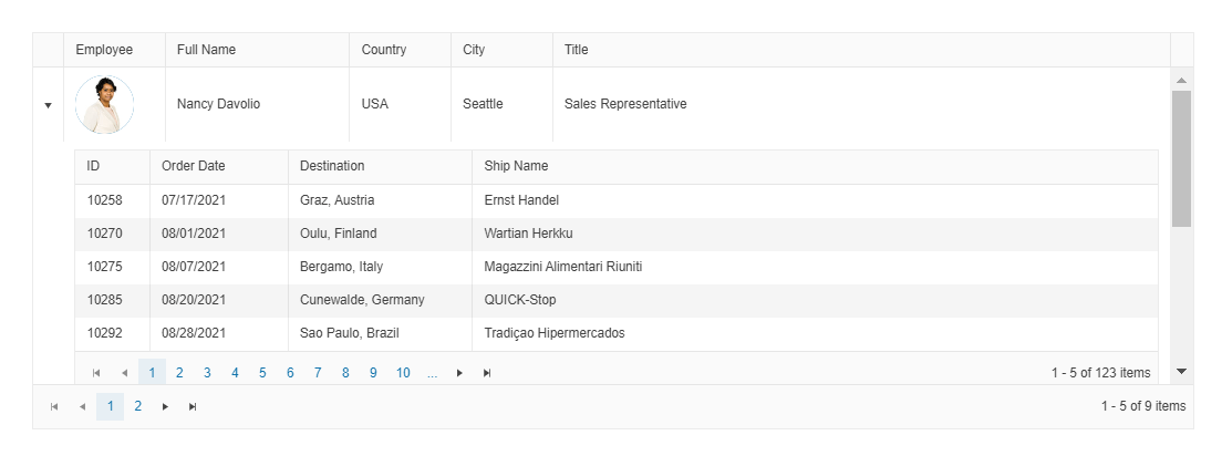
Seamless Integration with the Grid
Create CSP-compatible, secure Grid, leveraging the Telerik UI for ASP.NET Core Template component. This UI control can be incorporated into all templating options of the Grid, including setting a desired column template, custom editor, customize the layout and appearance of the rows, configure specific toolbar commands, etc.
See the Telerik UI for ASP.NET Core Template-Grid integration demo
-
Smooth Integration with the TileLayout
Benefit from the Telerik UI for ASP.NET Core Template component to define nested UI components in the tiles of the ASP.NET Core TileLayout. Simply use the AddComponent() method to showcase any component or leverage the AddHtml() option to insert HTML code between the components.
See the Telerik UI for ASP.NET Core Template-TileLayout integration demo
-
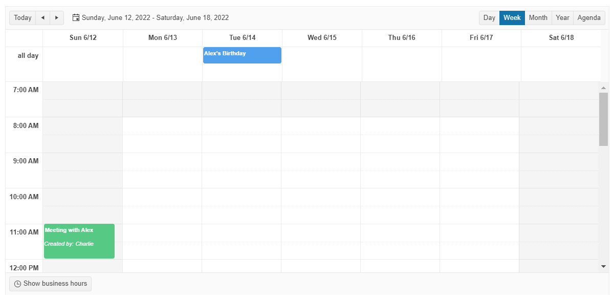
CSP-Compatible Integration with the Scheduler
One of the most popular components within Telerik UI for ASP.NET Core UI library – the Scheduler – also supports the Template control. Effortlessly customize the appearance of the events and the "all day" events or pass the name of the custom editor template that is created through the Template component via different configuration options.
See the Telerik UI for ASP.NET Core Template-Scheduler integration demo