UI for ASP.NET Core
ASP.NET Core Drawer
- Feature-rich ASP.NET Core Drawer component for flawless user navigation.
- Part of the Telerik UI for ASP.NET Core library along with 120+ professionally designed UI components.
- Includes support, documentation, demos, virtual classrooms, Visual Studio Code Extensions and more!
-
Overview
Need a menu that’s visible, but doesn’t take over the entire screen? This is where the Drawer widget comes in! This component provides a menu that can slide in to the app from the left or right, while overlaying or pushing the main page content. With a single button click, traditionally with a hamburger icon, the user can either expand the menu to see all available options or hide it with another click. The Navigation Drawer also features support for touch gestures. This means the component can easily work for dashboards built for the desktop or used as compact navigation option for responsive apps rendered on mobile devices. Drawer content is fully customizable and can take advantage of pre-built styles or custom templates.
See the Telerik UI for ASP.NET Core Drawer demo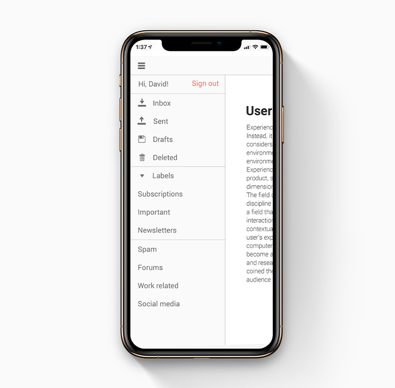
-
Visualization Modes
The Drawer will allow you to choose how exactly it should get displayed on the page. You can configure it to overlay the content in a modal form or push it to the side as the menu expands.
-
Mini Mode
The mini version of the Drawer widget provides quick access to navigation even when closed. Rather than the full menu options only the icons are displayed in this mode, providing an even more compact navigation option.
Explore the Drawer Mini Mode in this demo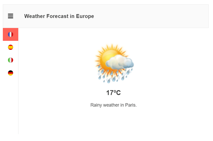
-
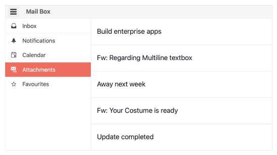
Separators
If you need to have some items logically grouped – we’ve got you covered. The Drawer allows you to organize the items to fit your custom business scenario.
-
Hierarchical Items
The Telerik UI for ASP.NET Core Drawer provides an easy way to create a hierarchical navigation structure by placing child elements with indentation inside the parent drawer items.
See more on ASP.NET Drawer Hierarchy Items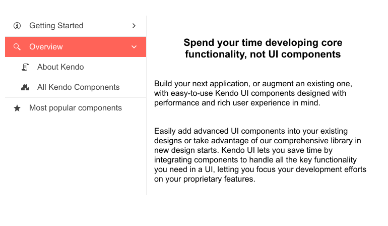
-
Icons
Each item can be rendered with icons, letting you spruce up your navigation items beyond just the text. On top of this, the icon selected will be used exclusively when mini mode is activated – all for a more compact UX experience.
-
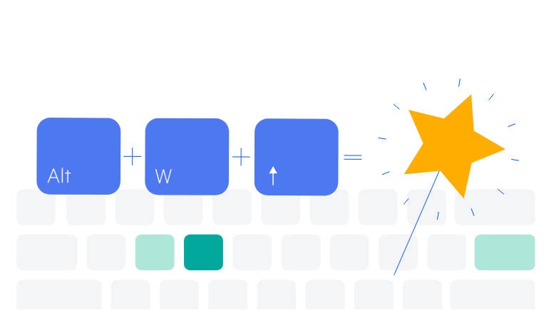
Keyboard Navigation
Users who prefer to use their mouse as little as possible would appreciate the built-in keyboard support for the Drawer. By pressing the arrow keys to move around, Space to select the current item and Escape to close it, you can do pretty much anything you could with a mouse.