UI for ASP.NET Core
ASP.NET Core Sortable
- The ASP.NET Core Sortable component provides a sortable drag-and-drop functionality to elements within a list.
- Part of the Telerik UI for ASP.NET Core library along with 120+ professionally designed UI components.
- Includes support, documentation, demos, virtual classrooms, Visual Studio Code Extensions and more!
-
Overview
The Telerik UI for ASP.NET Core Sortable component allows you to sort elements within a list by simply dragging and dropping them around. It comes with various features and functionalities such as hints, items, cursor, placeholder, different integrations with other components, sortable panels, events, and more.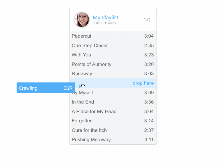
-
Hint
By default, the ASP.NET Core Sortable component renders a hint, however if you think it is not suitable for your project, you can easily disable it. -
Items
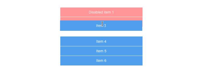
The Core Sortable component allows you to control the behavior of its items. You can choose to disable them, so they cannot be dragged but are valid drop targets, or to filter them, so they cannot be dragged and are not valid drop targets.
-
Cursor
The cursor configuration of the control determines the type of cursor that will be rendered when the user is dragging a sortable item.
-
Placeholder
The Sortable component has a default placeholder, which you can easily change by setting the placeholder configuration option.
-
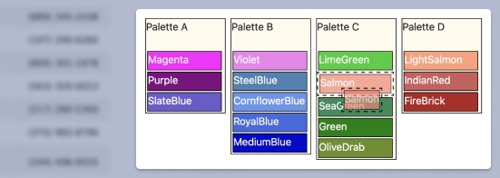
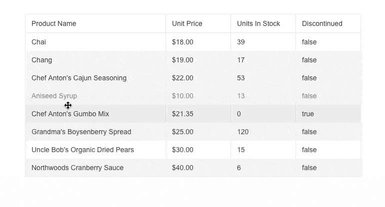
Integration
-
Events
The component fires a variety of events including AutoScroll, Ignore, Cursor, Render etc.

-
HTML and Tag Helpers
The Telerik UI for ASP.NET Core suite offers two approaches to declare the Sortable component – choose HTML or Tag helpers based on your preference, practice, and technology background, and add this advanced input element to any new or existing form.