UI for ASP.NET Core
ASP.NET Core Skeleton Container
- Create an accurate representation of how content is going to be displayed with the ASP.NET Core Skeleton Container.
- Part of the Telerik UI for ASP.NET Core library along with 120+ professionally designed UI components.
- Includes support, documentation, demos, virtual classrooms, Visual Studio Code Extensions and more!

-
Overview
The Telerik UI for ASP.NET Core Skeleton is a loading container mainly used for indicating to users that the page content is currently loading. What separates it from the conventional loaders is that it mimics the page layout by showing its elements in a shape similar to the actual content as it loads.
Check out the ASP.NET Core Skeleton Container demo
-
Items Configurations
The SkeletonContainer HtmlHelper uses the default CSS Grid layout as a base. Each cell or group of cells from the CSS Grid can be represented by an item from the SkeletonContainer. -
Theming
The Skeleton supports several built-in themes such as Default (our own styling), Material (based on the Material Design guidelines), Bootstrap (which looks like the Bootstrap styling for smoother integration) and Fluent (based on Microsoft Fluent UI). You can easily customize any of the out-of-the-box themes with a few lines of CSS or create a new theme to match your colors and branding using the Telerik SASS ThemeBuilder application.

-
Grid Integration
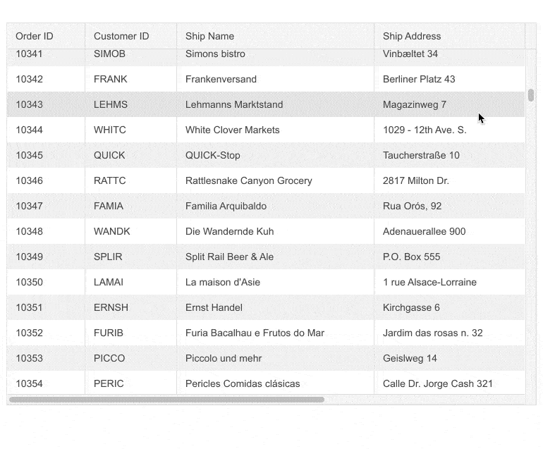
The Skeleton is a versatile control that can be seamlessly integrated with other ASP.NET Core components, such as the Grid, to indicate that the content is being loaded. The Skeleton container is shown automatically every time the grid requests new data.
See more about Skeleton Container Grid Integration