UI for ASP.NET Core
ASP.NET Core ChipList
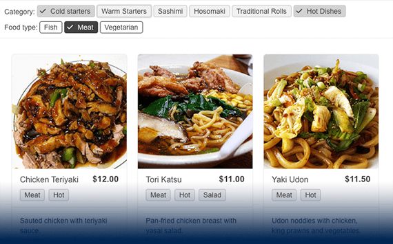
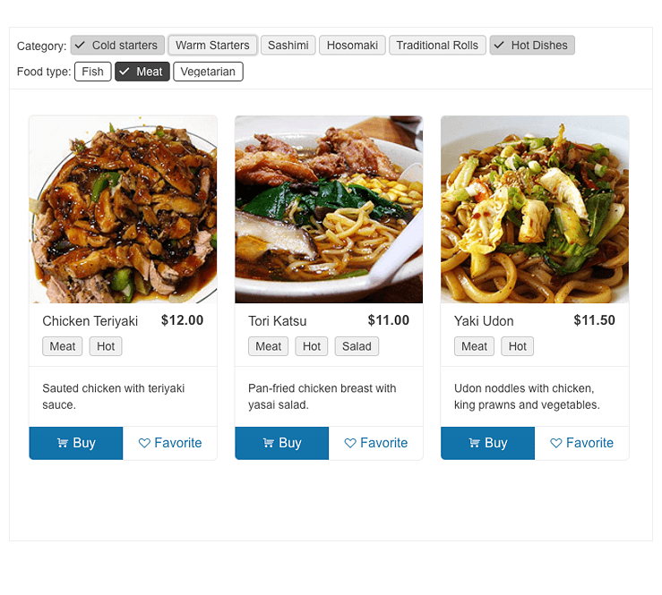
- Display and manage a collection of ASP.NET Core chips, leveraging the Telerik UI for ASP.NET Core ChipList.
- Part of the Telerik UI for ASP.NET Core library along with 120+ professionally designed UI components.
- Includes support, documentation, demos, virtual classrooms, Visual Studio Code Extensions and more!

-
Overview
List a collection of individual ASP.NET Core Chip components, organize and manage it by adding and removing items and maintaining the selected chips. Leverage the Telerik UI for ASP.NET ChipList component for both single and multiple selections, e.g., when additions to an ordered meal need to be displayed.

-
Appearance
Configure the look and feel of the ASP.NET Core ChipList component by leveraging the predefined set of appearance options. You can easily configure the size of the chips or the fill mode.

-
Selection Mode
Enabling single or multiple selections is possible through the selection mode feature in Telerik UI for ASP.NET Core ChipList. Showcasing a read-only list is also feasible by completely disabling the selection option.
-
Disabled ChipList
Use a single configuration option to disable the entire ChipList component. This is beneficial in cases where you need to restrict the user interaction with the ASP.NET Core ChipList items.
-
Customization
Designed to fit any requirement, the Telerik UI for ASP.NET Core ChipList delivers all customization options included in the ASP.NET Core Chip component. Customize the color and style of the ChipList based on your brand or visual preferences. You can also add close/delete icons or avatars, text and images to the ChipList content.
-
Events
To ensure smooth interaction, the Telerik UI for ASP.NET Core ChipList component exposes different events related to user interaction:
- Select event which fires when the user changes a Chip selection in the ChipList
- Remove event that fires when the user clicks the Remove icon of the Chip.
-
ChipList Theming
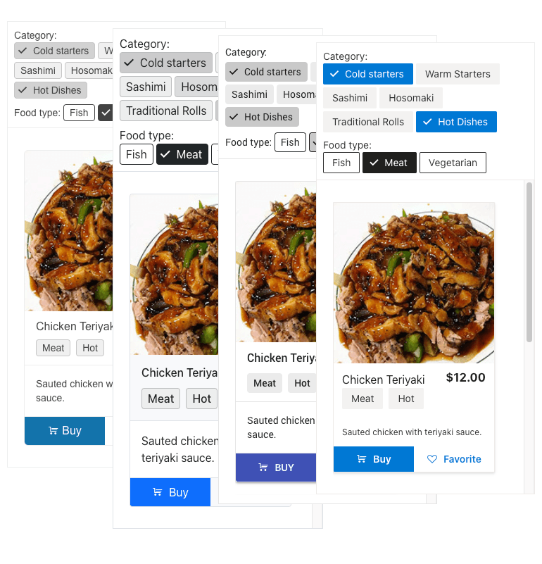
The Telerik UI for ASP.NET Core ChipList component has several built-in themes, including Default (our own styling), Material (based on the Material Design guidelines), Bootstrap (which looks like the Bootstrap styling) and Fluent (based on Microsoft Fluent UI).
You can easily customize any of the out-of-the-box themes with a few lines of CSS, or create new theme to match your colors and branding by using Progress ThemeBuilder.

All ASP.NET Core Components
Data Management
- Grid
- Filter
- ListView
- Pager
- PivotGrid
- PivotGrid v.2
- PropertyGrid
- Rating
- Spreadsheet
- TaskBoard
- TreeList
Scheduling
Editors
- AutoComplete
- Captcha
- CheckBoxGroup
- Color Picker
- ColorGradient
- ColorPalette
- ComboBox
- Date & Time Pickers
- DateInput
- DateRangePicker
- DropDownList Updated
- DropDownTree
- Editor
- FlatColorPicker
- Image Editor
- ListBox
- MaskedTextBox
- MultiColumnComboBox
- MultiSelect
- Numeric TextBox
- OTP Input
- RadioGroup
- Signature
- Switch
- TextArea
- TextBox
- TimeDurationPicker
- TimePicker
Navigation
Data Visualization
Layout
- Avatar
- Badge
- Dialog
- DockManager
- Form
- GridLayout
- Notification
- Popover
- Responsive Panel
- Splitter
- StackLayout
- TileLayout
- Tooltip
- Window
- Wizard
File Upload & Management
Interactivity & UX
- Chat (Conversational UI)
- Circular Progress Bar
- Loader
- Progress Bar
- Ripple
- Skeleton Container
- Slider
- Sortable
- Template
Productivity Tools
Media
Geo Visualization
Document Processing
MVC & Razor Pages
