UI for ASP.NET Core
ASP.NET Core Badge
- Easily visualize app notifications, show statuses and short messages with the ASP.NET Core Badge component.
- Part of the Telerik UI for ASP.NET Core library along with 120+ professionally designed UI components.
- Includes support, documentation, demos, virtual classrooms, Visual Studio Code Extensions and more!
-
Button and Button Group integration
The Badge comes out of the box with a built-in integration with the Button and ButtonGroup components to enhance the information they bring.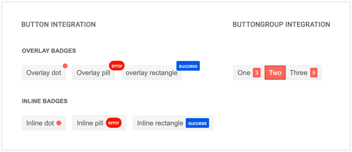
-
Used Standalone
The Telerik UI for ASP.NET Core Badge component can be placed inline anywhere on the page. It can be included in the template of a bigger component to enrich the visual information on the page. -
Configurable Appearance
You can choose from multiple modes like Dot, Pill and Rectangle to portray the Badge component in a way that works best for your scenario.
Check out the ASP.NET Core Badge Templates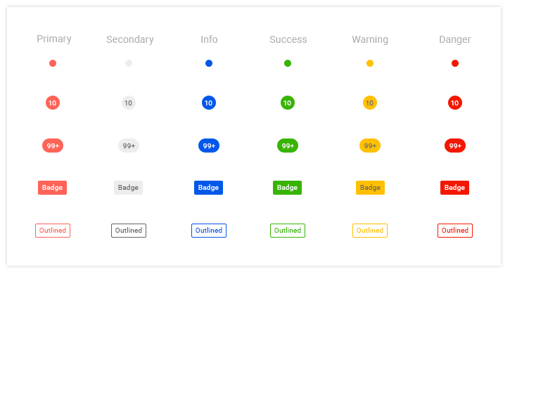
-
Overview
The Badge component for Telerik UI for ASP.NET Core enables you to easily show statuses, notifications and short messages in your app and provide some additional contextual information to something on the page. You can also add the Badge component to any existing ASP.NET Core components.
See the ASP.NET Core Badge demo