UI for ASP.NET Core
ASP.NET Core Loader
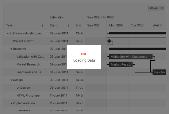
- Use the ASP.NET Core Loader component to illustrate any slow background task in progress.
- Part of the Telerik UI for ASP.NET Core library along with 120+ professionally designed UI components.
- Includes support, documentation, demos, virtual classrooms, Visual Studio Code Extensions and more!
-
Overview
You always want to indicate to the user if a slow background task is in progress like communication with a remote server. The Telerik UI for ASP.NET Core Loader component was designed to illustrate that progress. Options are provided to customize the Loader with different styles so it seamlessly fits in your application’s style.
-
Customization
The Loader can be customized through the following settings:
- Shape & animation – one of Pulsing (the default), InfiniteSpinner or ConvergingSpinner

- Color

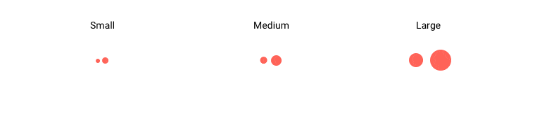
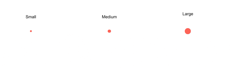
- Size – one of small, medium or large
- Shape & animation – one of Pulsing (the default), InfiniteSpinner or ConvergingSpinner
-
Integration
The Loader UI control can be easily integrated with other Telerik UI for ASP.NET Core UI components to indicate that an operation is executing. Check out a demo on how to integrate a Loader with a Button component.

-
Loader Component Theming
The Telerik ASP.NET Core Loader component has several built-in themes such as Default (our own styling), Material (based on the Material Design guidelines), Bootstrap (which looks like the Bootstrap styling to integrate better) and Fluent (based on Microsoft Fluent UI). You can easily customize any of out-of-the-box themes with a few lines of CSS, or create new theme to match your colors and branding by using the Telerik SASS ThemeBuilder application.