
UI for ASP.NET Core
ASP.NET Core TimePicker
- Use the Telerik UI for ASP.NET Core TimePicker to let users select a certain time from a dropdown list.
- Part of the Telerik UI for ASP.NET Core library along with 120+ professionally designed UI components.
- Includes support, documentation, demos, virtual classrooms, Visual Studio Code Extensions and more!
-
Overview
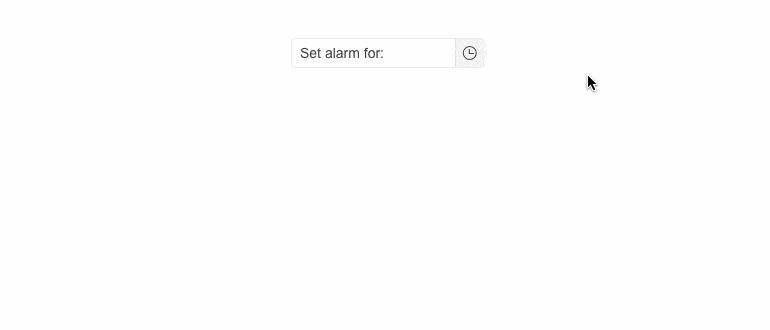
The Telerik UI for ASP.NET Core TimePicker allows users to select a certain time throughout the day. It can be implemented in many scenarios such as setting an alarm, booking and appointment or setting a reminder for an important meeting. You can choose a modern or classic appearance to fit your application’s style. The component supports keyboard navigation, RTL and is compliant with accessibility standards.
Check out the Telerik UI for ASP.NET Core TimePicker demo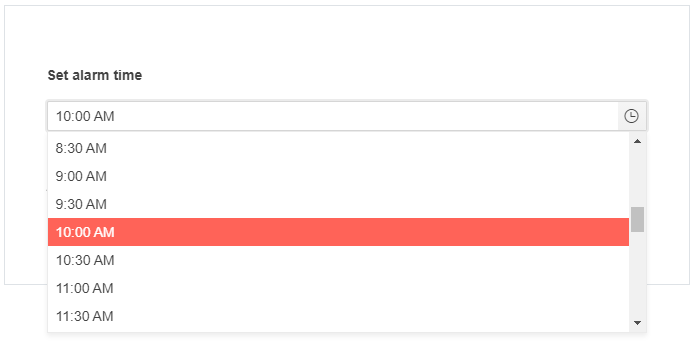
-
Component type
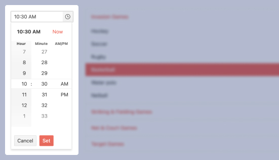
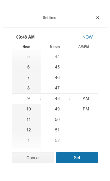
The TimePicker has two looks – modern and classic. The modern type allows users to adjust the hour, minute and select AM/PM from a popup with a sleek UI. The classic type renders a dropdown menu which users can scroll to find their desired timeslot.
See both component types in action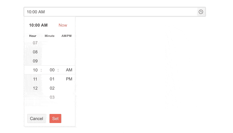
-
Focused Time
Easily define focused time when the time chooser pop-up is opened, thus elevating user interactions with the Telerik UI for ASP.NET Core TimePicker component even further. The focused time capability provides a convenient way for the user to effortlessly select a highlighted time slot.
See the Telerik UI for ASP.NET Core TimePicker focused time documentation
-
Range Selection
Adding two TimePicker controls to an application would allow users to set a time range by selecting a Start and End hour, specifying the duration of an event.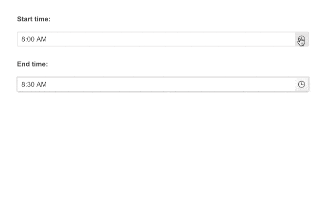
-
Floating Label
Create smoother and more efficient form UX with the Telerik UI for ASP.NET Core TimePicker Floating Label feature. By adding a label that floats above the input field, you can save space while ensuring end-users don’t lose the form context.
-
Adaptive Mode
Setting the AdaptiveMode parameter to AdaptiveMode.Auto provides you with a mobile-friendly rendering of the TimePicker time selector popup. This allows automatic adaptation of the picker component to the current screen size and changes its rendering accordingly.
See the Telerik UI for ASP.NET Core TimePicker Adaptive Rendering Demo
-
Date and Time Picker
In case your project requires a component that can be more time specific, such as setting dentist appointments or booking a session with a tutor, you can implement the Telerik UI for ASP.NET Core DateTimePicker and specify the exact date and time using a single component.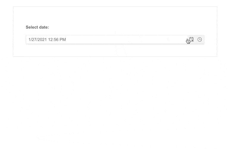
-
Events
The TimePicker fires various events triggered OnClick – some include Open, Close, Change value.

-
Declarative Initialization
Declarative initialization—a feature that serializes the component declaration as an MVVM declarative configuration instead of an inline initialization script—is supported in Telerik UI for ASP.NET Core TimePicker. It is beneficial in cases when the Content Security Policy (CSP) is enabled as it eliminates the requirement to call the methods that defer the initialization script generated after the component's HTML markup.
See Telerik UI for ASP.NET Core TimePicker declarative initialization demo
-
Globalization
The TimePicker supports Globalization features and is designed to work in different cultures and respond to their requirements for time formatting. You can define the culture through the kendo.culture() method.
Check out the ASP.NET Core TimePicker Globalization demo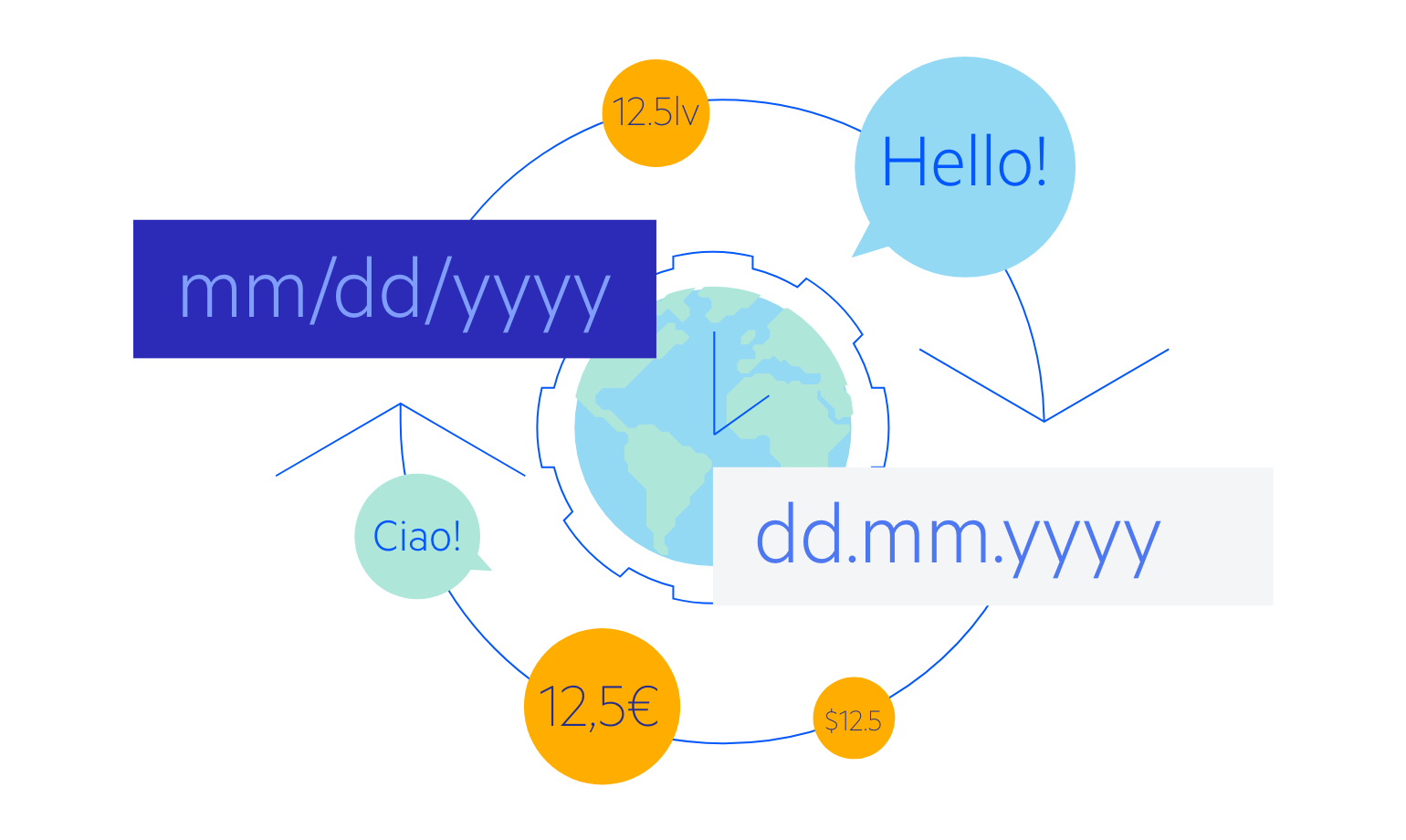
-
RTL Support
The TimePicker component supports right-to-left users, and you can easily adapt it for them by changing the alignment from left-to-right and right-to-left with only a few settings.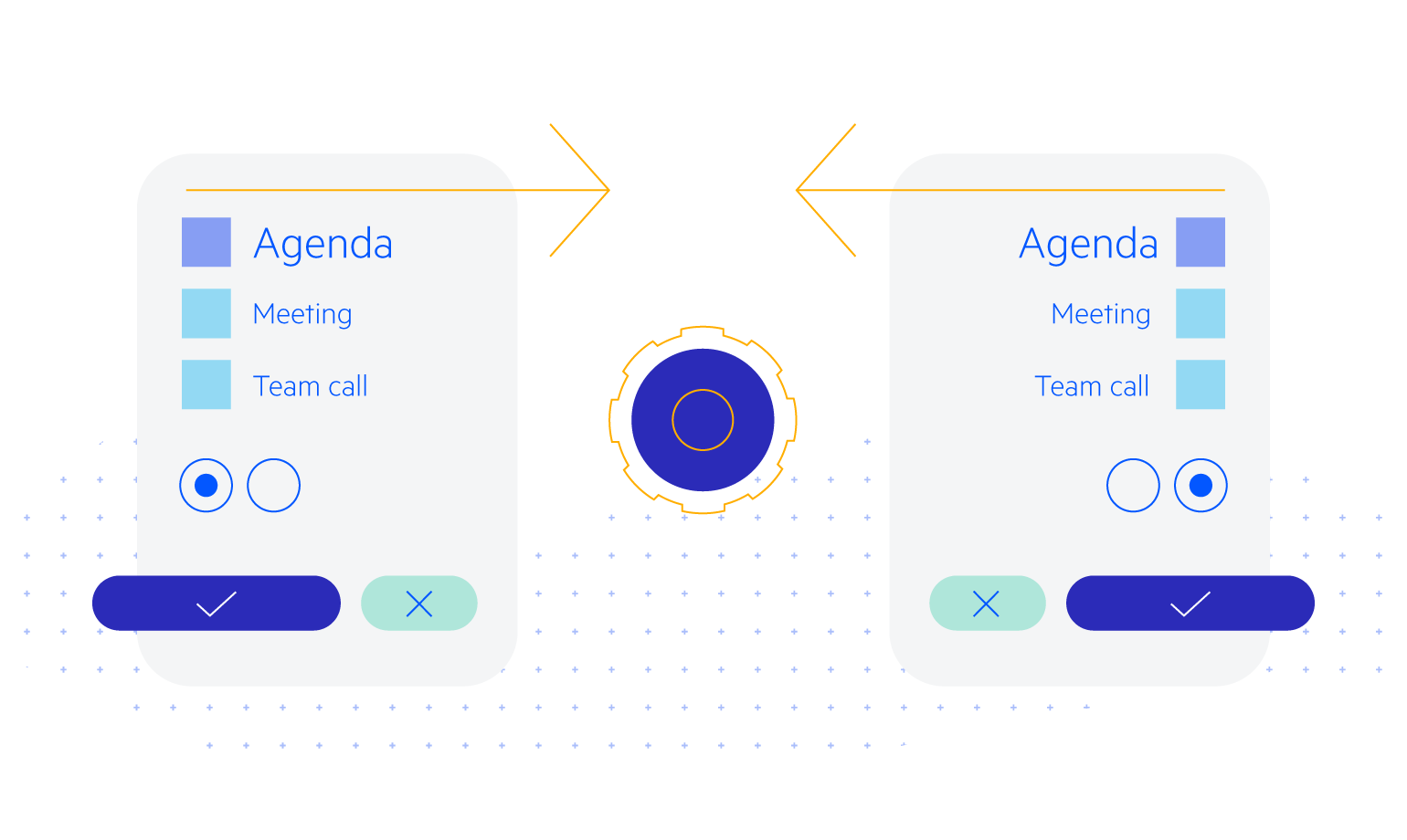
-
HTML and Tag Helpers
Telerik UI for ASP.NET Core provides two ways to declare UI components – by using HTML or Tag helpers. You can choose between the two approaches based on technology background, developer preference and practice, and implement the TimePicker component in your applications.
-
Accessibility
The Telerik TimePicker is perfect for scenarios where accessibility is important for your application. The control complies with Section 508 and WCAG 2.1 guidelines, ensuring that individuals with disabilities can still view and interact with it.
-
Keyboard Navigation
Out-of-the-box keyboard navigation is supported by the TimePicker component. It allows users to open and close the popup and select the desired time. To see a full list of keyboard controls and user actions visit this demo.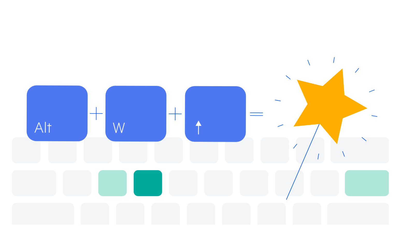
-
TimePicker Theming
The ASP.NET Core TimePicker component has 20+ built-in themes and swatches. You can easily customize any of out-of-the-box themes with a few lines of CSS to match your customer’s design requirements, or you create new themes by using the Progress SASS ThemeBuilder application.
