UI for ASP.NET Core
ASP.NET Core DateRangePicker
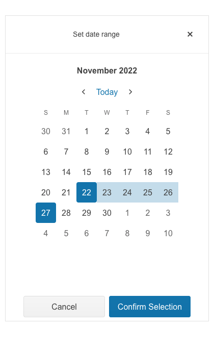
- Use the ASP.NET Core DateRangePicker control to easily input or select a date range from a calendar.
- Part of the Telerik UI for ASP.NET Core library along with 120+ professionally designed UI components.
- Includes support, documentation, demos, virtual classrooms, Visual Studio Code Extensions and more!
-
Overview
The ASP.NET Core DateRangePicker is a container-based component that enables your end-user to easily select a date range either from a calendar or through a direct input. The component also supports multiple views, custom templates for month view, configurable options for minimum and maximum date, start view and the depth of the navigation and more.
Visit the Telerik UI for ASP.NET Core DateRangePicker demo page
-
Disabled Dates
The DateRangePicker allows you to disable specific dates, which are not intended to be selected by the end users such as weekends and national holidays. You simply need to set an array of dates or add a function - see our documentation page to learn more.
-
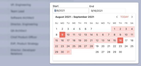
Selected Dates
You can define the minimum and maximum dates displayed within the DateRangePicker and provide a pre-selected date range - changed manually from the dropdown calendar or inputs. For a complete example on how to select ranges, refer to the ASP.NET Core DateRangePicker demo on range selection.
-
Start View and Navigation Depth
The Telerik ASP.NET Core DateRangePicker enables you to set the initial view and control the navigation depth of the calendar. Simply pick from the four predefined views - Month, Year, Decade and Century. Refer to our documentation page for more information.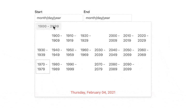
-
Adaptive Mode
The DateRangePicker adaptive mode enables a mobile-friendly rendering of its calendar popup. Simply set the AdaptiveMode parameter to AdaptiveMode.Auto – this will trigger the picker component to automatically adapt to the current screen size and will change its rendering accordingly.
See the Telerik UI for ASP.NET Core DateRangePicker Adaptive Rendering Demo
-
Flexible Server- and Client-Side API
Use the rich server- and client-side API found within the DateRangePicker component to implement advanced and specific scenarios. The available public methods, properties and events provide robust functionalities such as enable/disable or open/close the calendar.
-
HTML and Tag Helpers
Telerik UI for ASP.NET Core offers two options for declaring UI components – through HTML or Tag Helpers. You can choose the approach based on your preference, technology background or team development practice. Both methods allow you to lay out the DateRangePicker component and its configuration with a simple and easy-to-read HTML-like or Razor syntax.
-
Declarative Initialization
Declarative initialization—a feature that serializes the component declaration as an MVVM declarative configuration instead of an inline initialization script—is supported in Telerik UI for ASP.NET Core DateRangePicker. It is beneficial in cases when the Content Security Policy (CSP) is enabled as it eliminates the requirement to call the methods that defer the initialization script generated after the component's HTML markup.
See Telerik UI for ASP.NET Core DateRangePicker declarative initialization demo
-
Globalization & Localization
The DataRangePicker supports Globalization and Localization features, allowing it to adapt to specific cultural requirements. To find out more about the feature, check out our ASP.NET Core DataRangePicker documentation page.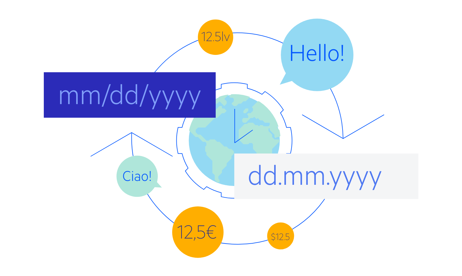
-
Right-to-Left (RTL) Support
Right-to-left support is available for languages like Arabic and Hebrew, in which users read from right to left. You can satisfy any local preference and ease user interaction by toggling between left-to-right and right-to-let alignment with only a few settings.
-
Keyboard Navigation & Accessibility
The DateRangePicker component provides keyboard navigation and accessibility features, making your apps usable by anyone. You can interact with the component entirely through keyboard, without the need of a mouse. It complies with WAI-ARIA, WCAG 2.1 and Section 508 guidelines, enabling easy interaction for individuals with disabilities.
To get more familiar with the topic of accessibility and its importance, please check out our whitepaper.
Learn more about ASP.NET Core DateRangePicker Keyboard Navigation