
Kendo UI for Angular
Angular TreeView
- The easiest way to display hierarchal data either as data items or app navigation.
- Part of the Kendo UI for Angular library along with 110+ professionally-designed components.
- Includes support, documentation, demos, virtual classrooms, Visual Studio Code Extensions and more!
-
Robust Filtering
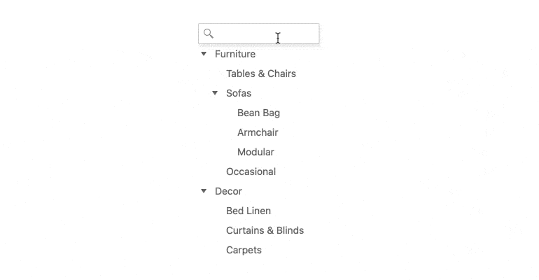
The Angular Tree component gives you many options for filtering its displayed data.
- You can give users a field, much like a search box, that allows them to enter keywords to filter by.
- Configure filter behavior with operators or ignoring case.
- Set an initial filter that can or can't be unapplied by the user.
- Choose whether or not to automatically expand nodes when filtering or clearing filters.
-
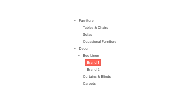
Expanding Items
You can program every node in the Kendo UI for Angular TreeView to be expanded or collapsed dynamically. You can also allow users to set the functionality upon initial render.

-
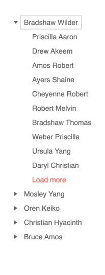
Load More Button
When thousands or hundreds of thousands of rows need to be loaded at once, The Kendo UI for Angular TreeView provides a Load More button to improve performance and load the data in chunks. This allows you to define an initial set of data to load and then subsequentially load more as users continue to click the Load More button.
See Angular TreeView Load More Button demo.
-
Dragging and Dropping
With the drag and drop functionality of the Kendo UI for Angular TreeView, users can move and reorder nodes by a simple drag and drop interaction. Nodes can be dragged within a single or across multiple Angular TreeViews on the same page.

-
Node Templates
With built-in support for Angular Templates, every node in the Kendo UI for Angular Tree component can be completely customized through a standardized template format. This gives you full control over the look and feel of the component.
-
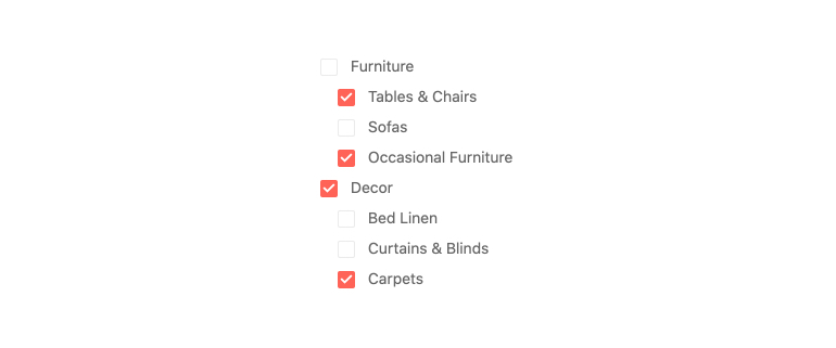
Checkboxes
The Kendo UI for Angular TreeView offers a single configuration option that renders a checkbox next to each node, giving users an intuitive and simple way to select one or several nodes.
-
Selection
The Kendo UI for Angular TreeView allows for items to be selected by a simple click of the node or through checkboxes, which can be toggled on or off with a single configuration option.

-
Conditional Checkboxes
The Angular TreeView enables you to selectively display checkboxes based on your business logic. By using the conditional checkboxes, you can easily tailor the component for maximum flexibility and convenience.
See the Angular TreeView Conditional Checkboxes demo

-
Persisting State
The Kendo UI for Angular TreeView enables you to persist several key aspects of the TreeView state, including the expanded or collapsed and enabled or disabled states of a node. This ensures that any update or re-render of the Angular Tree component can maintain state and not cause a disruption for the end user.
See Angular TreeView Persisting State demo.
-
Compact Size Option
To help you develop for small screens, the Angular TreeView gives you the option to set its appearance to small, medium, or large. Each setting changes the padding around items to add or subtract whitespace and fit more or fewer items on the screen. Many developers set this option dynamically for responsive behavior.
-
Globalization
The Angular TreeView component provides a few features to ensure your app is readable wherever your user is.
- When local is set, the proper characters are used.
- Messages are well organized for easy localization.
- Right-to-left display is supported.
-
Keyboard Navigation
The Kendo UI for Angular TreeView allows users to navigate through and interact with all nodes of the component using keyboard navigation.
-
Accessibility
The Kendo UI for Angular TreeView is compliant with Section 508 and WAI-ARIA standards, and is AA rated with WCAG 2.0.

-
Also Available for These Web Frameworks
We support every popular web development framework and strive for parity among our component libraries. You can find the DateTimePicker for these popular platforms:
-
Disable All or Parts of the TreeView
For ultimate flexibility, you can choose to make the entire tree read only or only selected parent nodes. When you do this, children can still be fully interactive. Additionally, you can load the nodes in expanded state so that the children can be seen. You can also allow expanding/collapsing of disabled nodes.
-
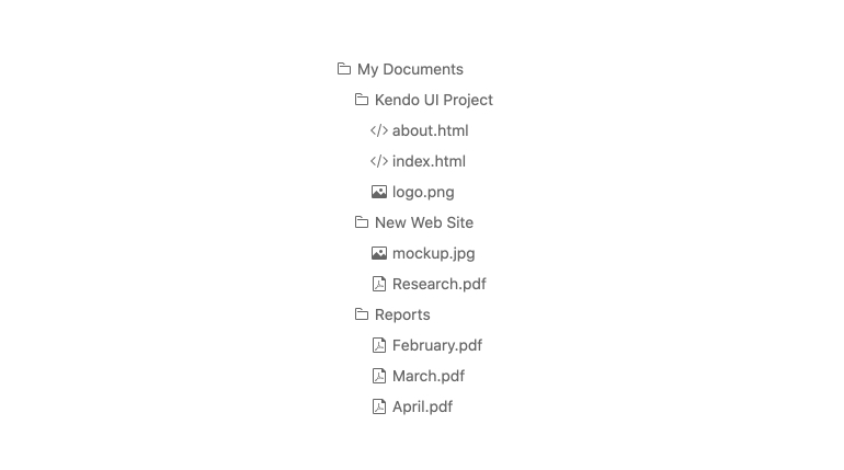
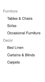
Display Data in an Interactive Tree
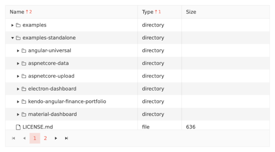
The Kendo UI for Angular Tree View component is perfect for scenarios that require hierarchical data to be displayed in a tree structure, either as related data items or as navigation. Items in the Angular Tree component can be dragged and dropped in order to be reordered and users can choose to perform these interactions with either the mouse or keyboard.
-
Flat or Hierarchical Data Binding
The Kendo UI for Angular Tree component has no restrictions for the type of data that can be bound, giving you ultimate flexibility to implement the Angular TreeView component. Directives for both flat and hierarchical data binding are included.


Get Started with Kendo UI for Angular
