
Kendo UI for Angular
Angular AutoComplete
- Enable users to filter and select items from a list of available options using a variety of methods.
- Part of the Kendo UI for Angular library along with 110+ professionally-designed components.
- Includes support, documentation, demos, virtual classrooms, Visual Studio Code Extensions and more!
-
Filtering
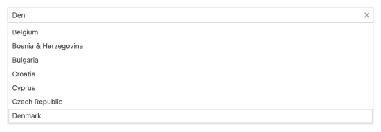
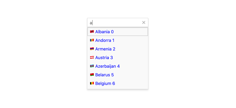
Precisely define how data items are filtered to match the user’s input with the filtering options of the Kendo UI for Angular AutoComplete. Through the implementation of conditional statements such as “starts with”, “contains” and more, you can control the dropdown of available items based on what the user is typing.

-
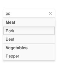
Grouping
Define categories and group items by category in AutoComplete to avoid long lists help users navigate the available options in an organized way.
-
Suggestions
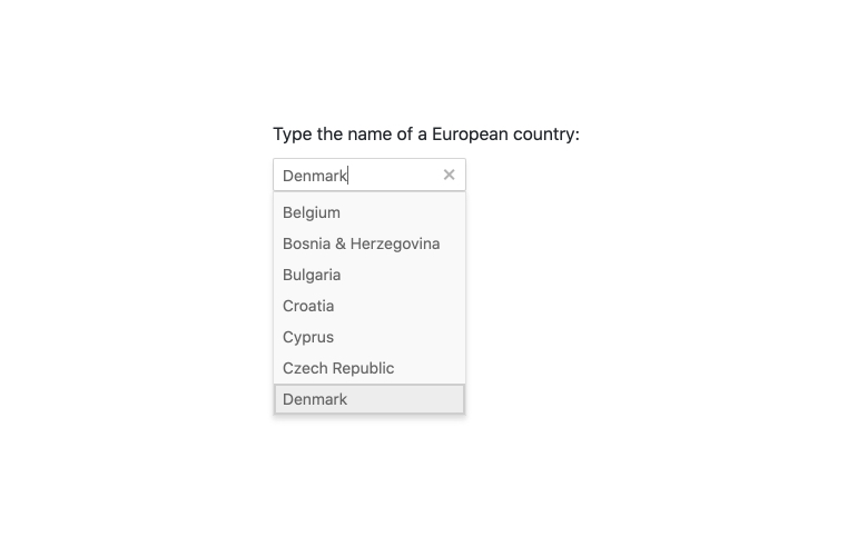
Save users time and keystrokes to find their desired value. With suggestions turned on, Kendo UI for Angular AutoComplete will autofill the input field with suggestions based on what the user has typed in so far.
See Angular AutoComplete Suggestions demo.
-
Floating Labels
Popularized by Material Design, the floating label starts off as a placeholder in an input element only to animate out and float above the input and act as a label. Thanks to integration with the Kendo UI for Angular FloatingLabel component, our Angular AutoComplete can easily use floating labels no matter the design language you are using.

-
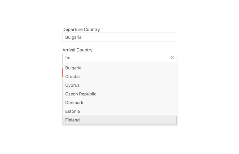
Forms Support
Build your web application with a form of your choice. The Kendo UI for Angular AutoComplete component works with both template-driven and reactive forms, allowing you to integrate the component in any form.
-
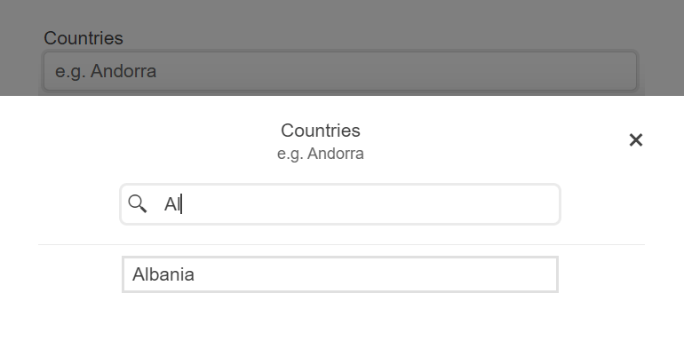
Adaptive Mode
Тhe Angular AutoComplete supports an adaptive mode, enabling a mobile-friendly rendering of the component popup. The component automatically adapts to the current screen size and alters its rendering accordingly.
-
Templates
Fully customize the look and feel of each item within the Angular AutoComplete with templates. This includes the default items that represents each data item, as wells as the header and footer elements of Kendo UI for Angular AutoComplete.
-
Prefix and Suffix Adornments
Elevate user interactivity leveraging the option for adding prefix and suffix adornments. These are custom items, usually an icon or button, inside the field before or after the input area. Typical prefix adornments are currency symbols or unit indicators, while suffix adornments are often used for password visibility toggles, formatting or clearing the input.
-
Keyboard Navigation
Empower users to increase productivity and facilitate accessibility with keyboard support. Kendo UI for Angular AutoComplete has built-in keyboard support to help users navigate every aspect of the application using just a keyboard.
-
Accessibility
Ensure your application meets the international accessibility requirements. Every Kendo UI for Angular component has built-in digital accessibility features to help you stay compliant with accessibility standards.
Our Kendo UI for Angular AutoComplete follows the official WCAG guidelines and supports Section 508, Keyboard Navigation, and WCAG 2.0 (with a AAA rating) compliance.

-
Show Suggestions as Users Type
Enable users to easily and intuitively discover, narrow down and select items from a list of available options with Kendo UI for Angular AutoComplete.
-
Virtualization
Performance is at the forefront for Kendo UI for Angular UI components. Effortlessly scroll through large sets of data thanks to the high-performance, built-in Angular AutoComplete virtualization feature.

Get Started with Kendo UI for Angular
