
Kendo UI for Angular
Angular DropDownList
- Enable users to select a single item from a pop up list of predefined options.
- Part of the Kendo UI for Angular library along with 110+ professionally-designed components.
- Includes support, documentation, demos, virtual classrooms, Visual Studio Code Extensions and more!

-
Data Binding
The Kendo UI for Angular DropDownList enables you to bind it to various forms of data, including datasets of complex items (objects) or an array of primitive items. As a part of this binding, fields can be defined to represent the text displayed to the user as well as a separate underlying value to be used by developers.

-
Grouping
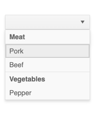
Group similar data items in natural categories to help users quickly and easily navigate and understand drop-down list. Define the field responsible for each category while you bind your dataset to the Kendo UI for Angular DropDownList.
-
Filtering
While users cannot directly type into the Kendo UI for Angular DropDownList main element, you can enable them to search through the data items with the Angular DropDownList filtering mechanism. Rather than displaying in the input of the Angular component, the filter appears as a search box at the top of the drop-down. You can configure Filtering in various ways, including employing “starts with” or “contains” conditions to ensure an intuitive experience and accurate results.

-
Default Item
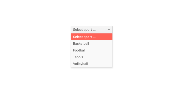
With the Kendo UI for Angular DropDownList, you can specify a default value that will appear when the component initially renders. It provides a placeholder you can populate with the default value already selected or leave it empty. You can also use it as a label to indicate to users what to do or select from the drop-down list. By setting the Default Item property, the DropDownList will display your predefined custom value if users haven’t made their choice yet.
-
Virtualization
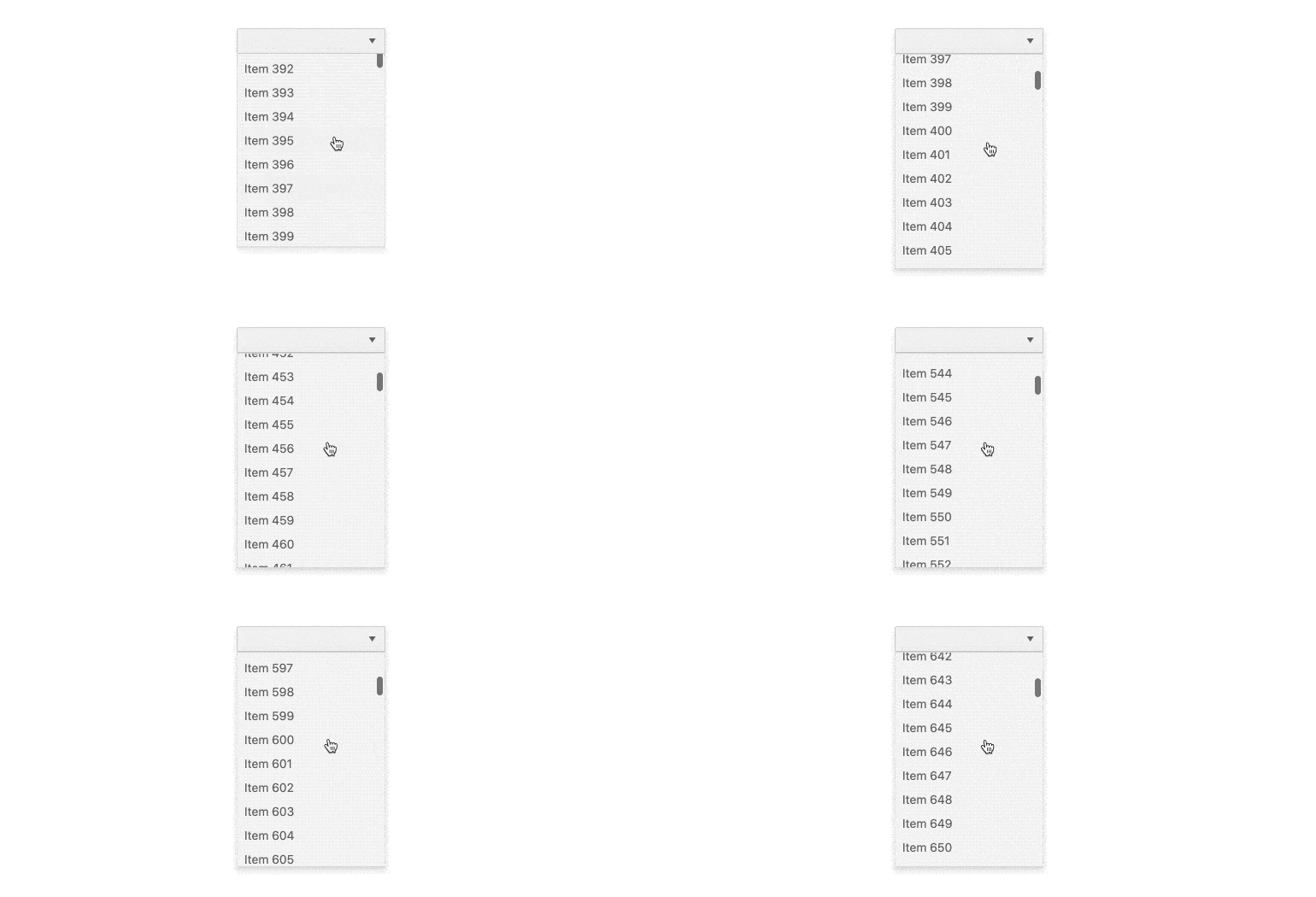
The Kendo UI for Angular DropDownList can handle large datasets without compromising performance. It comes with built-in virtualization that can easily process hundreds of thousands of data items at the speed of the users scrolling through the available options.
-
Cascading DropDownLists
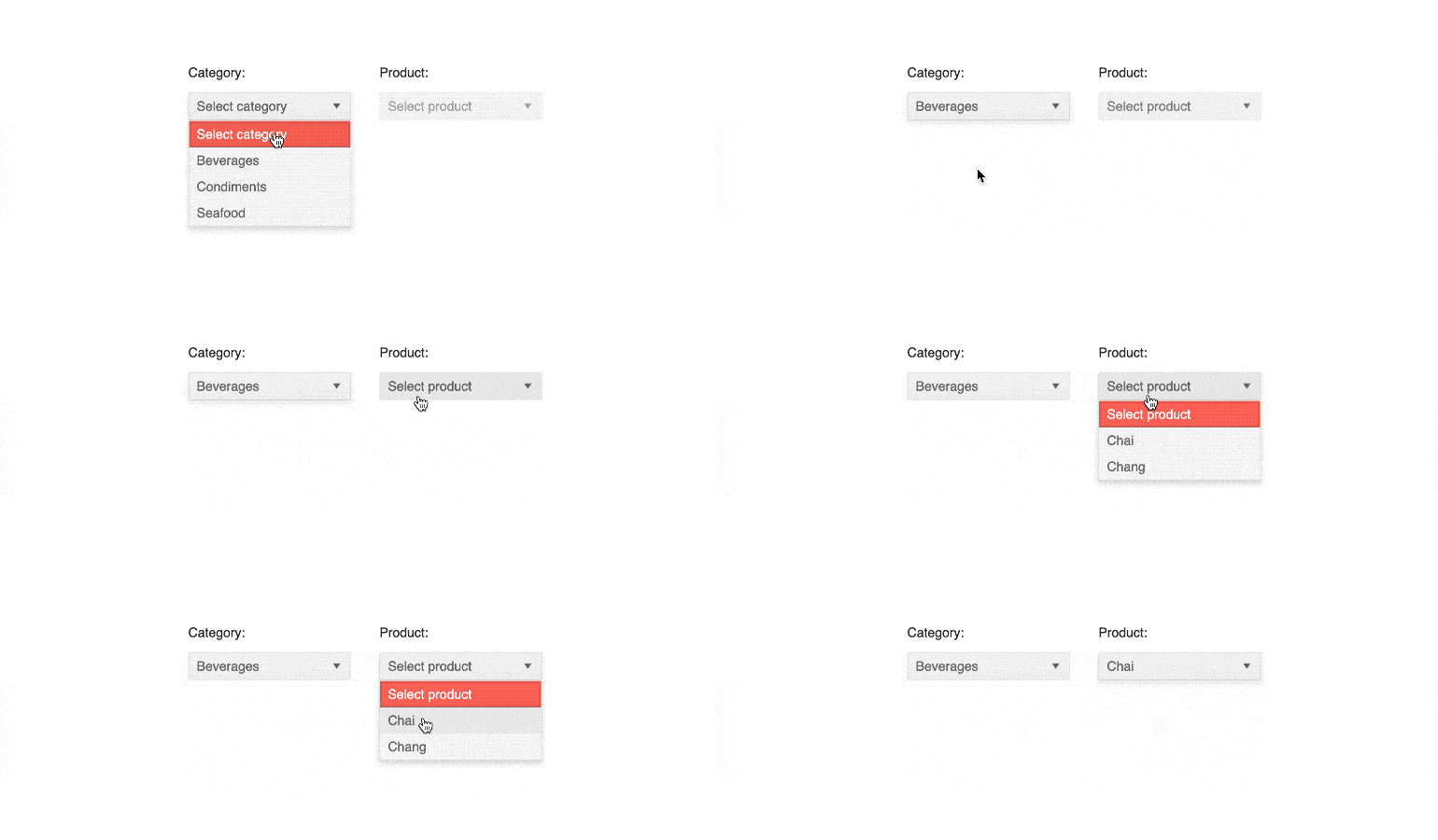
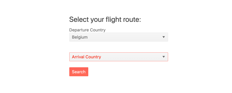
You can connect several Angular DropDownLists to act as a data filtering mechanism—selecting a value in one affects the available options in the other. This is often referred to as Cascading DropDownLists. The Kendo UI for Angular DropDownList enables you to effortlessly add multiple Angular DropDownLists on a page to leverage data dependencies in your datasets.
-
Adaptive Mode
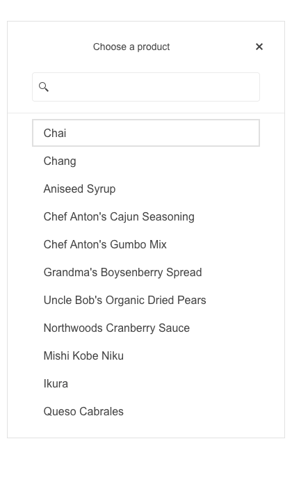
The Angular DropDownList supports an adaptive mode, enabling a mobile-friendly rendering of the component popup. The component automatically adapts to the current screen size and alters its rendering accordingly.
-
Templates
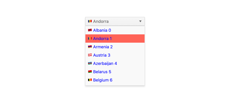
Out of the box, the Kendo UI for Angular DropDownList renders items as plain text. You can utilize Angular templates to create a custom layout for each element, including the list items, the list value, the header and footer areas, as well as the message displayed when no data is connected to the Angular DropDownList.
-
Globalization
For applications that require support for multiple cultures, the Kendo UI for Angular DropDownList has built-in support for updating internal messages to different languages. Additionally, the Angular DropDownList can be rendered as RTL (right-to-left).

-
Keyboard Navigation
The Kendo UI for Angular DropDownList comes with support for keyboard navigation out of the box to help users navigate and select data items using just the keyboard.
See the Angular DropDownList Keyboard Navigation demo.

-
Accessibility
The Kendo UI for Angular DropDownList is complaint with Section 508 standards, is AA rated with WCAG 2.0 and follows WAI-ARIA standards.

-
Also Available for These Web Frameworks
We support every popular web development framework and strive for parity among our component libraries. You can find the DateTimePicker for these popular platforms:
-
Give Users a Dropdown Menu
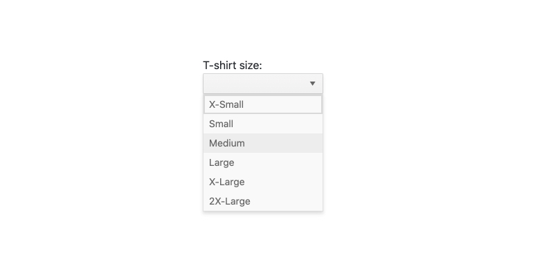
The Kendo UI for Angular Dropdown List component is a form component that enables users to select a single item from a popup list of options. A richer version of the HTML <select> element, the Angular DropDownList does not include an input element for typing values and instead relies on the user to select a value from the provided data list.
-
Forms Support
The Kendo UI for Angular DropDownList supports both template-driven and reactive forms, ensuring you can incorporate the Angular DropDownList in any Angular form.
Frequently Asked Questions
-
How can I try the Kendo UI for Angular DropDownList?
You can try all Kendo UI for Angular Components by signing up for a 30-day trial. During your evaluation, you will have access to all the components, technical support, documentation and on-demand technical training.
See the Angular Drop Downs Getting Started article for a quick tutorial. Also, don’t forget to sign up for a trial of the Kendo UI for Angular components library to get free support.
-
What other Angular Drop-Down components are available?
The Kendo UI for Angular Components library includes a variety of dropdowns, each designed for a specific purpose.
-
Why should I choose the Kendo UI for Angular DropDownList?
- All Kendo UI for Angular components are built from the ground up for Angular. Many others are wrappers around jQuery or other technologies.
- The component is highly customizable and can be easily modified to suit your needs.
- It is one of over 100 other components in our Angular components library that developers use to build modern, consistent UI.
- As a commercial product, it is frequently updated for Angular compatibility and user demand by a full-time team of experts.
- Our support team consistently wins accolades from industry organizations and users themselves.
- Each feature is meticulously documented.
-
How do I get started with the Kendo UI for Angular DropDownList?
Getting started is easy. Visit the Angular Drop Downs Getting Started tutorial for an easy step-by-step tutorial. All you need to do is install the NPM package, add the component to a page, and set desired properties!
Don’t forget to sign up for a trial of the Kendo UI for Angular components library. This gives you a 30-day license and access to support resources to help you during your learning and evaluation process.
-
Where can I buy the Kendo UI for Angular DropDownList?
The Angular DropDownList component is one of over 100 in the Kendo UI for Angular components library which is part of the Kendo UI bundle. Kendo UI includes libraries for jQuery, Angular, React, and Vue. You can purchase Kendo UI online or by contacting sales.
You can also choose to purchase DevCraft, which bundles all our .NET and JavaScript components.
All Kendo UI for Angular Components
Charts
- Area Chart
- Bar Chart
- Box Plot
- Bubble Chart
- Bullet Chart
- Chart Wizard New
- Charts
- Donut Chart
- Funnel Chart
- Heatmap
- Line Chart
- Pie Chart
- Polar Chart
- Pyramid Chart
- Radar Chart
- Range Area Chart
- Sankey Diagram
- Scatter Chart
- Sparkline
- Waterfall Chart
Editor
TreeList
Scheduler
Buttons
- Button
- ButtonGroup
- Chip
- ChipList
- DropdownButton
- Floating Action Button
- Speech To Text Button New
- SplitButton
Common Features
Conversational UI
Indicators
Progress Bars
Date Inputs
Dialogs
Labels
Icons
Design
Navigation
Diagrams and Maps
Dropdowns
Gauges
Grids
Upload
Inputs
- Checkbox
- ColorGradient
- ColorPalette
- ColorPicker
- FlatColorPicker
- Form New
- FormField
- MaskedTextBox
- NumericTextBox
- RadioButton
- RangeSlider
- Rating
- Signature
- Slider
- Switch
- TextArea
- TextBox
- TreeView
Bar & QR Codes
Data Tools

Get Started with Kendo UI for Angular
