
Kendo UI for Angular
Angular MultiColumnComboBox
- Display selectable options in a drop-down table with full support for data binding, filtering. Sorting, CRUD, and more.
- Part of the Kendo UI for Angular library along with 110+ professionally-designed components.
- Includes support, documentation, demos, virtual classrooms, Visual Studio Code Extensions and more!
-
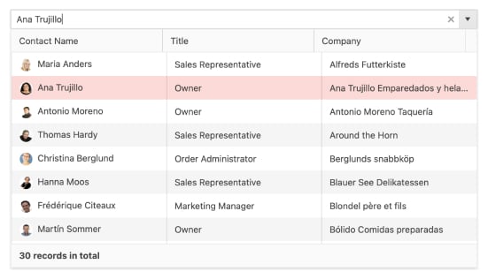
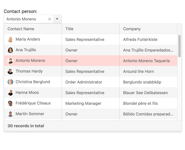
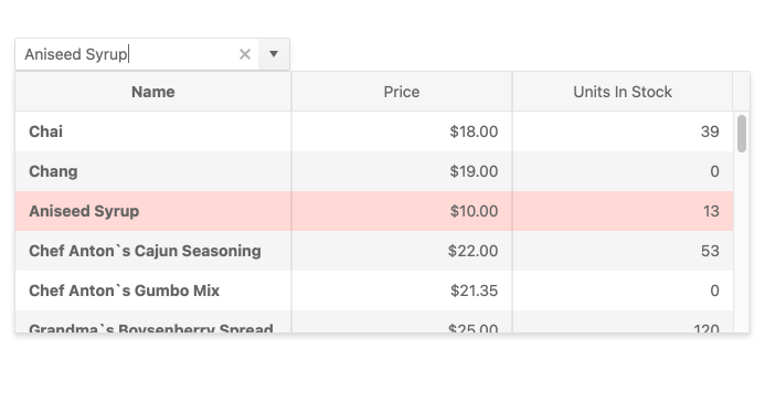
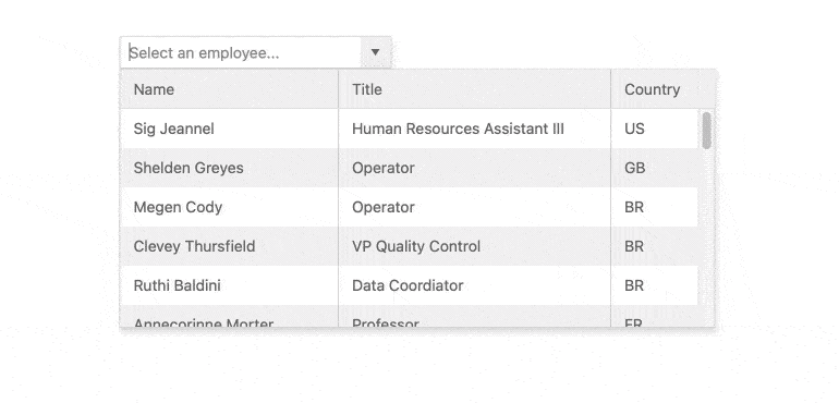
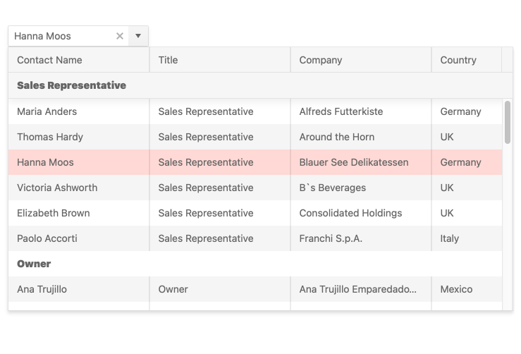
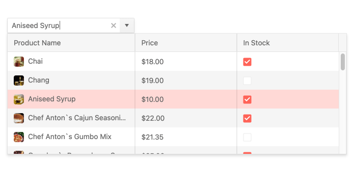
Display a Grid View in a Dropdown List
The Kendo UI MultiColumnComboBox is a form component that lets you choose from a table-structured list of options from a popup. It is a richer version of the <select> element and supports data binding, filtering, templates, and the entering of custom values.
-
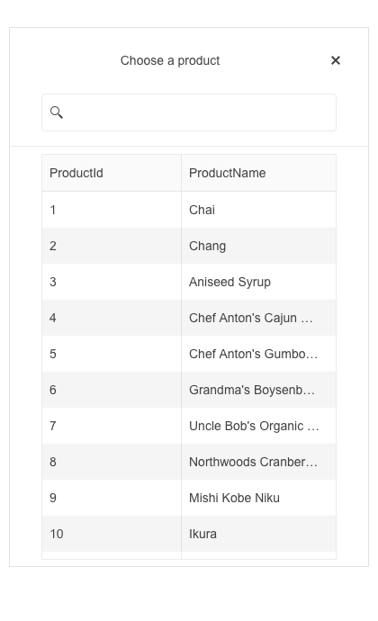
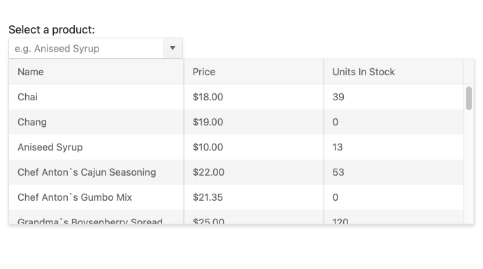
Data Binding
The Kendo UI for Angular MultiColumnComboBox supports binding of data objects to fill columns of data from local or remote sources. All you need to do is define text, value, and columns and the MultiColumnComboBox will fill in the popup table for you.
-
Columns
The Kendo UI for Angular MultiColumnComboBox allows you to completely control the display of your data. Choose which columns you want to display and size and style them however you like.
-
Filtering
Ensure users have an intuitive experience when filtering down data items with the Kendo UI for Angular MultiColumnComboBox built-in filtering mechanism. It helps you reduce the available data items inside the Angular MultiColumnComboBox and you can configure the filtering settings by including conditional rules such as “starts with” or “contains”.
-
Grouping
Organize data in categories to easily traverse datasets. With the grouping feature of the Kendo UI for Angular MultiColumnComboBox, you can define what field in your data is responsible for the group and the Angular MultiColumnComboBox will automatically group the underlying data accordingly.
-
Adaptive Mode
The Angular MultiColumnComboBox supports an adaptive mode, enabling a mobile-friendly rendering of the component popup. The component automatically adapts to the current screen size and alters its rendering accordingly.
-
Virtualization
The Kendo UI for Angular MultiColumnComboBox can handle large datasets without compromising performance. It comes with built-in virtualization that can easily process hundreds of thousands of data items by loading information as the user scrolls.
-
Suggestions
As the user modifies the input value, MultiColumnComboBox will show results that start with the string as the user types.
-
Prefix and Suffix Adornments
Elevate user interactivity leveraging the option for adding prefix and suffix adornments. These are custom items, usually an icon or button, inside the field before or after the input area. Typical prefix adornments are currency symbols or unit indicators, while suffix adornments are often used for password visibility toggles, formatting or clearing the input.
-
Templates
Out of the box, the Kendo UI for Angular MultiColumnComboBox renders items as plain text. You can utilize Angular templates to create custom layouts for every element of the component including columns, headers, footers, groups, and even elements with no data.
-
Keyboard Navigation
The Kendo UI for Angular MultiColumnsComboBox supports keyboard navigation such as up and down arrow to navigate through the items and open and close the popup.
See the Angular MultiColumnsComboBox keyboard navigation demo.
-
Accessibility
The Kendo UI for Angular MultiColumnComboBox is AAA rated for WCAG 2.0 and compliant with both WAI-ARIA and Section 508 standards.

-
Forms Support
The Kendo UI for Angular MultiColumnsComboBox componenet supports both reactive and template-driven forms, ensuring that the Angular MultiColumnsComboBox can be integrated in any Angular form.

Get Started with Kendo UI for Angular
