
Kendo UI for Angular
Angular Spreadsheet
- Bring advanced Excel-like and Google Sheet-like experience to your Angular applications.
- Part of the Kendo UI for Angular library along with 110+ professionally-designed components.
- Includes support, documentation, demos, virtual classrooms, Visual Studio Code Extensions and more!
-
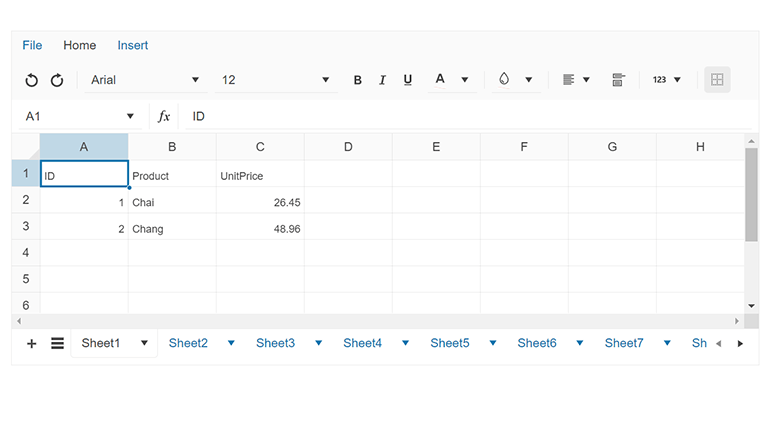
Menu and Toolbar Tools
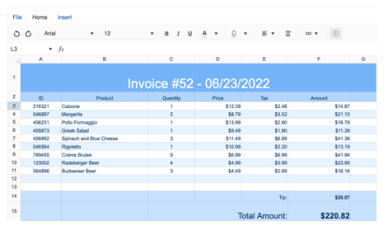
The component has a variety of built-in tools to help users create, edit, and style the data. The main menu has three different tabs, including File, Home, and Insert, each offering a convenient way to manage the data. The Home menu enables users to format and style the text in different ways to make it more readable and visually appealing. The insert menu, on the other hand, provides an easy way to insert or delete rows and columns within the spreadsheet.
-
Data Import and Export
The Kendo UI for Angular Spreadsheet provides the possibility to store and load data in a native JSON format, as well as import and export .xlsx files directly within the component.
-
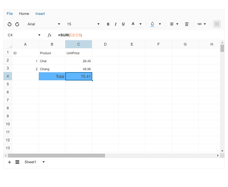
Action Bar
Save time and increase your productivity with the Spreadsheet’s action bar, providing various tools for managing the cell selection and calculating cell values by entering formulas into the dedicated formula input.
-
Sheets Bar
The Sheets Bar offers a convenient way to manage the sheets and perform various actions, such as adding a new sheet, modifying an existing one (rename, delete, duplicate, or reorder), and changing an active sheet.
-
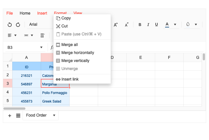
Context Menu
The Spreadsheet‘s context menu provides extensive capabilities, enabling you to perform different actions within the spreadsheet, such as the ability to copy and paste content from the clipboard directly into the cells or the ability to fine-tune the rows and columns appearance.
-
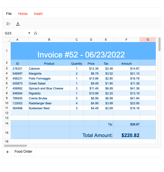
Appearance
The component enables you to customize the default appearance of the cells and the look and feel of the respective content. The built-in properties allow you to configure all cells at once or just highlight the most important information. You can customize the header width and height, row height, column width, and the default cells style.
-
Events
The Spreadsheet component enables you to emits certain events that enable you to control its behavior upon user interaction:
activeSheetChange – triggered when the active sheet is about to change
change – triggered when a value in the spreadsheet is changed
excelExport – triggered when the user clicks the Export to Excel toolbar button
excelImport – triggered when the user clicks the Open toolbar button
formatChange – triggered when the selected range format is changed
selectionChange – triggered when a user changes a selection
-
Keyboard Navigation
Enhance accessibility and productivity with keyboard-only navigation. The Angular Spreadsheet component includes keyboard navigation support, enabling users to navigate and interact with its items efficiently using only the keyboard.

-
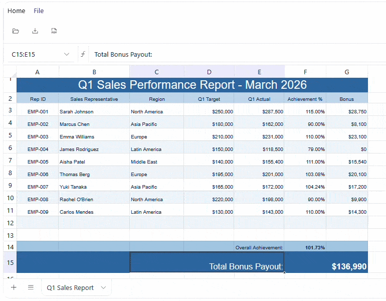
Enrich Your Web Apps with Excel and Google Sheet-like Experiences
The Kendo UI for Angular Spreadsheet enables you to easily edit and visualize tabular data by using cell formatting options, styles, and themes. With a wide range of functionalities, the component empowers users to effectively manage and manipulate data in a spreadsheet-like interface.

-
Custom Cell Editors
The Angular Spreadsheet Custom Cell Editors feature lets you replace the default in cell editing with specialized input components tailored to your data, such as color palettes, date pickers and dropdown lists. You can extend the built in editing experience with rich visual components, apply custom validation and formatting logic and integrate other Kendo UI for Angular components directly inside cells to make complex sheets easier and more intuitive to use.
You configure custom editors by binding the
cellEditorsproperty of the Spreadsheet to an array ofSpreadsheetCellEditorOptions, where each editor definition provides a unique name, the Angular component to render, optional icon settings and action handlers that map component events to Spreadsheet updates. In addition to your own editors, the Spreadsheet automatically activates built in validation editors like_validation_listand_validation_datewhen the corresponding data validation rules are present, and you can also wrap existing Kendo UI for Angular components into reusable editor components that encapsulate business specific palettes, ranges or status logic.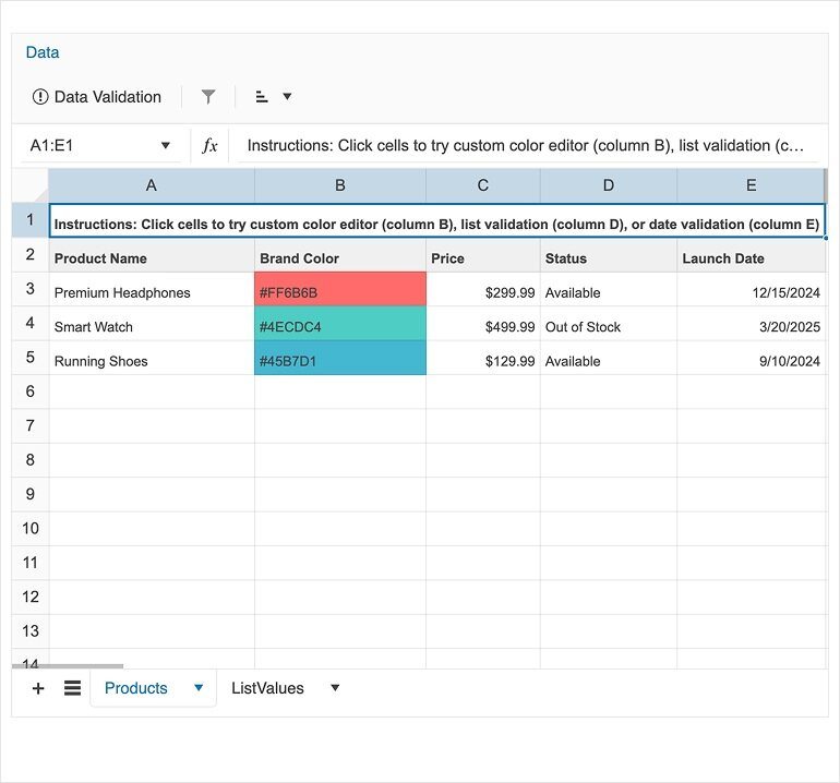
-
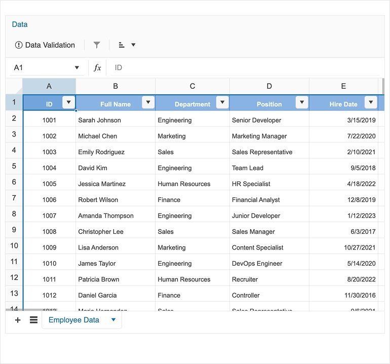
Filtering & Sorting
The Angular Spreadsheet Filtering & Sorting feature adds familiar, Excel like tools for organizing, exploring and analyzing data directly inside your Angular application. Users can apply column filters to focus on specific values or ranges, then sort the same data in ascending or descending order to quickly surface top performers, outliers or trends without leaving the Spreadsheet view.
Filtering and sorting are available from the Data menu in the Spreadsheet toolbar and work over selected ranges or full columns, including support for filter dropdowns in header cells so users can refine results and change sort order with a couple of clicks. This makes it easier to work with large datasets, especially when combined with related capabilities such as Data Validation and custom cell editors.
-
Disabled Cells
Prevent users from editing specific cells by marking them as disabled. These cells remain visible but are non-interactive, helping protect important data from accidental changes.
See the Kendo UI for Angular Spreadsheet disabled cells demo
-
Cell Comments
Add contextual notes directly to cells with cell comments. This makes it easier to provide explanations, instructions, or feedback without altering the data itself.

Get Started with Kendo UI for Angular
