
Kendo UI for Angular
Angular Calendar
- The quickest way to add a visual calendar form component to your Angular UI to allow users to select a single date.
- Part of the Kendo UI for Angular library along with 110+ professionally-designed components.
- Includes support, documentation, demos, virtual classrooms, Visual Studio Code Extensions and more!
-
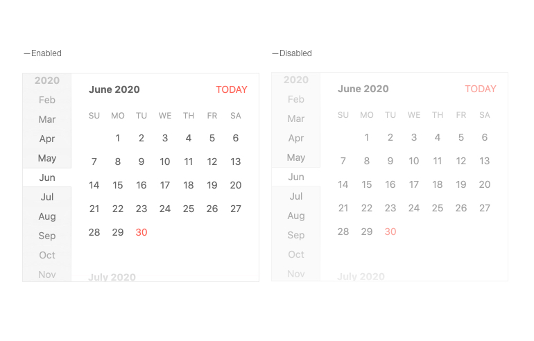
Disabled Calendar
By default, the Kendo UI for Angular Calendar is enabled and fully interactive. With the disabled property, you can disable the calendar to prevent users from editing or modifying the calendar contents, such as selecting a date, until a condition is met.
-
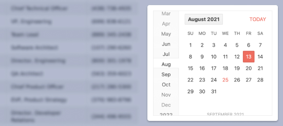
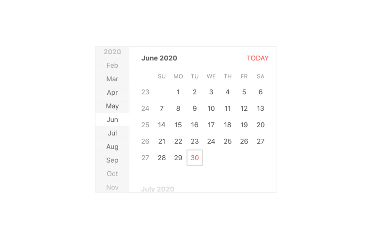
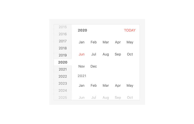
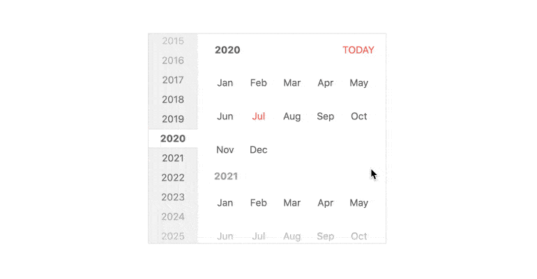
Fast Navigation Bar
The Fast Navigation Bar of the Kendo UI for Angular Calendar gives users a way to navigate through years and months without having to leave the main calendar interface. Enabled by default, this part of the user experience can be hidden with a single configuration option.
-
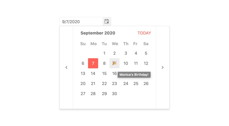
Templates
With templates, you can customize individual calendar cells, including date, month, year and week cells as well as the navigation elements like the header title.
-
Week Number Column
You can add the week number, one through 52, to any date or date range with the Week Number Column feature. The Kendo UI for Angular Calendar component can show or hide a column responsible for displaying the week number next to each week displayed in the calendar.
-
Active View
The Active View of the Kendo UI for Angular Calendar allows you to define how far back and how far ahead users can go to start selecting a date, including years, months and dates. You can set the default Active View to show only the days of a month, the months in a year or the years in a decade in a calendar month format.
-
View Selection Depth
The View Selection Depth feature of the Kendo UI for Angular Calendar enables you to limit or expand the depth of the calendar to which the user can navigate. You can define how far users can zoom in on a date selection or zoom out of a date by for example narrowing down the selection options to only selecting a year and a month or only a month of a particular year.
-
Date Limits
Out of the box, the Kendo UI for Angular Calendar component allows users to select any date in the past, present or future. You can limit the range of available dates users can select from with the Date Limits feature by setting the min and max properties.
-
Globalization
Globalization within the Kendo UI for Angular Calendar allows the component to adhere to the locale of the user. This can include changing the language of the placeholders and messages that appear in the Calendar, as well as updating the names of the month.
-
Keyboard Navigation
The Kendo UI for Angular Calendar component has built-in keyboard navigation to assist with traversing the component and selecting a date using nothing but a keyboard.
-
Accessibility
Accessibility is an important part of the Kendo UI for Angular library and the Calendar component is no exception. Out of the box, the Angular Calendar is compliant with Section 508 standards, follows WAI-ARIA standards, and is AAA rated according to WCAG 2.1.

-
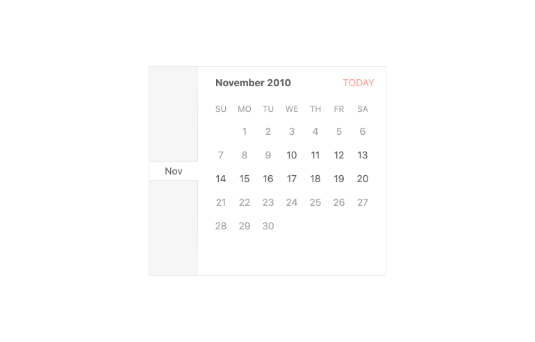
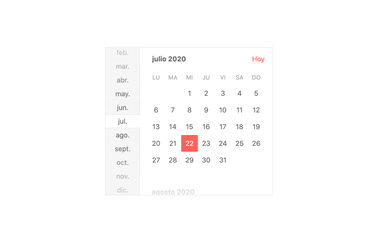
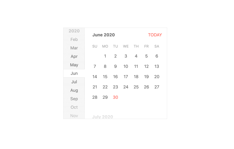
Display Dates in an Interactive Calendar View
The Kendo UI for Angular Calendar component is a form component representing a Gregorian calendar. The component allows users to quickly select a single date with just a single click. Each cell within the calendar can be completely customized and the Angular Calendar component is fully compatible with modern accessibility guidelines.

Get Started with Kendo UI for Angular
