
Kendo UI for Angular
Angular TextBox
- Add a text box to your Angular forms with built-in theming, floating labels and more interactive features.
- Part of the Kendo UI for Angular library along with 110+ professionally-designed components.
- Includes support, documentation, demos, virtual classrooms, Visual Studio Code Extensions and more!
-
Configurable Text Input Field
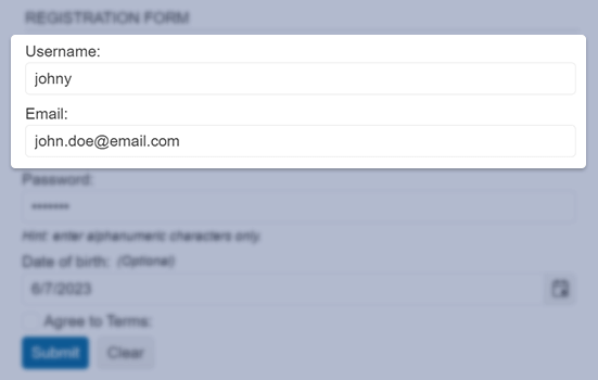
The Kendo UI for Angular TextBox component takes existing Kendo UI styles on your page and applies them to the default HTML input element. This ensures that every building block of your Angular applications follows a consistent look and feel.

-
Forms Support
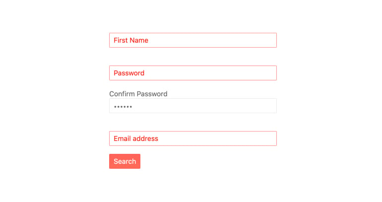
The Kendo UI for Angular TextBox supports both template-driven and Reactive forms.
-
Floating Labels
Popularized by Material Design, the floating label is now integrated into many modern design languages. The combination of Kendo UI for Angular FloatingLabel and TextBox allows any input element in your application to take advantage of floating labels.

-
Adornments
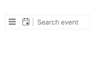
Adornments are used to add functionality or style to an Angular TextBox. You can add custom adornments as a prefix or suffix to the text area in the component or use those included with Kendo UI for Angular TextBox. These include a clear button that appears as user types or and a separator to help with layout of multiple adornments.
-
Validation Icons
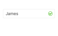
Kendo UI for Angular includes built-in icons for success and error results but you can also use your own custom icons.
-
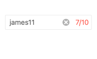
Character Counter
In cases where you need limit the character count of a particular field, it is good UX to show the character count. Kendo UI for Angular includes a character counter built-in.
-
Accessibility
The Kendo UI for Angular TextBox is WAI-ARIA compliant through the Tab key and is tested against screen readers. It is also Section 508 compliant.

All Kendo UI for Angular Components
Charts
- Area Chart
- Bar Chart
- Box Plot
- Bubble Chart
- Bullet Chart
- Chart Wizard New
- Charts
- Donut Chart
- Funnel Chart
- Heatmap
- Line Chart
- Pie Chart
- Polar Chart
- Pyramid Chart
- Radar Chart
- Range Area Chart
- Sankey Diagram
- Scatter Chart
- Sparkline
- Waterfall Chart
Editor
TreeList
Scheduler
Buttons
- Button
- ButtonGroup
- Chip
- ChipList
- DropdownButton
- Floating Action Button
- Speech To Text Button New
- SplitButton
Common Features
Conversational UI
Indicators
Progress Bars
Date Inputs
Dialogs
Labels
Icons
Design
Navigation
Diagrams and Maps
Dropdowns
Gauges
Grids
Upload
Inputs
- Checkbox
- ColorGradient
- ColorPalette
- ColorPicker
- FlatColorPicker
- Form New
- FormField
- MaskedTextBox
- NumericTextBox
- RadioButton
- RangeSlider
- Rating
- Signature
- Slider
- Switch
- TextArea
- TextBox
- TreeView
Bar & QR Codes
Data Tools

Get Started with Kendo UI for Angular
