Kendo UI for Angular
Angular ScrollView
- Give your users a great UX with this highly customizable Angular carousel component.
- Part of the Kendo UI for Angular library along with 110+ professionally-designed components.
- Includes support, documentation, demos, virtual classrooms, Visual Studio Code Extensions and more!

-
Show Content in a Carousel
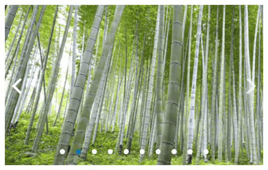
The Kendo UI for Angular ScrollView displays a horizontal collection of content or images with built-in navigation tools, automatic scrolling and visual indicators to help users keep track of their location in the collection at any time.

-
Animations
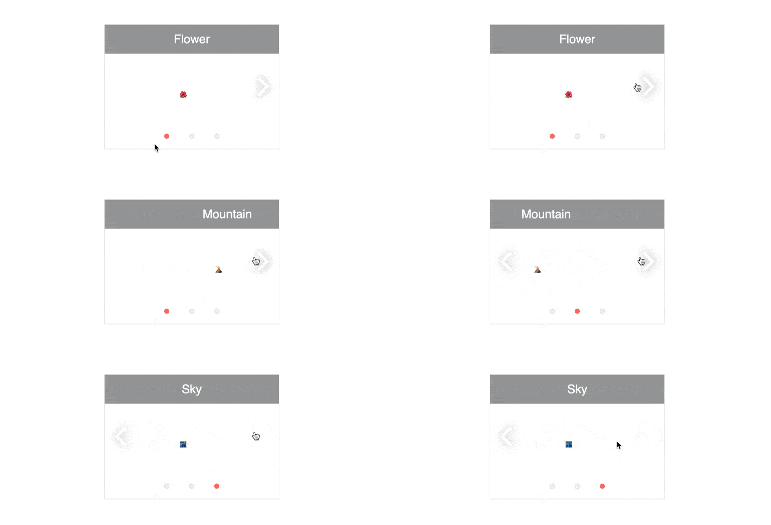
By default, navigation between the ScrollView items features a sliding animation to showcase the transition from one item to the next. This animation can be disabled to have each item appear independently and without any transition.
-
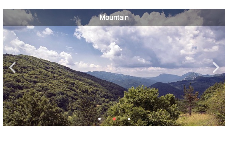
Arrows and Paging
The navigation arrows, and the page indicator, of the Kendo UI for Angular ScrollView is highly configurable. It can be enabled or disabled based on a configuration option for each feature.You can also choose between dark and light mode in order to make it stand out against the content.

-
Endless Scrolling
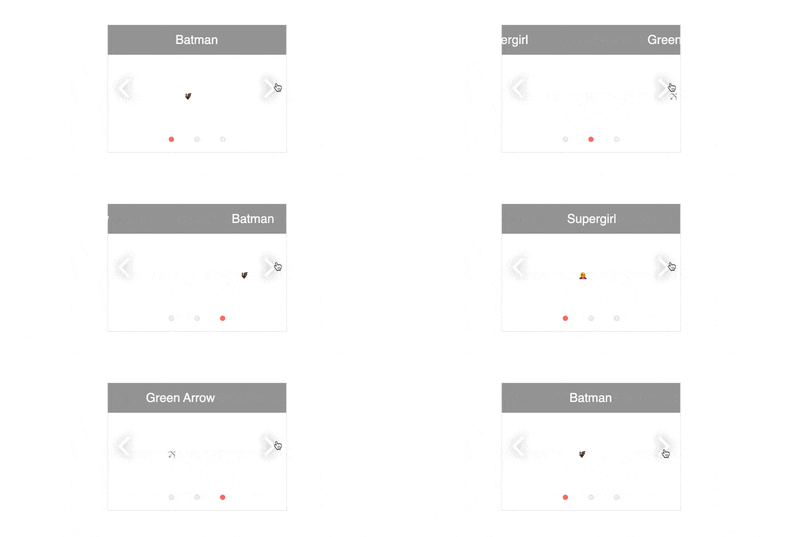
By default, the Kendo UI for Angular ScrollView allows users to scroll through the content from left to right until they reach the last collection item. In order to get back to the beginning, users have to scroll back to the left. You can enable the Endless Scrolling feature to make the last item slide back to the first item of the Angular ScrollView.

-
Dimensions
You can customize the dimensions of the Kendo UI for Angular ScrollView by defining its height and width properties.
-
Data Binding
Items displayed within the Kendo UI for Angular ScrollView can be manually created and defined declaratively or bound to a data source.
-
Globalization
The Kendo UI for Angular ScrollView can be rendered in an RTL (right-to-left) fashion, which enables users to scroll through the content items from left to right.
-
Keyboard Navigation
Users can use the arrow keys of their keyboard to scroll through the items within the Kendo UI for Angular ScrollView.
-
Accessibility
The Kendo UI for Angular ScrollView is rated AAA with WCAG 2.0 and complies withboth Section 508 and WAI-ARIA standards.

All Kendo UI for Angular Components
Charts
- Area Chart
- Bar Chart
- Box Plot
- Bubble Chart
- Bullet Chart
- Chart Wizard New
- Charts
- Donut Chart
- Funnel Chart
- Heatmap
- Line Chart
- Pie Chart
- Polar Chart
- Pyramid Chart
- Radar Chart
- Range Area Chart
- Sankey Diagram
- Scatter Chart
- Sparkline
- Waterfall Chart
Editor
TreeList
Scheduler
Buttons
- Button
- ButtonGroup
- Chip
- ChipList
- DropdownButton
- Floating Action Button
- Speech To Text Button New
- SplitButton
Common Features
Conversational UI
Indicators
Progress Bars
Date Inputs
Dialogs
Labels
Icons
Design
Navigation
Diagrams and Maps
Dropdowns
Gauges
Grids
Upload
Inputs
- Checkbox
- ColorGradient
- ColorPalette
- ColorPicker
- FlatColorPicker
- Form New
- FormField
- MaskedTextBox
- NumericTextBox
- RadioButton
- RangeSlider
- Rating
- Signature
- Slider
- Switch
- TextArea
- TextBox
- TreeView
Bar & QR Codes
Data Tools

Get Started with Kendo UI for Angular
