
Kendo UI for Angular
Angular NumericTextBox
- Allow users to input numbers in their Angular apps in interactive ways.
- Part of the Kendo UI for Angular library along with 110+ professionally-designed components.
- Includes support, documentation, demos, virtual classrooms, Visual Studio Code Extensions and more!
-
Input Numbers with Keyboard or Spinners
The Kendo UI for Angular Numeric Text Box component is a form component dedicated exclusively to handling numeric values. Information can be inserted using the keyboard or manipulated using the UI spin buttons.

-
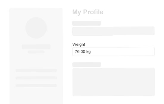
Read-Only NumericTextBox
Set the Kendo UI for Angular NumericTextBox to read-only mode when you want to display information that users can see but cannot edit.
-
Predefined Steps
The Kendo UI for Angular NumericTextBox can be configured to increase or decrease its numerical value by any predefined step. By default, the steps are increased by one, but with the predefined steps option, the number in the Angular NumericTextBox can be changed in increments of five, 10, or any other custom value.

-
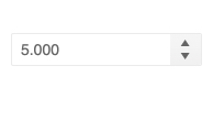
Spin Buttons
The Kendo UI for Angular NumericTextBox features a set of spin buttons on the side of the input field, which allow users to input numbers by clicking the up and down arrows. The spin buttons can be enabled or disabled through a single configuration option.

-
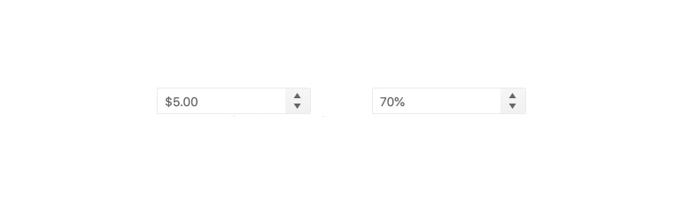
Formats
Numeric values come in various formats, such as decimals, percentages, currency and more. The Kendo UI for Angular NumericTextBox can be passed a format string to ensure that the component displays numeric values in the proper format.
-
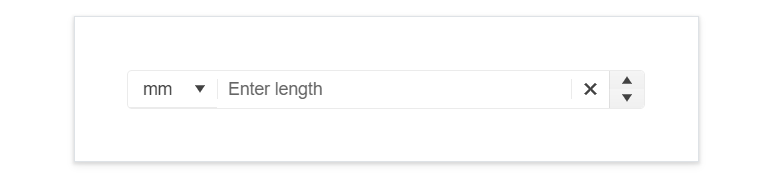
Prefix and Suffix Adornments
Elevate user interactivity leveraging the option for adding prefix and suffix adornments. These are custom items, usually an icon or button, inside the field before or after the input area. Typical prefix adornments are currency symbols or unit indicators, while suffix adornments are often used for password visibility toggles, formatting or clearing the input.
-
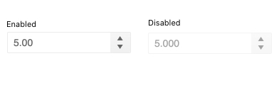
Disabled NumericTextBox
With a single configuration option, you can toggle between enabling and disabling the Kendo UI for Angular NumericTextBox. Disable the Angular NumericTextBox when you want to prevent users from interacting with the component.
See Angular NumericTextBox Disabled demo.
-
Keyboard Navigation
Thanks to the built-in keyboard navigation, the Kendo UI for Angular NumericTextBox allows user to change the component value solely with the keyboard arrow keys.
-
Accessibility
The Kendo UI for Angular NumericTextBox is fully accessible, complies with Section 508 and WAI-ARIA standards and has AAA WCAG 2.0 rating.

-
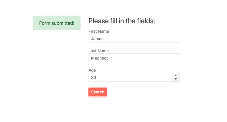
Forms Support
The Kendo UI for Angular NumericTextBox can be added to any existing Angular form thanks to its support for Template-driven and Reactive forms.

Get Started with Kendo UI for Angular
