Kendo UI for Angular
Angular Skeleton
- Reduce perceived initial load times by showing sleek looking place holders while images load.
- Part of the Kendo UI for Angular library along with 110+ professionally-designed components.
- Includes support, documentation, demos, virtual classrooms, Visual Studio Code Extensions and more!

-
Display UI Placeholders While Data is Loading
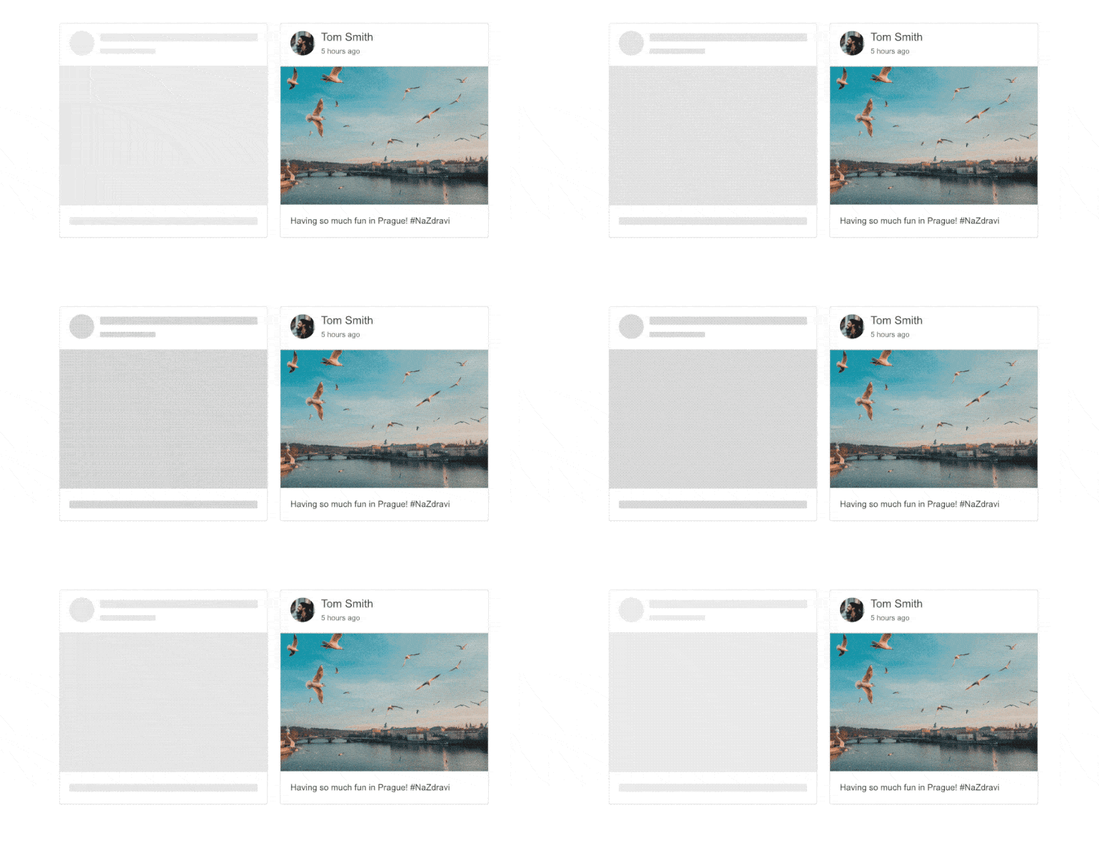
The Angular Skeleton component helps you reduce the perceived initial load time by displaying a placeholder on the screen while other content loads. This element’s default design is a grey box, but you can choose from other shapes and add animations. Use the Skeleton wherever you need to load large data and other complex content including other Kendo UI for Angular components!

-
Appearance
To ensure that the component fits well with your design, the Skeleton provides you with various built-in shapes and animations. Shapes include a small box that indicates a line of text, a circle, or a larger rectangle. Also, choose from pulse and wave animations or have no animation at all.
All Kendo UI for Angular Components
Charts
- Area Chart
- Bar Chart
- Box Plot
- Bubble Chart
- Bullet Chart
- Chart Wizard New
- Charts
- Donut Chart
- Funnel Chart
- Heatmap
- Line Chart
- Pie Chart
- Polar Chart
- Pyramid Chart
- Radar Chart
- Range Area Chart
- Sankey Diagram
- Scatter Chart
- Sparkline
- Waterfall Chart
Editor
TreeList
Scheduler
Buttons
- Button
- ButtonGroup
- Chip
- ChipList
- DropdownButton
- Floating Action Button
- Speech To Text Button New
- SplitButton
Common Features
Conversational UI
Indicators
Progress Bars
Date Inputs
Dialogs
Labels
Icons
Design
Navigation
Diagrams and Maps
Dropdowns
Gauges
Grids
Upload
Inputs
- Checkbox
- ColorGradient
- ColorPalette
- ColorPicker
- FlatColorPicker
- Form New
- FormField
- MaskedTextBox
- NumericTextBox
- RadioButton
- RangeSlider
- Rating
- Signature
- Slider
- Switch
- TextArea
- TextBox
- TreeView
Bar & QR Codes
Data Tools

Get Started with Kendo UI for Angular
