
Kendo UI for Angular
Angular ComboBox
- Allow users to select items from a list of predefined options with support for filtering, custom rendering and virtualization.
- Part of the Kendo UI for Angular library along with 110+ professionally-designed components.
- Includes support, documentation, demos, virtual classrooms, Visual Studio Code Extensions and more!
-
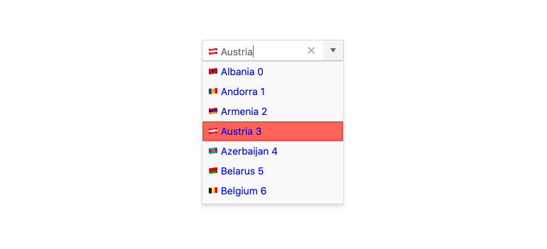
Filtering
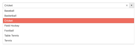
Ensure users have an intuitive experience when filtering down data items with the Kendo UI for Angular ComboBox built-in filtering mechanism. It helps you reduce the available data items inside the Angular ComboBox and you can configure the filtering settings by including conditional rules such as “starts with” or “contains”.

-
Grouping
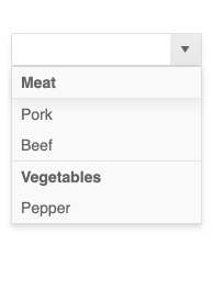
Organize data in categories to easily traverse datasets. With the grouping feature of the Kendo UI for Angular ComboBox, you can define what field in your data is responsible for the group and the Angular ComboBox will automatically group the underlying data accordingly.
-
Virtualization
Enable users to scroll through large datasets with virtualization. When your Angular ComboBox needs to hold hundreds of thousands of data items, virtualization becomes key in rendering large amount of data with high performance.

-
Suggestions
Offer users automatic suggestions as they type. With the suggestion feature enabled, the Kendo UI for Angular ComboBox takes the text available within its input element and provides suggestions for users from the available data items. The more users type, the more accurate the suggestion will be.

-
Forms Support
Designed to support intelligent, advanced form building, the Kendo UI for Angular ComboBox has built-in styles to showcase invalid input and validation messages. You can use the Angular ComboBox in both template-driven and reactive forms.
-
Adaptive Mode
The Angular ComboBox supports an adaptive mode, enabling a mobile-friendly rendering of the component popup. The component automatically adapts to the current screen size and alters its rendering accordingly.
-
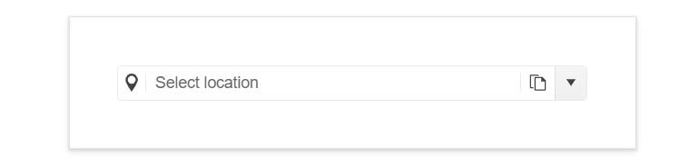
Prefix and Suffix Adornments
Elevate user interactivity leveraging the option for adding prefix and suffix adornments. These are custom items, usually an icon or button, inside the field before or after the input area. Typical prefix adornments are currency symbols or unit indicators, while suffix adornments are often used for password visibility toggles, formatting or clearing the input.
-
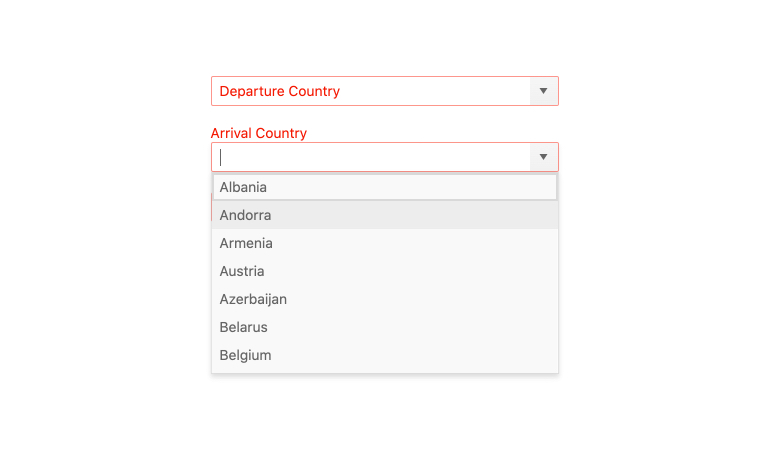
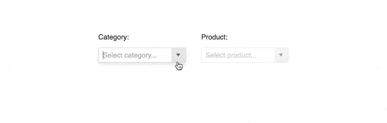
Cascading ComboBoxes
Connect two or more Angular ComboBoxes to build relationships between values of different form fields. With multiple cascading Angular ComboBoxes on a single page, you can set the input of one ComboBox to update the content of another. For example, selecting a country in one ComboBox will filter the available cities in the following ComboBox.
-
Floating Labels
Popularized by Material Design, Floating Labels are commonplace in many modern design languages. With the Kendo UI for Angular ComboBox, getting floating labels is as easy as adding the standalone Kendo UI for Angular FloatingLabel component and associating it with the Angular ComboBox.

-
Keyboard Navigation
Improve accessibility and productivity with keyboard-only navigation. This component supports keyboard navigation to help navigate the Angular ComboBox and assist with selecting a value using the keyboard alone.
-
Accessibility
Angular ComboBox is complaint with Section 508 standards, is AA rated with WCAG 2.0 and follows WAI-ARIA standards.

-
Feature-rich ComboBox Menu
Kendo UI for Angular ComboBox is a form component designed to let you choose a predefined value from a list of items. It operates similarly to the Select HTML element, and supports filtering, custom rendering and virtualization to give users a more comprehensive experience.
-
Templates
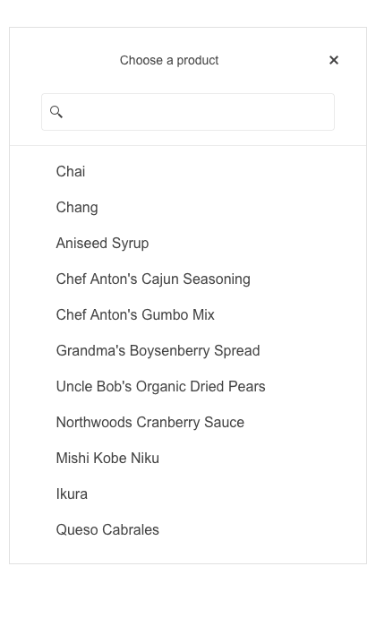
Out of the box, the Kendo UI for Angular ComboBox renders any items with just plain text. When just text is not enough, the template functionality of the Angular ComboBox is the way to go as it allows for an Angular template to be used when rendering any date items. This allows for scenarios like adding images or icons next to the text, custom styling for certain items, and much more. Beyond data items, header and footer templates are also provided to help ensure that any aspect of the Angular ComboBox can be customized to fit your application.

Get Started with Kendo UI for Angular
