
Kendo UI for Angular
Angular AppBar (NavBar)
- Ensure user satisfaction with this full-featured Angular UI navigation element, often referred to as an NavBar.
- Part of the Kendo UI for Angular library along with 110+ professionally-designed components.
- Includes support, documentation, demos, virtual classrooms, Visual Studio Code Extensions and more!
-
Convenient Element for Main Navigation
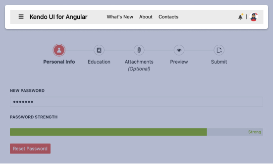
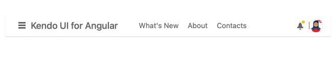
The Kendo UI for Angular AppBar (aka NavBar) component provides information and action related to a screen and is most commonly used as the main navigation element for an app or page. Convenient properties allow you to set content, position, color, and more.
-
Position
Provide the right user experience by specifying where the Angular AppBar component appears on the page and whether or not it sticks to the top pf the page.
-
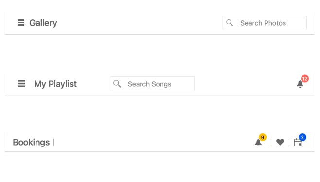
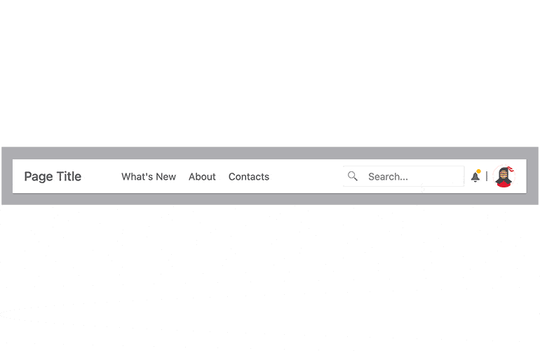
Content Arrangement
The Angular AppBar component will help you satisfy UI requirements with settings for both spacing and content separators (ex: a pipe between objects).
-
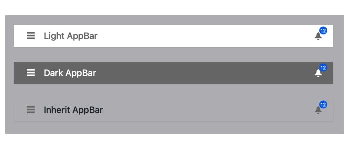
Theme Color
Similar to desktop apps, AppBar allows the end-user to choose between light, dark, and inherit modes.
-
Responsive Design
AppBar takes the worry out of supporting a range of devices and screen size by automatically adjusting its layout to the current screen size.

Get Started with Kendo UI for Angular
