Kendo UI for Angular
Angular Bubble Chart
- Visualize relationships between three or more numeric variables with the Kendo UI for Angular Bubble Chart.
- Part of the Kendo UI for Angular library along with 110+ professionally-designed components.
- Includes support, documentation, demos, virtual classrooms, Visual Studio Code Extensions and more!
-
Build Powerful Data Visualizations with the Angular Bubble Chart
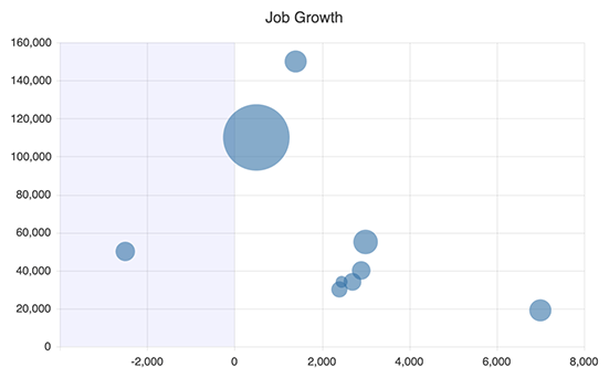
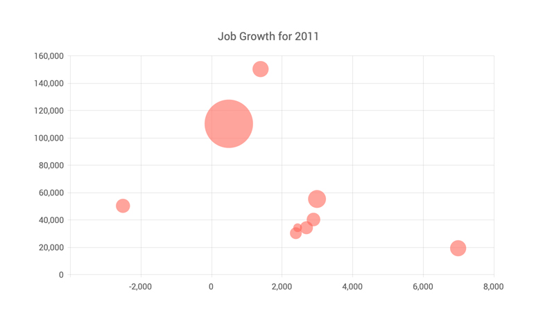
The Kendo UI for Angular Bubble Chart visualizes the relationships between three or more numeric variables. It expands on the traditional scatter plot by adding a third numerical dimension whose value is proportionate to the size of its circle. Use the Angular Bubble chart when you need to visualize notably large differences and variation in the metrics to tell a compelling, multi-layered story.
-
Bubble Chart Configuration Options
The Angular Bubble Chart's high interactivity allows its users to explore every dimension of individual data points on the plot area. You can enable the highlight effect and set its color opacity to enable users to zero in on a bubble. Combine that with the series tooltips to add contextual information (like category names) about the “active” bubble, triggered on hover. You can also customize the appearance of other Angular Bubble Chart elements, including the bubble border, chart label, negative values area, font, legend and more.
-
Data Binding
You can populate the Angular Bubble Chart series with data from various source types, including numbers, arrays and objects (or models)—simply specify the fields you want to use during configuration.
-
Rendering
The Angular Bubble Chart renders data in the Canvas (bitmap) and SVG (vector graphics) formats. SVG is the default format to ensure an always crips presentation of your data. When performance is the priority, you can easily switch to a canvas format through a single configuration option to ensure your chart will handle large data and real-time updates with no interruption.
-
Export Options
You can export your Angular Bubble Chart to PDF, SVG, PNG and the Kendo UI drawing format. In scenarios where you need to change the image size or fit the chart to a paper size when exporting to PDF, the intuitive export method of the component will allow you to preserve the quality and rendering of the Chart in the output file.
-
Themes
Customize the series colors of the Kendo UI for Angular Bubble component with one of our predefined color sets, including Default (our own styling), Material (based on the Material Design guidelines), Bootstrap (resembles the Bootstrap styling) and Fluent (based on Microsoft Fluent UI). You can further customize any of the built-in themes or create a new theme to match your branding using Progress ThemeBuilder.
-
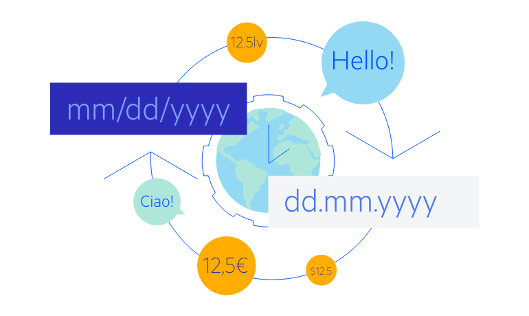
Globalization
The Kendo UI for Angular Bubble Chart supports globalization and localization to ensure that the component can effectively support any application’s language and locale. You can also enable the right-to-left (RTL) rendering for languages that use right-to-left scripts.

Get Started with Kendo UI for Angular