
Kendo UI for Angular
Angular ColorPalette
- Give users an intuitive and visual way to select colors from a predefined color scheme.
- Part of the Kendo UI for Angular library along with 110+ professionally-designed components.
- Includes support, documentation, demos, virtual classrooms, Visual Studio Code Extensions and more!
-
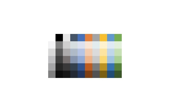
Select Colors from a Predefined or Custom Palette
The Kendo UI for Angular Color Palette renders a predefined set of colors as blocks, letting the user select from one of the available colors. Without the ability to add a custom color, the component is perfectly suited when only a limited set of colors should be available to users.

-
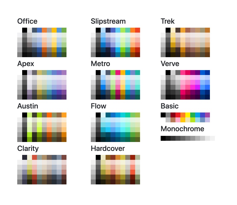
ColorPalette Presets
Save time defining a full color spectrum thanks to the varied set of built-in color presets available in the Kendo UI for Angular ColorPalette. You can lean on available color palettes like Office, Basic, Metro and others.
-
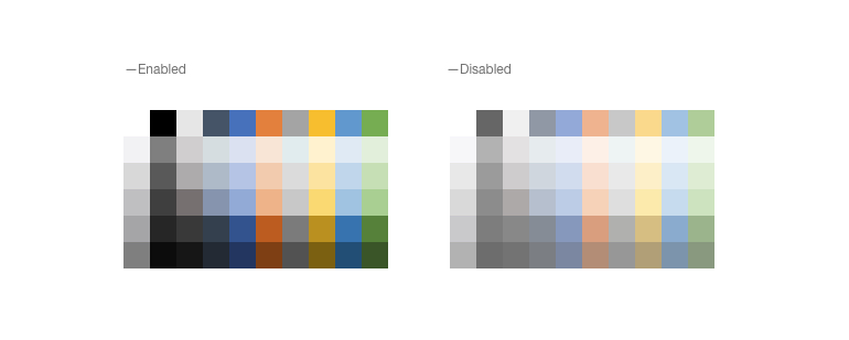
Disabled ColorPalette
The Kendo UI for Angular ColorPalette can be disabled to prevent user interactions when necessary.
-
Read-Only ColorPalette
Any Kendo UI for Angular ColorPalette can be rendered in a read-only mode, preventing users from selecting a color while retaining the enabled visual style.
-
Forms Support
The Kendo UI for Angular ColorPalette supports integration with both template-driven and Reactive forms.

Get Started with Kendo UI for Angular
