
Kendo UI for Angular
Angular Popup
- Give your users a great UX with this customizable and interactive Angular popup window.
- Part of the Kendo UI for Angular library along with 110+ professionally-designed components.
- Includes support, documentation, demos, virtual classrooms, Visual Studio Code Extensions and more!
-
Alignment and Positioning
The Kendo UI for Angular Popup component has built-in calculations for displaying the popup and allows you to align the popup to other Angular components with various configuration options to control precisely where the popup should appear.

-
Animations
By default, the Kendo UI for Angular Popup component animates the open and close actions. Animations can be tweaked and customized or disabled completely.

-
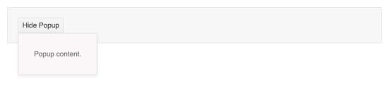
Configurable Angular Popup
The Kendo UI for Angular Popup component can be used to present content next to an HTML element. It is typically laid over other content to display critical information or provide users with choices. The Angular Popup can be used as a standalone component and comes integrated into several other Kendo UI for Angular components.

-
Appearance
Out of the box, the Kendo UI for Angular Popup component contains some basic styling. For scenarios that require advanced or custom styling, developers can take full control over the appearance of the Angular Popup to ensure that the component will fit any Angular application’s design.


Get Started with Kendo UI for Angular
