
Kendo UI for Angular
Angular Drawer
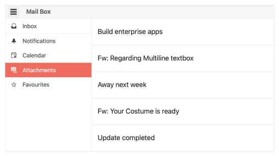
- Give your users a great UX with a side navigation element that can slide in and out.
- Part of the Kendo UI for Angular library along with 110+ professionally-designed components.
- Includes support, documentation, demos, virtual classrooms, Visual Studio Code Extensions and more!
-
Display Modes
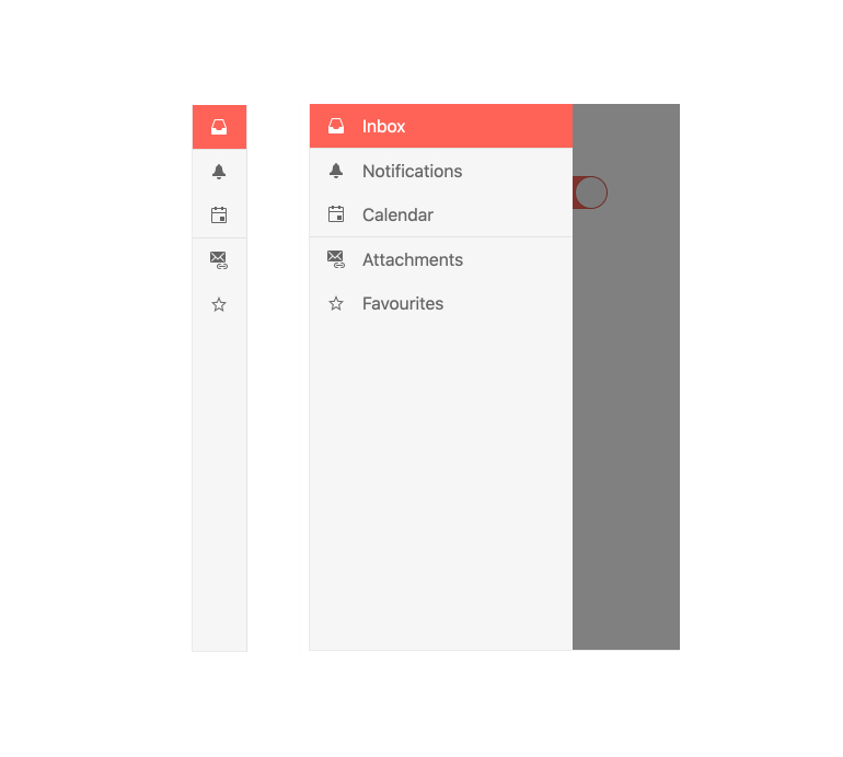
The Kendo UI for Angular Drawer offers several display modes, allowing developers to customize how the component behaves. You can choose to overlay the Angular Drawer content on top of existing content, push the content over as the Angular Drawer expands or display the drawer as icons via the compact mini view.
-
Hierarchical Items
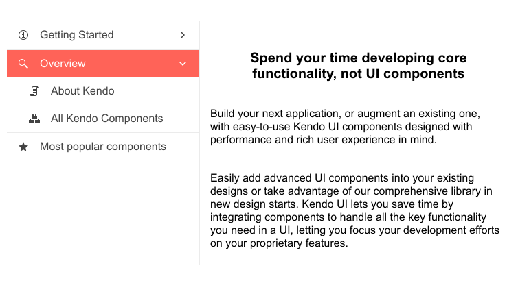
Render a hierarchical menu with parent and child nodes to help users navigate directly to where they want to go. Bind the menu to hierarchal data and automatically create menus and submenus or bind the Angular Drawer to multiple flat data sources and designate parents and children on your own.
-
Positioning
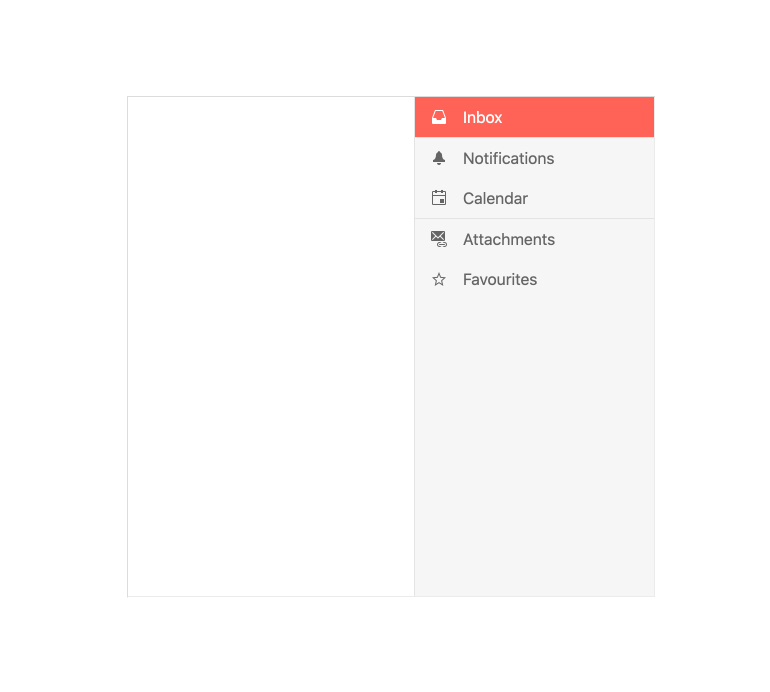
With a single property, the Kendo UI for Angular Drawer component can be rendered on either the left-hand side or right-hand side of the current page.
-
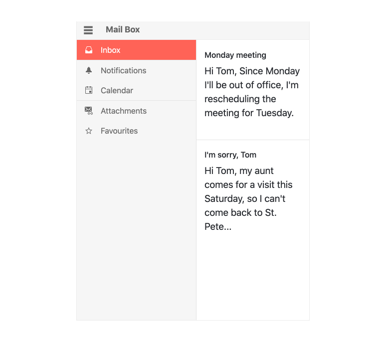
Configurable Slide-out Menu
A staple as a navigation element in many modern dashboard applications, the Kendo UI for Angular Drawer offers a side navigation element that can be toggled to be displayed or hidden, or permanently displayed. Each item can be represented as an image and text combination, just text, just an image, or utilize Angular templates for a custom layout.
-
Routing
Since the Kendo UI for Angular Drawer primarily supports navigation in an Angular application, the component can utilize the Angular Router to assist with navigating between different routes.
-
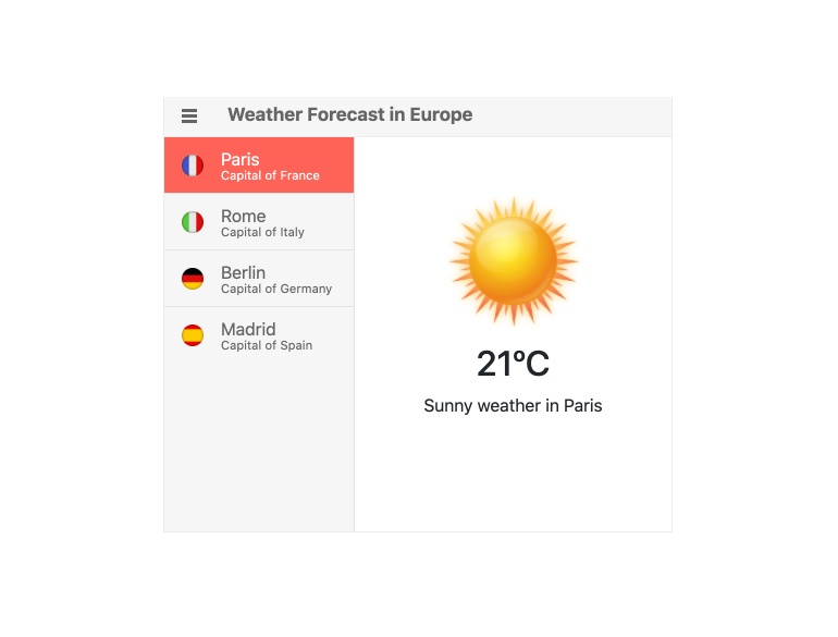
Templates
You can utilize an Angular template to customize the look and feel of each item within the Kendo UI for Angular Drawer.
All Kendo UI for Angular Components
Charts
- Area Chart
- Bar Chart
- Box Plot
- Bubble Chart
- Bullet Chart
- Chart Wizard New
- Charts
- Donut Chart
- Funnel Chart
- Heatmap
- Line Chart
- Pie Chart
- Polar Chart
- Pyramid Chart
- Radar Chart
- Range Area Chart
- Sankey Diagram
- Scatter Chart
- Sparkline
- Waterfall Chart
Editor
TreeList
Scheduler
Buttons
- Button
- ButtonGroup
- Chip
- ChipList
- DropdownButton
- Floating Action Button
- Speech To Text Button New
- SplitButton
Common Features
Conversational UI
Indicators
Progress Bars
Date Inputs
Dialogs
Labels
Icons
Design
Navigation
Diagrams and Maps
Dropdowns
Gauges
Grids
Upload
Inputs
- Checkbox
- ColorGradient
- ColorPalette
- ColorPicker
- FlatColorPicker
- Form New
- FormField
- MaskedTextBox
- NumericTextBox
- RadioButton
- RangeSlider
- Rating
- Signature
- Slider
- Switch
- TextArea
- TextBox
- TreeView
Bar & QR Codes
Data Tools

Get Started with Kendo UI for Angular
