
Kendo UI for Angular
Angular SplitButton
- Combines a button and a dropdown allowing the user to either click the button or open the menu.
- Part of the Kendo UI for Angular library along with 110+ professionally-designed components.
- Includes support, documentation, demos, virtual classrooms, Visual Studio Code Extensions and more!
-
Configurable Angular Split Button
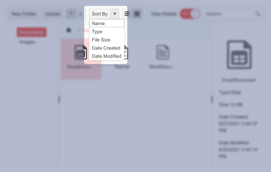
The Kendo UI for Angular Split Button component combines the functionality of a button with that of a dropdown element. It allows users to either click on the primary button and run its default behavior or to open the drop-down popup and choose from a list of additional actions.

-
Data Binding
The Kendo UI for Angular SplitButton can either be bound to a data list, automatically defining the options available in the popup, or programmed declaratively to manually configure the pre-defined drop-down items.
-
Icon SplitButton
Each item within the Kendo UI for Angular SplitButton contains plain text by default, but you can opt to also render icons or a mix of icons and text. Icons can be added from the component’s list of readily available icons, as a custom image or imported from third-party font icon libraries like FontAwesome.

-
Templates
To provide a custom design for items inside the Kendo UI for Angular SplitButton, simply make use of the standard Angular templates. A template gives you full control over the look and feel of each item.

-
Disabled SplitButton
The Kendo UI for Angular SplitButton can be disabled with a single configuration option, graying it out to visually indicate to users that the button is inactive. Additionally, individual action items can be disabled on a per-item basis.

-
Keyboard Navigation
The Kendo UI for Angular SplitButton provides built-in keyboard shortcuts to enable users select any of the options available in the dropdown without the necessity of a mouse.
-
Accessibility
The Kendo UI for Angular SplitButton is WCAG 2.0 AA rated and is compliant with Section 508 and WAI-ARIA standards.


Get Started with Kendo UI for Angular
