
Kendo UI for Angular
Angular GridLayout
- Take the hassle out of CSS grid layout with this automated Angular GridLayout component.
- Part of the Kendo UI for Angular library along with 110+ professionally-designed components.
- Includes support, documentation, demos, virtual classrooms, Visual Studio Code Extensions and more!

-
Automate CSS Grid Layout
The Angular GridLayout component helps you deliver great UX even faster by automating one of the most tedious UI implementation tasks: CSS grid layout. This component will use a grid-like system to arrange your content in columns and rows and will use the same rules across your entire app. This component will work with content from the most basic text to full components such as cards or charts.

-
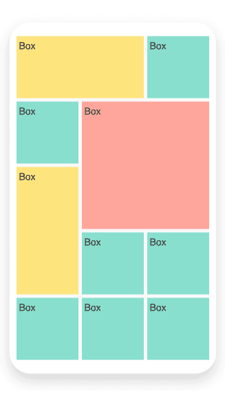
Items
The Angular GridLayout component gives you full control over the items, which is the content rendered in the grid. By default, the size of each item is one row and one column. Similar to other CSS grid systems, you can specify exact position of items or span them across rows and columns.
-
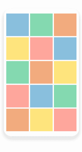
Layout
The Angular GridLayout also gives you control over the three elements of its layout: Rows and Columns, Gap, and Alignment. Rows and Columns allow you to specify the number and size of each. Gap lets you define spacing between items. Finally, Alignment sets the position of the content within a cell.

Get Started with Kendo UI for Angular
