
Kendo UI for Angular
Angular DateRange
- Allow users to select a range of dates using multiple side-by-side Angular calendars.
- Part of the Kendo UI for Angular library along with 110+ professionally-designed components.
- Includes support, documentation, demos, virtual classrooms, Visual Studio Code Extensions and more!
-
Date Ranges
The Kendo UI for Angular DateRange component can handle any future or past date the user provides. For scenarios that require you to limit the range of dates available to users, use the built-in Angular MultiViewCalendar min and max properties to define the earliest and latest dates that can be selected by the user.
-
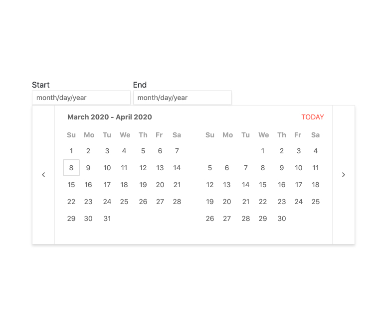
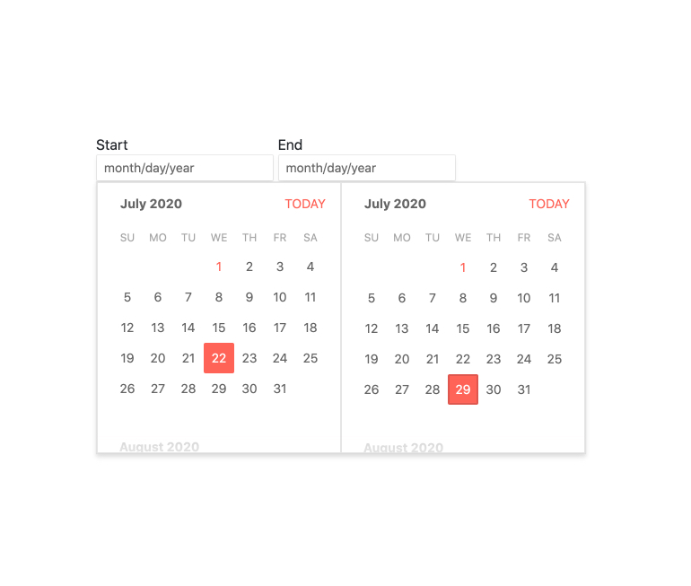
Focused Dates
By default, the Kendo UI for Angular DateRange always focuses today’s date. The focused date has a distinctive visual style to make it unique. You can set a different focused date through the available configuration options of the integrated Angular MultiViewCalendar.
-
Date Formats
Thanks to its support for standard format strings, the built-in Angular DateInputs of the Kendo UI for Angular DateRange are ready to handle any valid date format.

-
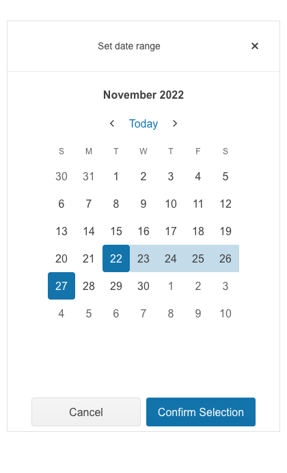
Adaptive Mode
The DateRange adaptive mode enables a mobile-friendly rendering of its calendar popup. Simply set the AdaptiveMode parameter to AdaptiveMode.Auto and this will trigger the component to automatically adapt to the current screen size and adapt its rendering accordingly. The adaptive mode for the DateRange component also enables you to define the title text rendered in the popup header.
-
Globalization
The Kendo UI for Angular DateRange component supports globalization out of the box. This means both the Angular DateInput and MultiViewCalendar can adjust to the user locale or application settings and conform to the according formats and language requirements.
-
Keyboard Navigation
The Kendo UI for Angular DateRange component enables users to select a date range using just keyboard navigation. This includes opening the popup calendars and selecting a single date or a date range or manually typing dates into each of the inputs.
-
Accessibility
The Kendo UI for Angular DateRange is designed to be compliant with Section 508 and WAI-ARIA standards and is AAA rated with WCAG 2.0.

-
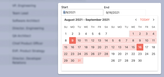
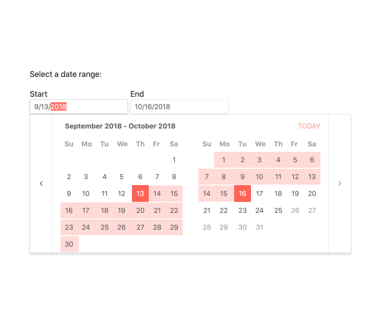
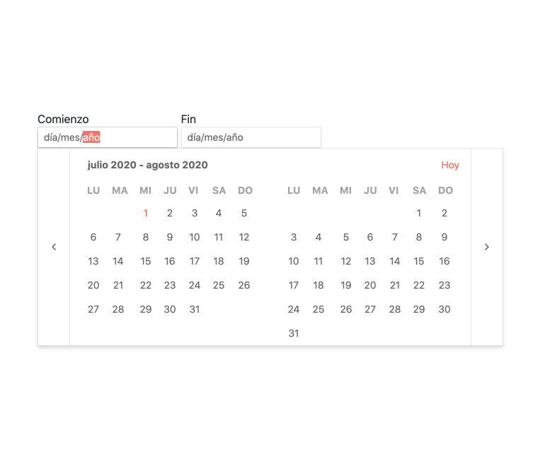
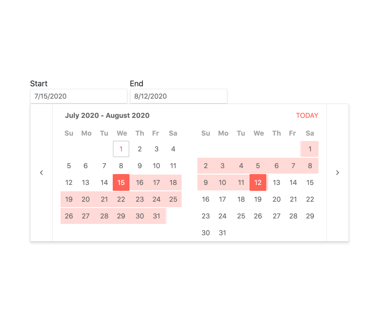
Select Date Ranges Using Multiple Calendars
The Kendo UI for Angular Date Range component provides users with a sleek and intuitive interface to select a range of dates over multiple side-by-side calendars. The Angular DateRange component is comprised of two Angular DateInputs—for the start date and end date, respectively. The side-by-side calendars which display when the user focuses the component the component is the Angular MultiViewCalendar. Combining these Angular UI components into a single composite component gives developers the full power of each individual component when it comes to customization and configuration options.
-
Templates
When you want to customize the standard look and feel of the Kendo UI for Angular DateRange needs to be customized to fit application requirements, developers can take full control over the integrated Angular DateInput and Agular MultiViewCalendar components. Each of these UI components have support for templates to achieve the desired look-and-feel.

Get Started with Kendo UI for Angular
