Kendo UI for Angular
Angular LinearGauge
- Represent data on a linear scale with one or more bars with this sleek and customizable Angular gauge component.
- Part of the Kendo UI for Angular library along with 110+ professionally-designed components.
- Includes support, documentation, demos, virtual classrooms, Visual Studio Code Extensions and more!

-
Show Data Values on a Linear Scale
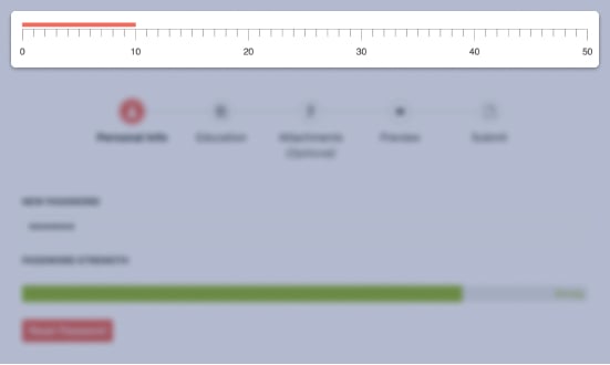
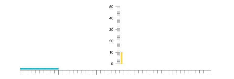
The Kendo UI for Angular LinearGauge shows values on a linear scale, usually represented as one or several bars along with tick lines and labels to provide users with additional context. The Angular Linear Gauge can be rendered in both horizontal and vertical modes.

-
Orientation
The Kendo UI for Angular LinearGauge can be rendered in both horizontal and vertical modes.

-
Scale Ranges
You can set a unique color for each range in the Kendo UI for Angular LinearGauge, allowing the rendered bars to dynamically change color depending on their value.

-
Scale Options
Every aspect of the Kendo UI for Angular LinearGauge can be customized by interacting with the various configuration options. You can customize the overall color, the series of colors for different ranges, scale and tick line colors, label colors, just to name a few.

-
Multiple Pointers
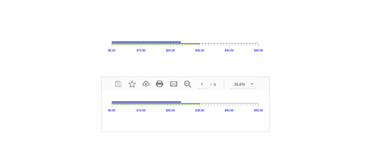
Values of the Kendo UI for Angular LinearGauge can be displayed along the scale in various shapes, such as a bar and a pointer, usually a triangle. These pointers can be part of a collection, allowing for multiple pointers to be displayed on a single Angular Linear Gauge.

-
Globalization
The Kendo UI for Angular LinearGauge supports right-to-left rendering as well as language customization of any labels, ensuring that the Angular component can fit any language or locale requirement.

-
Export Options
With the built-in integration with the Kendo UI for Angular Drawing library, you can export the Kendo UI for Angular LinearGauge component to various image formats, such as an SVG file or as part of a PDF file.

All Kendo UI for Angular Components
Charts
- Area Chart
- Bar Chart
- Box Plot
- Bubble Chart
- Bullet Chart
- Chart Wizard New
- Charts
- Donut Chart
- Funnel Chart
- Heatmap
- Line Chart
- Pie Chart
- Polar Chart
- Pyramid Chart
- Radar Chart
- Range Area Chart
- Sankey Diagram
- Scatter Chart
- Sparkline
- Waterfall Chart
Editor
TreeList
Scheduler
Buttons
- Button
- ButtonGroup
- Chip
- ChipList
- DropdownButton
- Floating Action Button
- Speech To Text Button New
- SplitButton
Common Features
Conversational UI
Indicators
Progress Bars
Date Inputs
Dialogs
Labels
Icons
Design
Navigation
Diagrams and Maps
Dropdowns
Gauges
Grids
Upload
Inputs
- Checkbox
- ColorGradient
- ColorPalette
- ColorPicker
- FlatColorPicker
- Form New
- FormField
- MaskedTextBox
- NumericTextBox
- RadioButton
- RangeSlider
- Rating
- Signature
- Slider
- Switch
- TextArea
- TextBox
- TreeView
Bar & QR Codes
Data Tools

Get Started with Kendo UI for Angular
