
Kendo UI for Angular
Angular Card
- The easiest way to display information groups in the modern, popular and interactive card format.
- Part of the Kendo UI for Angular library along with 110+ professionally-designed components.
- Includes support, documentation, demos, virtual classrooms, Visual Studio Code Extensions and more!

-
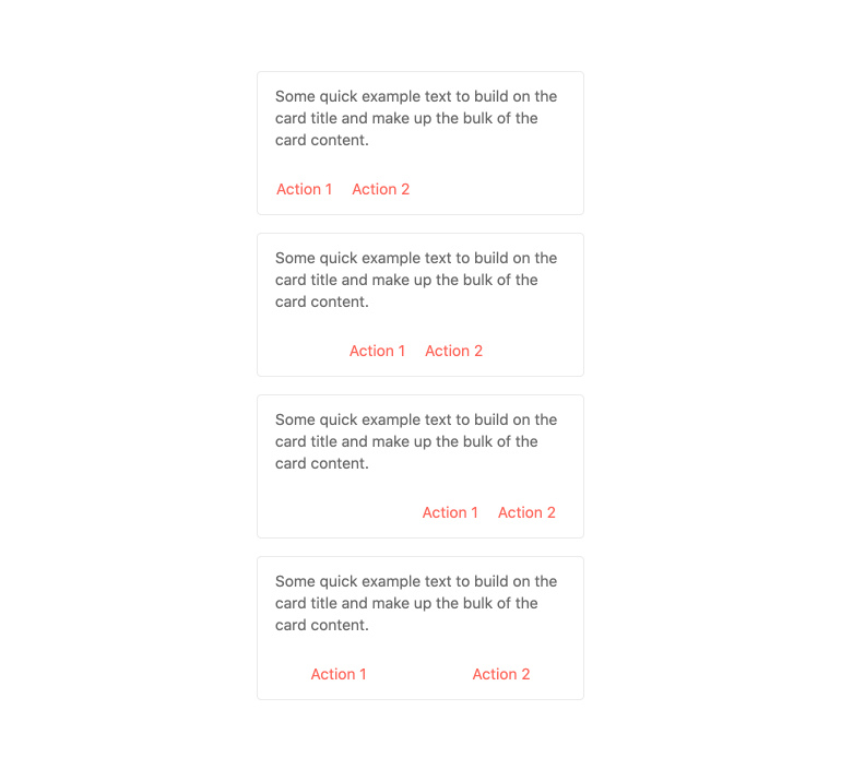
Action Buttons
Every Kendo UI for Angular Card contains action buttons which can provide context and additional actions related to the content within the card. What these action items are responsible for is completely up to you, allowing you to take full control over the user flow.
-
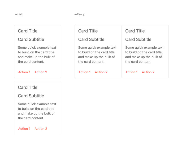
Custom Layout
While the Kendo UI for Angular Card component has built-in layout options, you can create a completely custom layout.
-
Globalization
Out of the box, the Kendo UI for Angular Card component supports rendering in an RTL (right-to-left) mode.
-
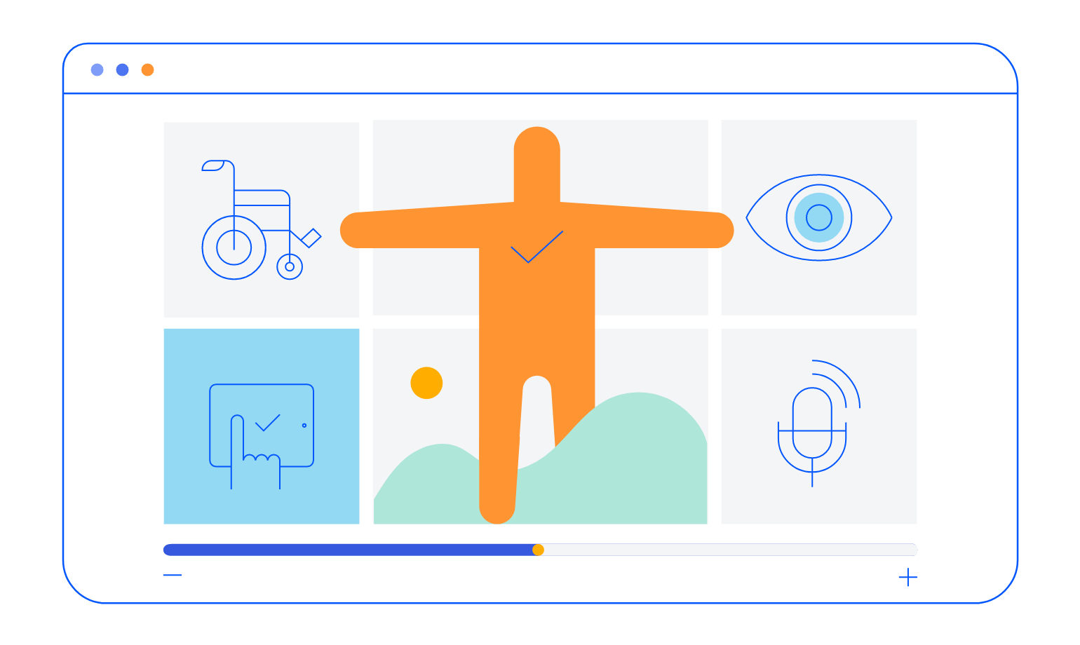
Accessibility
The Kendo UI for Angular Card is AA rated with WCAG 2.0 and supports both Section 508 and WAI-ARIA accessibility standards.
-
Group Information and Actions into Cards
The Kendo UI for Angular Card is a component that combines text, visual content and actions about a single subject. It has a dedicated header section, content section which contains both media and text areas, as well as an action button area. Found in many modern design languages, the Angular Card component ensures that developers can quickly and easily add this modern layout item to any Angular application.


Get Started with Kendo UI for Angular
