
Kendo UI for Angular
Angular DateTimePicker
- Allow users to select both date and time using visual popups or keyboard inputs.
- Part of the Kendo UI for Angular library along with 110+ professionally-designed components.
- Includes support, documentation, demos, virtual classrooms, Visual Studio Code Extensions and more!
-
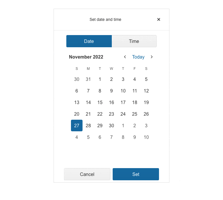
Give Users Convenient Controls to Select Date and Time
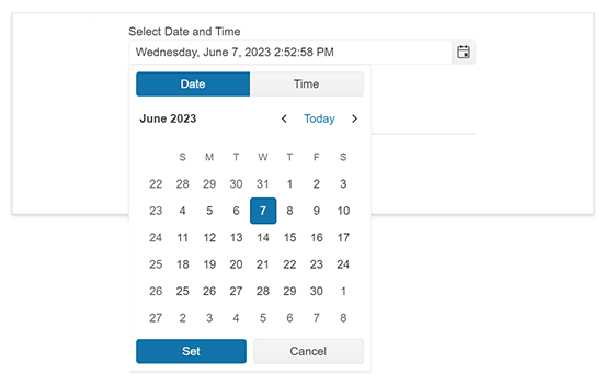
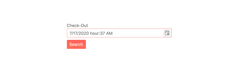
The Kendo UI for Angular DateTimePicker component combines the Angular DatePicker and Angular TimePicker in a single component, conveniently enabling users to select both date and time slots. Users can either select a date and time using the popups, or quickly type a date and time into the component input using their keyboard.
-
Incremental Steps
By default, you can increase or decrease each part of the Kendo UI for Angular DateTimePicker slots by one step. To customize the step number, you can provide a custom value and control the incremental intervals of the component's date and time slots - for example, increasing the time by 15-minute increments.

-
Date and Time Ranges
The Kendo UI for Angular DateTimePicker enables the user to input any time of the day or select any valid date in the past, present and future. By modifying the min and max settings of either the date and time you can set upper and lower limits on the time slots and days users can select.
-
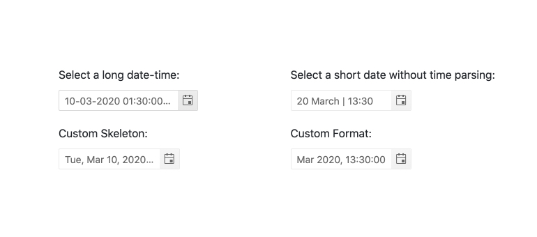
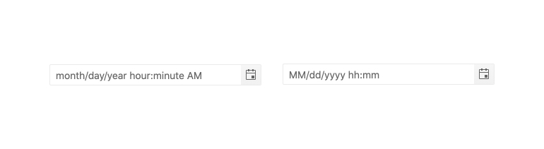
Formats
Date and time come in many formats and with its support for standard date strings, the Kendo UI for Angular DateTimePicker can handle any valid format to represent dates or times.
-
Placeholders
When dealing with dates and times, using a placeholder is a helpful way to indicate to the user what kind of date or format the component is expecting. The Kendo UI for Angular DateTimePicker can use any valid format string to define the format of the displayed date and time values.
-
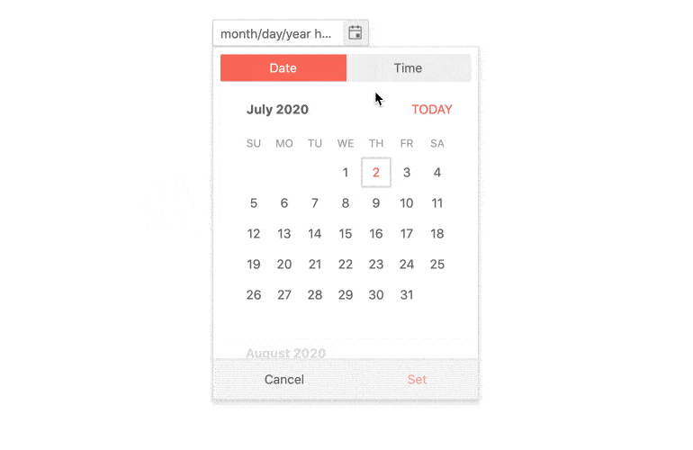
Adaptive Mode
The adaptive mode enables a mobile-friendly rendering of its calendar popup. Simply set the AdaptiveMode parameter to AdaptiveMode.Auto and this will trigger the component to automatically adapt to the current screen size and adapt its rendering accordingly. The adaptive mode also enables you to define the title text rendered in the popup header.
-
Globalization
The Kendo UI for Angular DateTimePicker supports globalization out of the box. This means that the component can be localized to display the date and time in a format based on the application settings or a user’s locale.

-
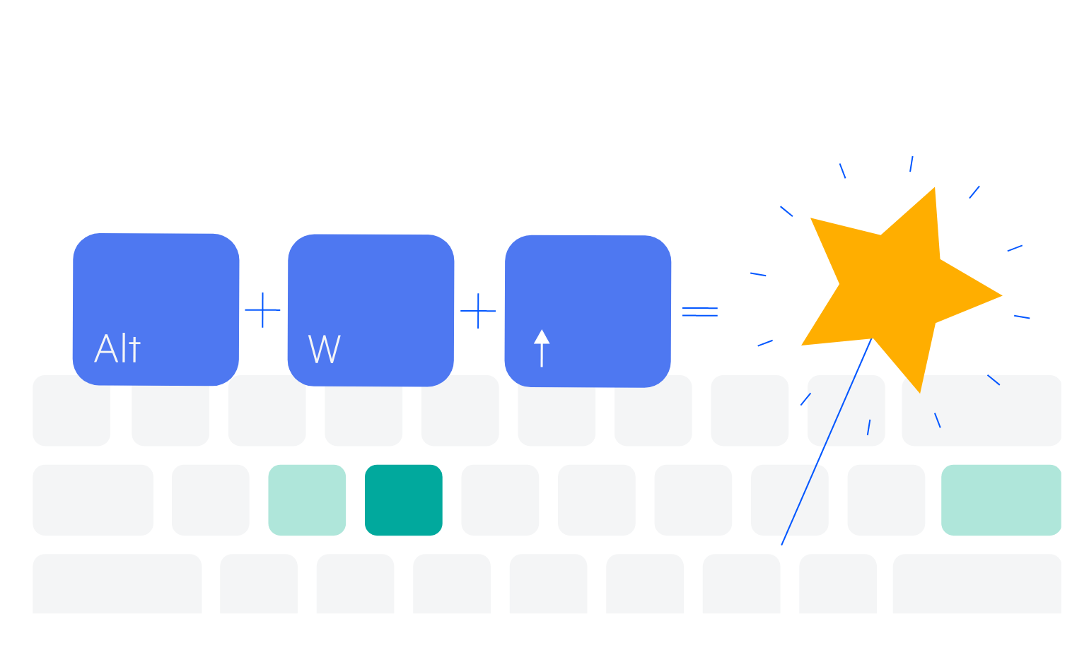
Keyboard Navigation
The Kendo UI for Angular DateTimePicker supports users manually typing both the date and time into its input. It also offers the ability to open and interact with the date and time-picking popups of the Angular DateTimePicker using keyboard navigation.
-
Accessibility
The Kendo UI for Angular DateTimePicker is AAA rated for WCAG 2.0 and compliant with both WAI-ARIA and Section 508 standards.

-
Also Available for These Popular Web Frameworks
We support every popular web development framework and strive for parity among our component libraries. You can also find the component for a variety of popular platforms:
-
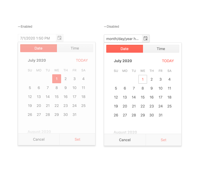
Disabled DateTimePicker
You can disable the Kendo UI for Angular DateTimePicker to prevent users from interacting with it. With a single configuration option, the Angular Date Time Picker can toggle between being enabled or disabled.
-
Forms Support
The Kendo UI for Angular DateTimePicker supports both reactive and template-driven forms, ensuring that the Angular DateTimePicker can be integrated into any Angular form.

Get Started with Kendo UI for Angular
