Kendo UI for Angular
Angular DropDown Button
- Open a list of items from a data source in an Angular popup menu with support for icons, images and templates.
- Part of the Kendo UI for Angular library along with 110+ professionally-designed components.
- Includes support, documentation, demos, virtual classrooms, Visual Studio Code Extensions and more!

-
Customizable Button with a Drop Down List
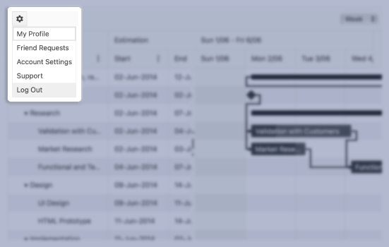
The Kendo UI for Angular DropDown Button is a dropdown button that opens an additional list of action items in a popup when a user clicks on it. The Angular DropDown Button enables you to create a list of items from a data source, display icons, as well as define templates for a custom look and feel.

-
Disabled DropDown Button
Out of the box, the Kendo UI for Angular DropDown Button becomes instantly active as soon as you add it to a page. When requirements call for users to be unable to interact with the component, the Angular DropDown Button can be disabled through a single configuration option. Individual actions can also be disabled for a more granular approach.

-
Data Binding
To create the Kendo UI DropDown Button, you can use a declarative approach and manually create all items or bind the component to an array of strings or objects.
-
Templates
Use Angular Templates to define a custom layout and design for each item displayed in the Kendo UI for Angular DropDown Button popup.

-
Keyboard Navigation
Thanks to its built-in keyboard navigation support, the Kendo UI for Angular DropDown Button lets users interact with the component using just their keyboard.
-
Accessibility
The Kendo UI for Angular DropDown Button is WCAG 2.0 AA rated and compliant with WAI-ARIA and Section 508 accessibility standards.

-
DropDown Button Icons
Items within the popup of the Kendo UI for Angular DropDown Button can be displayed as text, icons or a mix of text and icons. Icons can be set from the built-in Kendo UI for Angular theme, uploaded as an image or from third-party libraries like FontAwesome.

Frequently Asked Questions
-
What is an Angular DropDown Button?
An Angular Drop Down Button is a UI component—typically used in Angular applications—that combines a clickable button with a list of selectable items that appears when the button is activated (clicked or tapped). It allows users to select from a set of predefined actions or options. -
How Do I Try the Angular DropDown Button Demo
Explore interactive DropDown Button demos in our live playground, where you can view code samples and test functionality in real time.
-
How to Get Started with Angular DropDown Button
In short, install the Kendo UI for Angular library and import the relevant modules into your AppModule, Then, use the component in your template, passing in your list of actions or items. Finally, customize the styling, icons, and behavior as needed to fit your application. See the Getting Started Tutorial for full instructions.
-
How Do I Get the Selected Value of an Angular DropDown Button
To capture the selected value from a DropDown Button, use a (click) event handler on each menu item. Pass the item's value to a function in your component. This allows you to perform actions based on user selection. -
How Do I Use a DropDown Button in Angular?
To use a DropDown Button in Angular, integrate a UI component library such as Kendo UI, Import the required module into your application, then add the dropdown button component in your template. Bind it to a list of items and handle user actions via click events or data bindings.
All Kendo UI for Angular Components
Charts
- Area Chart
- Bar Chart
- Box Plot
- Bubble Chart
- Bullet Chart
- Chart Wizard New
- Charts
- Donut Chart
- Funnel Chart
- Heatmap
- Line Chart
- Pie Chart
- Polar Chart
- Pyramid Chart
- Radar Chart
- Range Area Chart
- Sankey Diagram
- Scatter Chart
- Sparkline
- Waterfall Chart
Editor
TreeList
Scheduler
Buttons
- Button
- ButtonGroup
- Chip
- ChipList
- DropdownButton
- Floating Action Button
- Speech To Text Button New
- SplitButton
Common Features
Conversational UI
Indicators
Progress Bars
Date Inputs
Dialogs
Labels
Icons
Design
Navigation
Diagrams and Maps
Dropdowns
Gauges
Grids
Upload
Inputs
- Checkbox
- ColorGradient
- ColorPalette
- ColorPicker
- FlatColorPicker
- Form New
- FormField
- MaskedTextBox
- NumericTextBox
- RadioButton
- RangeSlider
- Rating
- Signature
- Slider
- Switch
- TextArea
- TextBox
- TreeView
Bar & QR Codes
Data Tools

Get Started with Kendo UI for Angular
