Kendo UI for Angular
Angular Switch
- Provide a great user experience with this toggle that allows users to choose between two values, such as on/off.
- Part of the Kendo UI for Angular library along with 110+ professionally-designed components.
- Includes support, documentation, demos, virtual classrooms, Visual Studio Code Extensions and more!

-
Configurable Toggle Component
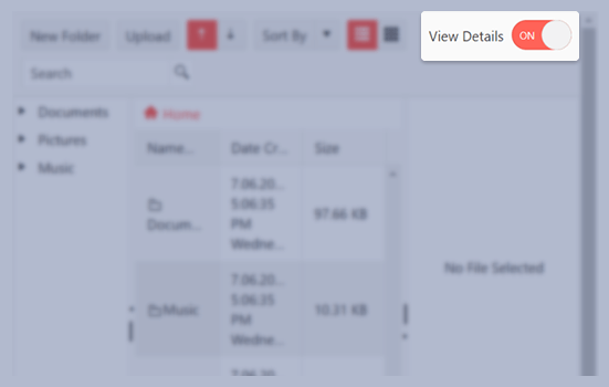
The Kendo UI for Angular Switch provides an intuitive UI component to toggle between two different values, like checked or unchecked.

-
Disabled Switch
When the Kendo UI for Angular Switch component is disabled, it will prevent users from interacting with it. A grayed out visual style clearly indicates that the Angular Switch is inactive and users are unable to slide it.

-
Read-Only Switch
The Kendo UI for Angular Switch can be set to a read-only mode, which displays the component like normal but prevents user interactions.

-
Labels
With the provided settings, you can the labels inside the Kendo UI for Angular Switch and customize the content displayed in the standard on and off states.

-
Forms Support
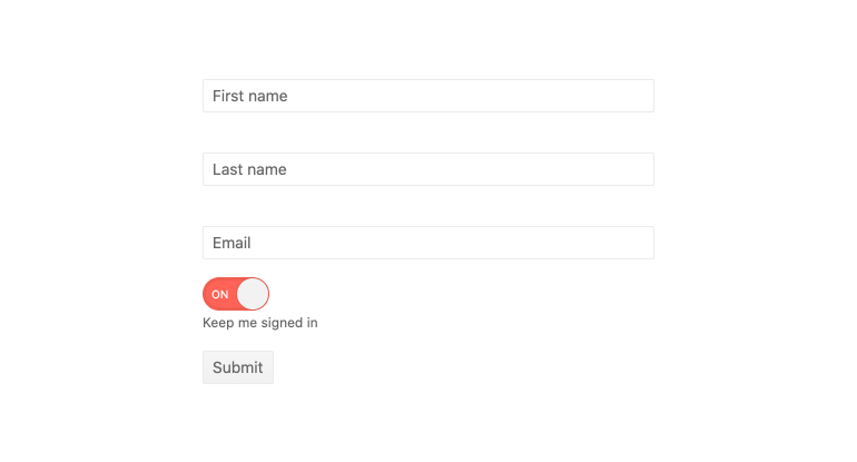
The Kendo UI for Angular Switch component can be added to both Reactive and template-driven forms.

-
Keyboard Navigation
With built-in keyboard shortcuts to help toggle between the two states of the Kendo U for Angular Switch, users can quickly update the mode of the component using just their keyboard.
-
Accessibility
The Kendo UI for Angular Switch supports both WAI-ARIA and Section 508 accessibility standards, and follows WCAG 2.0 with an AA rating.

All Kendo UI for Angular Components
Charts
- Area Chart
- Bar Chart
- Box Plot
- Bubble Chart
- Bullet Chart
- Chart Wizard New
- Charts
- Donut Chart
- Funnel Chart
- Heatmap
- Line Chart
- Pie Chart
- Polar Chart
- Pyramid Chart
- Radar Chart
- Range Area Chart
- Sankey Diagram
- Scatter Chart
- Sparkline
- Waterfall Chart
Editor
TreeList
Scheduler
Buttons
- Button
- ButtonGroup
- Chip
- ChipList
- DropdownButton
- Floating Action Button
- Speech To Text Button New
- SplitButton
Common Features
Conversational UI
Indicators
Progress Bars
Date Inputs
Dialogs
Labels
Icons
Design
Navigation
Diagrams and Maps
Dropdowns
Gauges
Grids
Upload
Inputs
- Checkbox
- ColorGradient
- ColorPalette
- ColorPicker
- FlatColorPicker
- Form New
- FormField
- MaskedTextBox
- NumericTextBox
- RadioButton
- RangeSlider
- Rating
- Signature
- Slider
- Switch
- TextArea
- TextBox
- TreeView
Bar & QR Codes
Data Tools

Get Started with Kendo UI for Angular
