
Kendo UI for Angular
Angular Splitter
- Build great UX by splitting a page into sections and allowing users to resize, expand and collapse them.
- Part of the Kendo UI for Angular library along with 110+ professionally-designed components.
- Includes support, documentation, demos, virtual classrooms, Visual Studio Code Extensions and more!
-
Organize Screens into Resizable Panels
The Kendo UI for Angular Splitter splits a page into sections and allows users to control the page layout. Sections of the page can be expanded and collapsed with a single click or resized using the provided handlers.
-
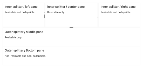
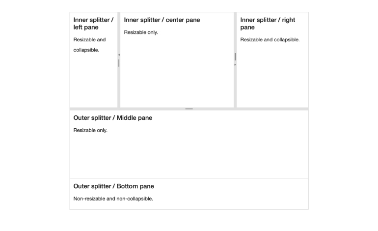
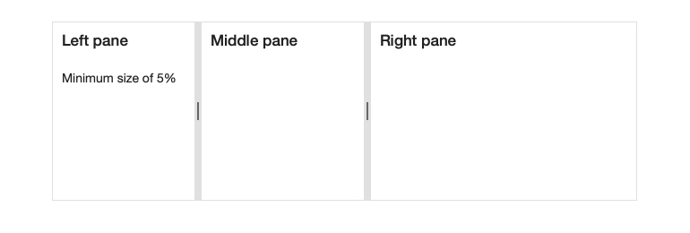
Panes
Panes are the building blocks of the Kendo UI for Angular Splitter. They represent each section and provide options for setting dimensions, resizing, collapsing, and scrolling properties—all of which can be set on a pane-by-pane basis.
-
Keyboard Navigation
With the built-in Keyboard Navigation, the Kendo UI for Angular Splitter lets users interact with the individual panes and their content using just the keyboard.
-
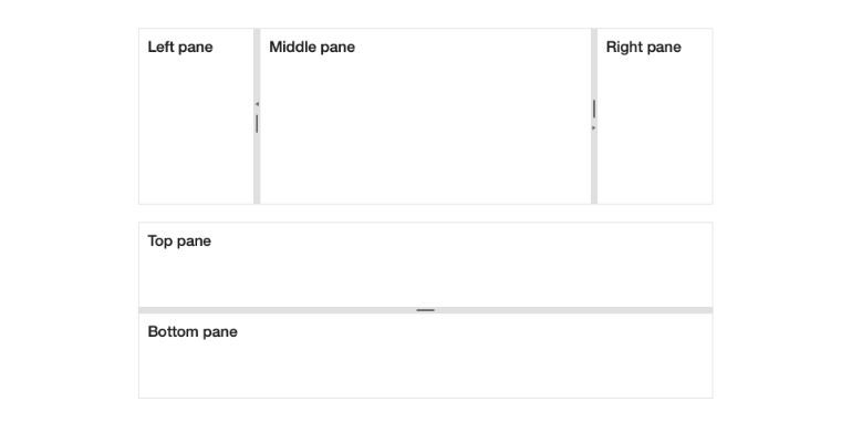
Orientation
The Kendo UI for Angular Splitter comes with built-in logic for handling Panes in both horizontal and vertical modes.
-
Accessibility
The Kendo UI for Angular Splitter is compliant with Section 508 and WAI-ARIA standards, and is AAA rated with WCAG 2.0.


Get Started with Kendo UI for Angular
