Kendo UI for Angular
Angular Range Area Chart
- Visualize a range that changes over time with the Kendo UI for Angular Range Area Chart.
- Part of the Kendo UI for Angular library along with 110+ professionally-designed components.
- Includes support, documentation, demos, virtual classrooms, Visual Studio Code Extensions and more!
-
Build Powerful Visualizations with the Angular Range Area Chart
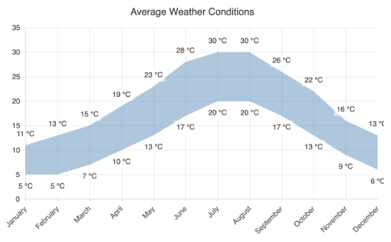
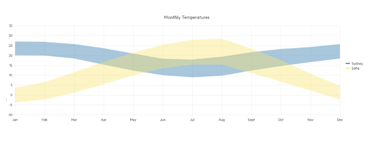
The Kendo UI for Angular Range Area Chart forms an area between the low and high values of a variable and follows it over time. The area space between the upper and lower bounds is colored and the X-axis usually represents a timeline. The Angular Range Area Chart is perfect for displaying ranges of values, such as between minimum and maximum prices over a timespan. Enjoy built-in legend, tooltips, series customization options, pan and zoom functionality and more features.
-
Data Binding
You can populate the Angular Range Area Chart series with data from various source types, including numbers, arrays and objects (or models)—simply specify the fields you want to use.
-
Panning and Zooming
Leverage built-in pan and zoom functionality to enable users to zero in on specific ranges of the Kendo UI for Angular Range Area Chart. The component makes use of a drag motion for panning and a mouse wheel or pinch-and-zoom motions for zooming. Additionally, you can disable panning and zooming for an axis to prevent users from moving vertically or horizontally across the chart plot area.
-
Angular Range Area Rendering
The Angular Range Area Chart renders data in the Canvas (bitmap) and SVG (vector graphics) formats. SVG is the default format to ensure an always crips presentation of your data. When performance is the priority, you can easily switch to a canvas format through a single configuration option to ensure your chart will handle large data and real-time updates with no interruption.
-
Export Options
You can export your Angular Range Area Chart to PDF, SVG, PNG and the Kendo UI drawing format. In scenarios where you need to change the image size or fit the chart to a paper size when exporting to PDF, the intuitive export method of the component will allow you to preserve the quality and rendering of the chart in the output file.
-
Themes
Customize the series colors of the Kendo UI for Angular Range Area component with one of our predefined color sets, including Default (our own styling), Material (based on the Material Design guidelines), Bootstrap (resembles the Bootstrap styling) and Fluent (based on Microsoft Fluent UI). You can further customize any of the built-in themes or create a new theme to match your branding using Progress ThemeBuilder.
-
Globalization
The Kendo UI for Angular Heatmap Range Area Chart supports globalization and localization to ensure that the component can effectively support any application’s language and locale. You can also enable the right-to-left (RTL) rendering for languages that use right-to-left scripts.
See the Angular Range Area Chart globalization demo

Get Started with Kendo UI for Angular