Kendo UI for Angular
Angular TabStrip
- Organize content info highly customizable tabs that automatically apply your Angular application's theme.
- Part of the Kendo UI for Angular library along with 110+ professionally-designed components.
- Includes support, documentation, demos, virtual classrooms, Visual Studio Code Extensions and more!

-
Organize Content into Tabs
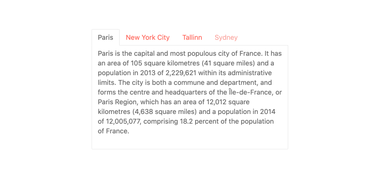
The Kendo UI for Angular Tab Strip component displays a collection of tabs, each with their own associated content. It is a great way to organize, fit and navigate wordy content in a single frame as it allows users to switch between the different tabs inside the component.

-
Tabs
Each tab inside the Kendo UI for Angular TabStrip component comes with its own set of configuration options, such as setting the title of the tabs, adjusting the tab position, implementing selectable or disabled tabs, as well as defining if tabs and their content is persisted in the DOM.

-
Closable Tabs
Give your users the power to chose which tabs show in their interface by adding a close icon on each tab in the Angular TabStrip. You can use the default icon or customize it by adding your own.
See the Angular TabStrip Closable Tabs demo -
Scrollable Tabs
When the space your tabs occupy is greater than the width of the container, your layout can become unpleasant. To avoid this, the Angular TabStrip will automatically add scroll controls. Your layout will be intact, and your users will be pleased.

-
Keyboard Navigation
Thanks to its built-in keyboard navigation, the Kendo UI for Angular TabStrip comes with several keyboard shortcuts to help users navigate and interact with all available tabs.
-
Globalization
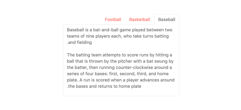
The Kendo UI for Angular TabStrip comes with built-in support for rendering its tabs in a left-to-right order, allowing for the component to work in any globalization scenario.

-
Accessibility
The Kendo UI for Angular TabStrip is fully accessible as it complies with Section 508 and WAI-ARIA standards and has an AAA rating for WCAG 2.0.

All Kendo UI for Angular Components
Charts
- Area Chart
- Bar Chart
- Box Plot
- Bubble Chart
- Bullet Chart
- Chart Wizard New
- Charts
- Donut Chart
- Funnel Chart
- Heatmap
- Line Chart
- Pie Chart
- Polar Chart
- Pyramid Chart
- Radar Chart
- Range Area Chart
- Sankey Diagram
- Scatter Chart
- Sparkline
- Waterfall Chart
Editor
TreeList
Scheduler
Buttons
- Button
- ButtonGroup
- Chip
- ChipList
- DropdownButton
- Floating Action Button
- Speech To Text Button New
- SplitButton
Common Features
Conversational UI
Indicators
Progress Bars
Date Inputs
Dialogs
Labels
Icons
Design
Navigation
Diagrams and Maps
Dropdowns
Gauges
Grids
Upload
Inputs
- Checkbox
- ColorGradient
- ColorPalette
- ColorPicker
- FlatColorPicker
- Form New
- FormField
- MaskedTextBox
- NumericTextBox
- RadioButton
- RangeSlider
- Rating
- Signature
- Slider
- Switch
- TextArea
- TextBox
- TreeView
Bar & QR Codes
Data Tools

Get Started with Kendo UI for Angular
