Kendo UI for Angular
Angular Slider
- Go beyond the standard numeric input with this sleek tool that selects values by dragging a handle along a bar.
- Part of the Kendo UI for Angular library along with 110+ professionally-designed components.
- Includes support, documentation, demos, virtual classrooms, Visual Studio Code Extensions and more!

-
Read-Only Slider
The Kendo UI for Angular Slider can be rendered in a read-only mode, which has the same visual style as the default Angular Slider but prevents users from updating the component’s value.

-
Orientation
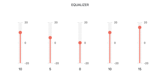
With the orientation setting, the Kendo UI for Angular Slider can be rendered in both horizontal and vertical modes.

-
Disabled Slider
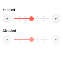
By setting the enabled property to false, the Kendo UI for Angular Slider will prevent user interactions and will be given a unique visual style that indicates that the component is disabled.

-
Predefined Steps
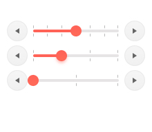
The Kendo UI for Angular Slider can be configured to contain both large and small steps, defining the exact values available inside the component. The difference between large and small steps usually indicates major values with minor steps in between.

-
Keyboard Navigation
Thanks to built-in support for keyboard navigation, users can interact with and navigate the Kendo UI for Angular Slider with their keyboard.
-
Accessibility
The Kendo UI for Angular Slider complies with modern accessibility guidelines, Section 508 and WAI-ARIA modes and is AAA rated with WCAG 2.0.

-
Visually Select Numeric Values
The Kendo UI for Angular Slider gives users a quick and sleek tool for selecting a value by dragging a handle around a track. Simple upon initial glance, the component can be customized to cover a large array of scenarios.

All Kendo UI for Angular Components
Charts
- Area Chart
- Bar Chart
- Box Plot
- Bubble Chart
- Bullet Chart
- Chart Wizard New
- Charts
- Donut Chart
- Funnel Chart
- Heatmap
- Line Chart
- Pie Chart
- Polar Chart
- Pyramid Chart
- Radar Chart
- Range Area Chart
- Sankey Diagram
- Scatter Chart
- Sparkline
- Waterfall Chart
Editor
TreeList
Scheduler
Buttons
- Button
- ButtonGroup
- Chip
- ChipList
- DropdownButton
- Floating Action Button
- Speech To Text Button New
- SplitButton
Common Features
Conversational UI
Indicators
Progress Bars
Date Inputs
Dialogs
Labels
Icons
Design
Navigation
Diagrams and Maps
Dropdowns
Gauges
Grids
Upload
Inputs
- Checkbox
- ColorGradient
- ColorPalette
- ColorPicker
- FlatColorPicker
- Form New
- FormField
- MaskedTextBox
- NumericTextBox
- RadioButton
- RangeSlider
- Rating
- Signature
- Slider
- Switch
- TextArea
- TextBox
- TreeView
Bar & QR Codes
Data Tools

Get Started with Kendo UI for Angular
