Kendo UI for Angular
Angular BreadCrumb
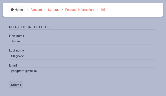
- Add a rich and interactive breadcrumb to your Angular app to give your users the experience they expect.
- Part of the Kendo UI for Angular library along with 110+ professionally-designed components.
- Includes support, documentation, demos, virtual classrooms, Visual Studio Code Extensions and more!

-
Collapse Modes
Decide how items are visualized with the Angular Breadcrumb width is greater than the width of the component. The items can wrap, collapse, or remain on screen without a line break. In the latter case, a scroll bar will appear.
-
Item Appearance
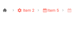
Customize its appearance of the Angular Breadcrumb component's items through support for icons, images, and disabled items,

-
Separator
Select from a collection of icons to use for item separators.
-
Templates
In addition to the default design of the items displayed by Breadcrumb, you can specify your own.
-
Routing
For more complex implementations, Kendo UI for Angular Breadcrumb supports the Angular Router. A common use cases exists when items navigate to parts of the app that do not share main components (public vs. admin, for example).
-
Accessibility
The Breadcrumb component supports WAI-ARIA and Section 508 standards.

-
Configurable Angular Breadcrumb Component
Easily add popular breadcrumb navigation to your app with Kendo UI for Angular Breadcrumb. Set it up your way with options for collapse modes, separators, appearance, and more!

All Kendo UI for Angular Components
Charts
- Area Chart
- Bar Chart
- Box Plot
- Bubble Chart
- Bullet Chart
- Chart Wizard New
- Charts
- Donut Chart
- Funnel Chart
- Heatmap
- Line Chart
- Pie Chart
- Polar Chart
- Pyramid Chart
- Radar Chart
- Range Area Chart
- Sankey Diagram
- Scatter Chart
- Sparkline
- Waterfall Chart
Editor
TreeList
Scheduler
Buttons
- Button
- ButtonGroup
- Chip
- ChipList
- DropdownButton
- Floating Action Button
- Speech To Text Button New
- SplitButton
Common Features
Conversational UI
Indicators
Progress Bars
Date Inputs
Dialogs
Labels
Icons
Design
Navigation
Diagrams and Maps
Dropdowns
Gauges
Grids
Upload
Inputs
- Checkbox
- ColorGradient
- ColorPalette
- ColorPicker
- FlatColorPicker
- Form New
- FormField
- MaskedTextBox
- NumericTextBox
- RadioButton
- RangeSlider
- Rating
- Signature
- Slider
- Switch
- TextArea
- TextBox
- TreeView
Bar & QR Codes
Data Tools

Get Started with Kendo UI for Angular
