
Kendo UI for Angular
Angular DatePicker
- Give users the choice to manually enter or pick dates from a calendar with this ready-to-use Angular component.
- Part of the Kendo UI for Angular library along with 110+ professionally-designed components.
- Includes support, documentation, demos, virtual classrooms, Visual Studio Code Extensions and more!
-
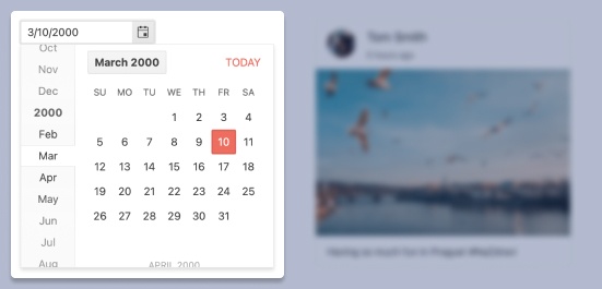
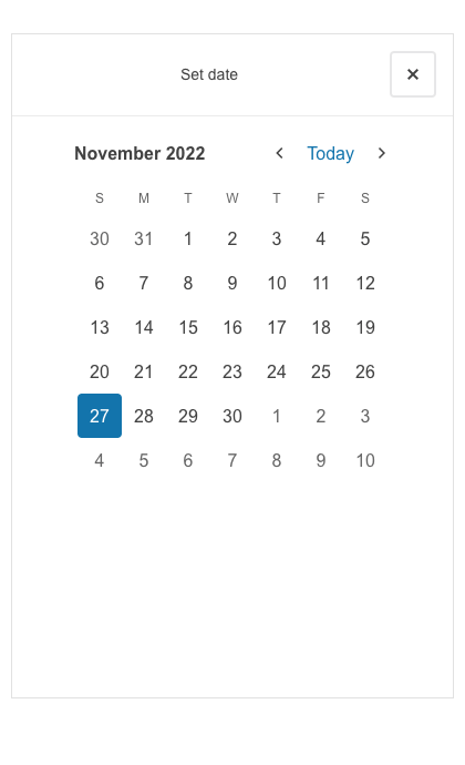
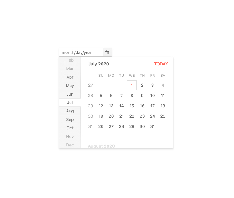
Display a Popup Calendar for Date Selection
The Kendo UI for Angular DatePicker component provides a sleek and intuitive interface for users to enter and select dates. It renders as a simple input element that allows users to either manually type in dates or quickly and visually pick dates and date ranges from a popup calendar.
-
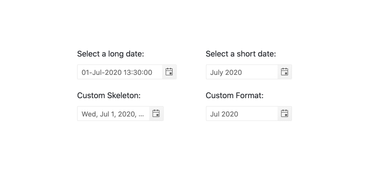
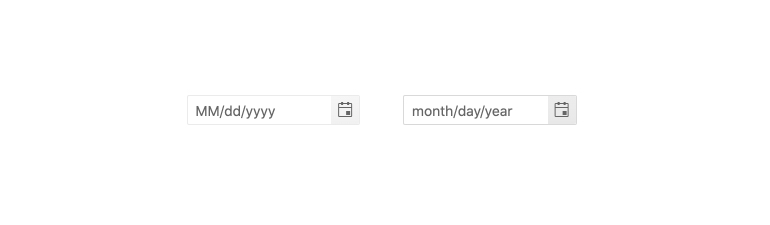
Date Formats
The Kendo UI for Angular DatePicker component can accept any valid date format string, allowing for application requirements to dictate how to handle date formats within the Angular DatePicker.
-
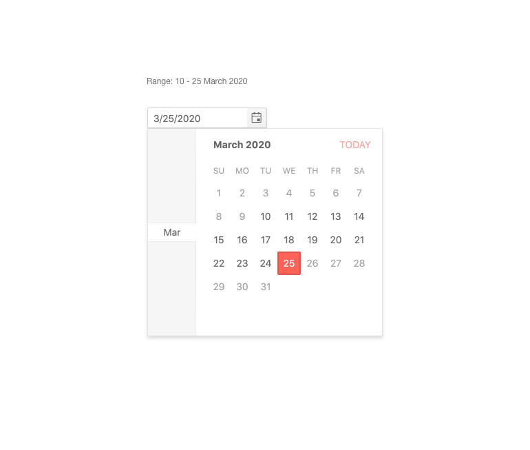
Date Ranges
By default, the Kendo UI for Angular DatePicker has no limits and will accept any date the user provides. To limit the available dates users can select from, simply use the Angular DatePicker min and max properties. They enable you to define the valid date ranges available within the component.
-
Placeholders
Placeholders intuitively guide users to the correct input value or format they should provide. The Kendo Angular DatePicker component allows you to define a text placeholder when no data has been provided and the Angular DatePicker is initially rendered.
-
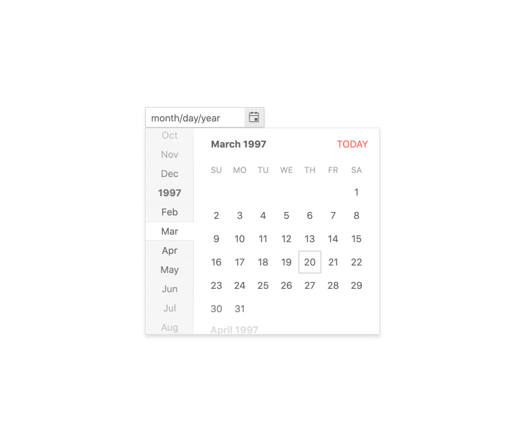
Adaptive Mode
The DatePicker adaptive mode enables a mobile-friendly rendering of its suggestion list popup. Simply set the AdaptiveMode parameter to AdaptiveMode.Auto and this will trigger the component to automatically adapt to the current screen size and will change its rendering accordingly. By enabling the auto adaptive mode, the DatePicker component also enables you to define the title text rendered in the popup header.
-
Templates
Customize the look and feel of the different Kendo UI for Angular DatePicker child components with templates. You can specifically tailor the built-in Angular Calendar elements all the way to the cell level to match your brand and application style.
-
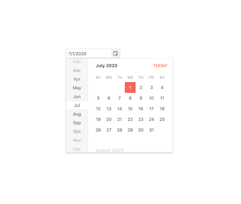
Focused Dates
The Kendo UI for Angular DatePicker popup calendar features a focused date that is highlighted and rendered differently to give it a distinct feel. The focused date defaults to today. You can change the default value of the focused date to a date of your choice with a single configuration option.
-
Disabled DatePicker
Certain scenarios may call for the Kendo UI for Angular DatePicker to be uneditable and prevent users from interacting with the component. You can easily disable the Angular DatePicker with a single configuration option, visually indicating to users that they cannot enter or pick dates.
-
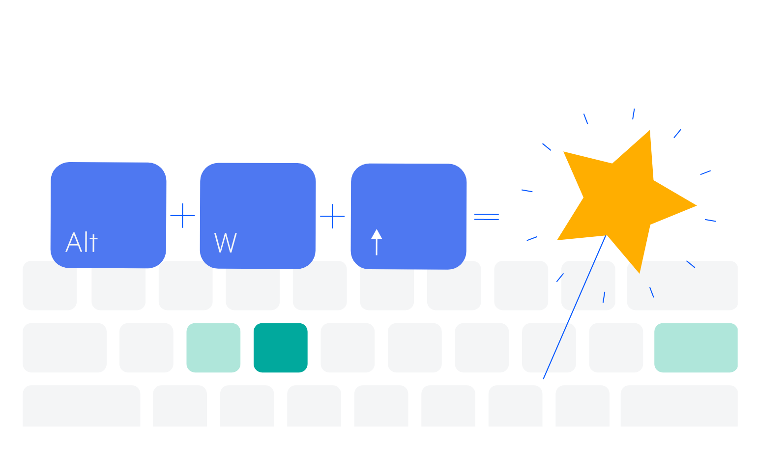
Keyboard Navigation
The Kendo UI for Angular DatePicker offers several different ways to select dates, using keyboard navigation alone. Users can manually type in the date, change the current date with the up and down arrow keys, or open the calendar to select a particular date.
-
Globalization
The Kendo UI for Angular DatePicker component supports globalization out of the box, allowing the provided date string and built-in messages to adjust to the user’s locale or language settings.
-
Accessibility
The Angular DatePicker is compliant with Section 508 and WAI-ARIA standards and is AAA rated with WCAG 2.0.

-
Also Available for These Popular Web Frameworks
We support every popular web development framework and strive for parity among our component libraries. You can find the DatePicker for these popular platforms:
-
Week Number Column
Similar to the Kendo UI for Angular Calendar component, the Kendo UI for Angular DatePicker has a configuration option to show or hide the week number next to every week displayed in the calendar.
-
Forms Support
The Kendo UI for Angular DatePicker supports integration with both template-driven and reactive forms, ensuring you can add the Angular DatePicker to any Angular form.

Get Started with Kendo UI for Angular
