
UI for ASP.NET Core
ASP.NET Core DatePicker
- Use the ASP.NET Core DatePicker component to let users easily select a date or multiple dates from a calendar. Take advantage of its various features, including disabled dates, week column, RTL support, keyboard navigation and more.
- Part of the Telerik UI for ASP.NET Core library along with 120+ professionally designed UI components.
- Includes support, documentation, demos, virtual classrooms, Visual Studio Code Extensions and more!
-
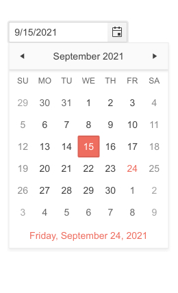
Overview
The Telerik UI for ASP.NET Core DatePicker allows users to select a date or multiple dates from a calendar. The component can be implemented in any ASP.NET Core applications, including booking scenarios. It can be customized by adding templates, disabling dates, adding a week column and more. It is accessible for all users and supports keyboard navigation and RTL adaptation.
See the Telerik UI for ASP.NET Core DatePicker in action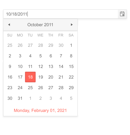
-
Component Types
The component features two types – modern with a sleek calendar view tailored to fit the newest applications, and classic for those of you who might feel nostalgic and want to keep the traditional authentic feeling in their applications.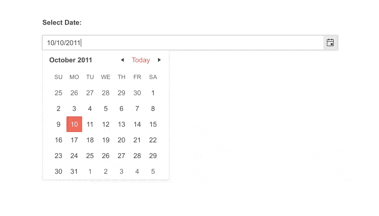
-
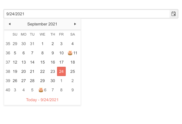
Templates
The ASP.NET Core DatePicker offers multiple template options, such as:- Month View Template – renders icons for specific days (birthdays, holidays etc.)
- Footer Template – displays the current date
- Week Column Template – rendering a week column on the left side of the calendar
Check them all out in the Telerik UI for ASP.NET Core DatePicker Templates demo
-
Start View and Selection Depth
The Telerik UI for ASP.NET Core DatePicker component allows you to set the initial view it shows (month, year, decade, century) and define the navigation depth of the views.
See more in our documentation -
Range Selection
There are several ways a user can select a range of dates. One option would be to use the Telerik UI for ASP.NET Core DateRangePicker, however, you can also provide two separate Date Pickers and allow users to specify the Start and End date.
See more in the ASP.NET Core DatePicker Range Selection demo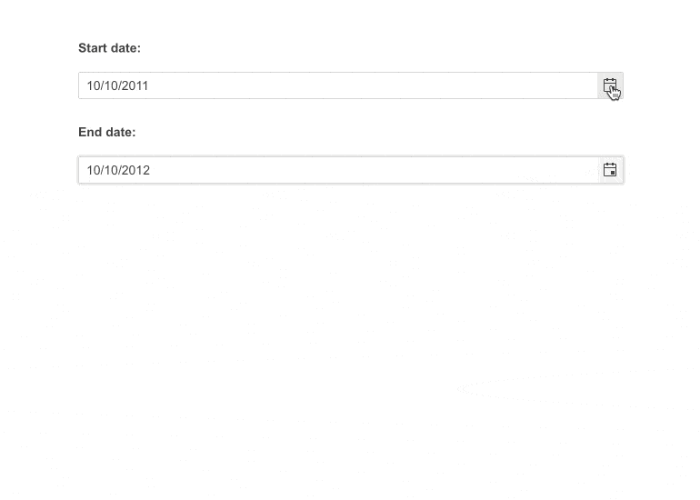
-
Date and Time Picker
In case your project requires a component that can be more time specific, such as setting dentist appointments or booking a session with a tutor, you can implement the Telerik UI for ASP.NET Core DateTimePicker and specify the exact date and time using a single component.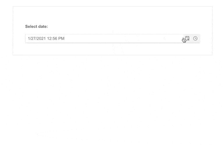
-
Disabled Dates
Implementing a calendar is always done for the sake of planning, and we know that in many cases every day is not an option. For example, most companies do not work during the weekend or on national holidays, that is why the ASP.NET Core DatePicker allows you to disable the dates that don’t work for you and let the users choose only from the acceptable options.
-
API
The component offers several API functions including set/get a value, open/close the calendar or configure its states. For a full list of events fired by the ASP.NET Core DatePicker visit our documentation.
-
Customization of DateInput Messages
With the Messages option in the DateInput UI component, you can now effortlessly personalize the message placeholder for the date input in the Date & Time Picker components. The component also offers the .Format() feature, which can be utilized to establish the date format that will be utilized to parse and format the machine date.
-
Globalization
The ASP.NET Core DatePicker supports Globalization as a feature and is designed to work in different cultures and respond to their requirements for date and time formatting, week and month names. You can define the culture through the kendo.culture() method.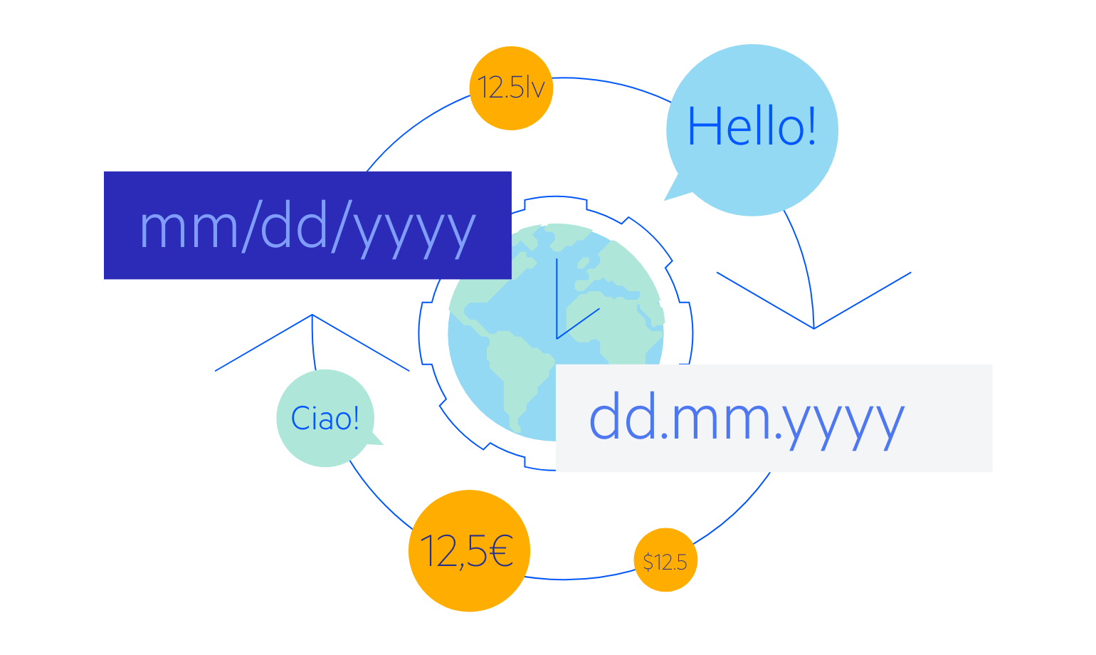
-
RTL Support
The DatePicker component supports RTL configuration. The RTL functionality is supported my most of our components to respond to users who communicate through a right-to-left language such as Arabic or Hebrew.
Check out the ASP.NET Core DatePicker RTL Support demo
-
HTML and Tag Helpers
Telerik UI for ASP.NET Core offers two options for declaring UI components – through HTML or Tag Helpers. You can choose which approach to use for the DatePicker component based on preference, technology background or team development practice. Both HTML and Tag helpers allow you to lay out the components and their configuration with a simple and easy-to-read HTML-like syntax.
-
Accessibility
Accessibility can be a large concern in any application. Thanks to the Telerik UI for ASP.NET Core DatePicker component being Section 508 and WCAG 2.1 guidelines compliant, you can rest assured when adding the component to your application.
-
Keyboard Navigation
The ASP.NET Core DatePicker allows users to open/close the popup and select/deselect dates by using the arrows or a combination of ctrl and arrows to navigate the months of the year. For a full list of supported keys and user actions visit the DatePicker Keyboard Navigation demo.
-
DatePicker Theming
You can Style the DatePicker component with one of 20+ built-in themes and swatches. You can easily customize any of out-of-the-box themes with a few lines of CSS, or create new themes to match your colors and branding by using the Progress SASS ThemeBuilder application.
