
Kendo UI for Angular
Angular Heatmap
- Show the relative value of data points using colors with the Kendo UI for Angular Heatmap.
- Part of the Kendo UI for Angular library along with 110+ professionally-designed components.
- Includes support, documentation, demos, virtual classrooms, Visual Studio Code Extensions and more!
-
Build Powerful Data Visualizations with the Angular Heatmap
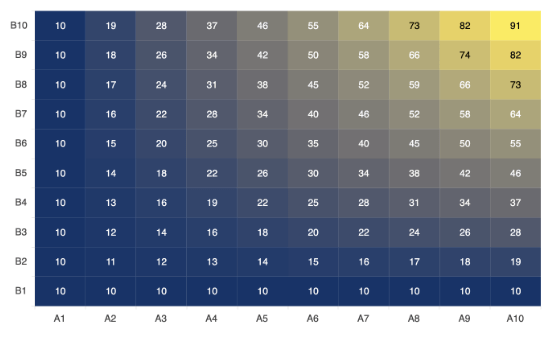
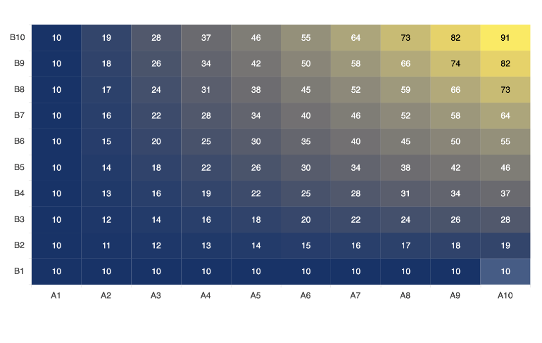
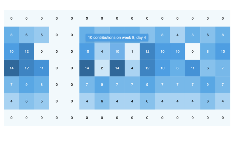
The Kendo UI for Angular Heatmap component uses a color system to graphically visualize the magnitude of data values in a grid. Each axis of the grid represents a different category, such as a year and its months, and the color represents the intensity or frequency of the value for the given categories, such as temperature. Thanks to its high visual potential, the Angular Heatmap is used in business scenarios to analyze a company's performance or user behavior. Enjoy built-in color scales, crosshairs, tooltips, customization and configuration options.
-
Data Binding
You can bind the Angular Heatmap chart series to arrays and objects (or models). To bind the component to an object, simply specify the fields you want to use for every dimension: X category, Y category and value.
-
Category Binding
You can bind the Angular Heatmap X and Y categories in the order in which they appear in the data source or use a custom order by setting the categories array of each axis before the data is mapped.
-
Color Scale
Leverage one of the preset color scales that come out of the box with the Kendo UI for Angular Heatmap. Each scale makes use of a color combination in varying hues that change depending on the data values. The lighter colors correspond to the lower values, while the main colors represent the areas with the highest value concentration. You can also define a custom color scale by setting the series color as a callback function.
-
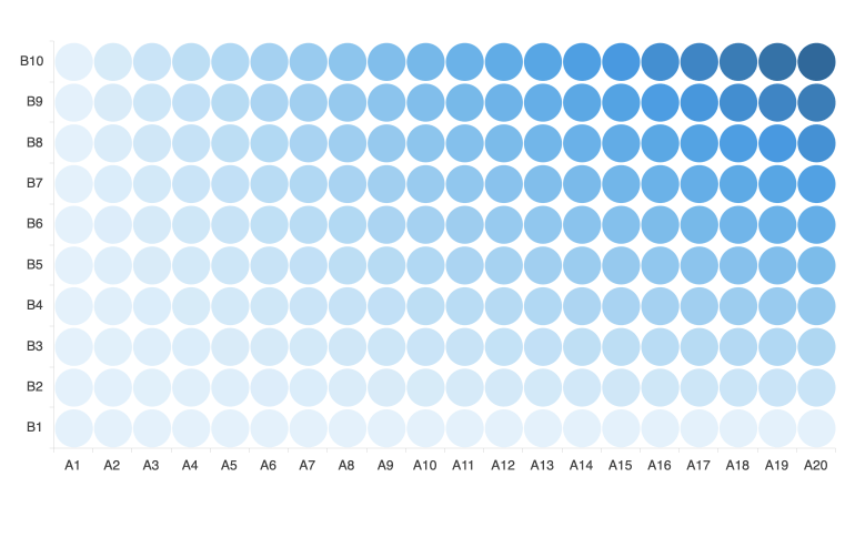
Marker Shape
Choose a marker shape for your Angular Heatmap from the readily available options: rectangular, rounded rectangular, circle and triangle.
-
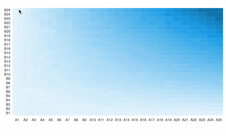
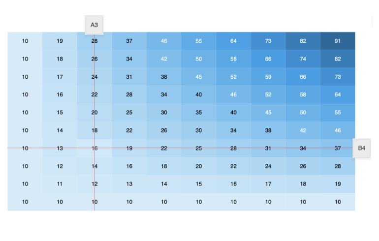
Panning and Zooming
Leverage built-in pan and zoom functionality to enable users to zero in on specific ranges of the Kendo UI for Angular Heatmap. The component makes use of a drag motion for panning and a mouse wheel or pinch-and-zoom motions for zooming. Additionally, you can disable panning and zooming for an axis to prevent users from moving vertically or horizontally across the chart plot area.
-
Heatmap Tooltips
Enable the Angular Heatmap series tooltips to display additional information when the user hovers over a value on the grid. The tooltip has a color matching the color of the value to help associate the tooltip with that point. You can keep the default background color or set a custom color by using the background and border options.
-
Heatmap Crosshairs
The Kendo UI for Angular Heatmap component comes with a built-in crosshairs feature that enables the user to zero in on exact values at the current cursor position.
-
Heatmap Rendering
The Angular Heatmap Chart renders data in the Canvas (bitmap) and SVG (vector graphics) formats. SVG is the default format to ensure an always crips presentation of your data. When performance is the priority, you can easily switch to a canvas format through a single configuration option to ensure your chart will handle large data and real-time updates with no interruption.
-
Export Options
You can export your Angular Heatmap Chart to PDF, SVG, PNG and the Kendo UI drawing format. In scenarios where you need to change the image size or fit the chart to a paper size when exporting to PDF, the intuitive export method of the component will allow you to preserve the quality and rendering of the chart in the output file.
-
Themes
Customize the series colors of the Kendo UI for Angular Heatmap component with one of our predefined color sets, including Default (our own styling), Material (based on the Material Design guidelines), Bootstrap (resembles the Bootstrap styling) and Fluent (based on Microsoft Fluent UI). You can further customize any of the built-in themes or create a new theme to match your branding using Progress ThemeBuilder.
See the Angular Heatmap Chart appearance demo
-
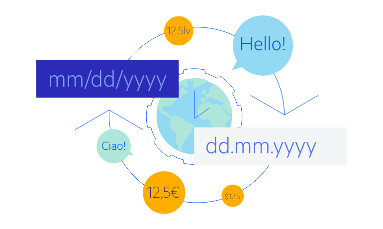
Globalization
The Kendo UI for Angular Heatmap Chart supports globalization and localization to ensure that the component can effectively support any application’s language and locale. You can also enable the right-to-left (RTL) rendering for languages that use right-to-left scripts.
See the Angular Heatmap Chart globalization demo

Get Started with Kendo UI for Angular
