background

Kendo UI for Angular

Angular TimePicker

  • Give users an easy and visual way to select time from a list of available slots.
  • Part of the Kendo UI for Angular library along with 110+ professionally-designed components.
  • Includes support, documentation, demos, virtual classrooms, Visual Studio Code Extensions and more!
TimePicker
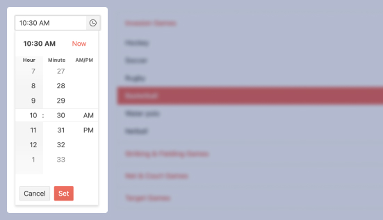
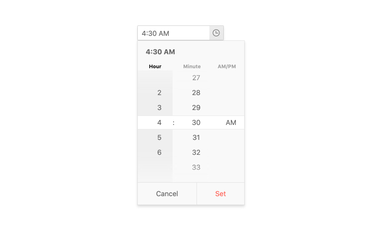
  • Type or Use Spinner Controls to Select Time Data

    The Kendo UI for Angular Time Picker is an input component that gives users an interactive way to enter time values in a form. When the user clicks or taps the time input field, the component will show spinners with available slots in any combination of hours, minutes, and/or seconds. The user selects his or her value and then it is represented in the appropriate format in the input field. With a large array of configuration options, the TimePicker is a versatile component for meeting your application requirements for helping users select any time of the day.
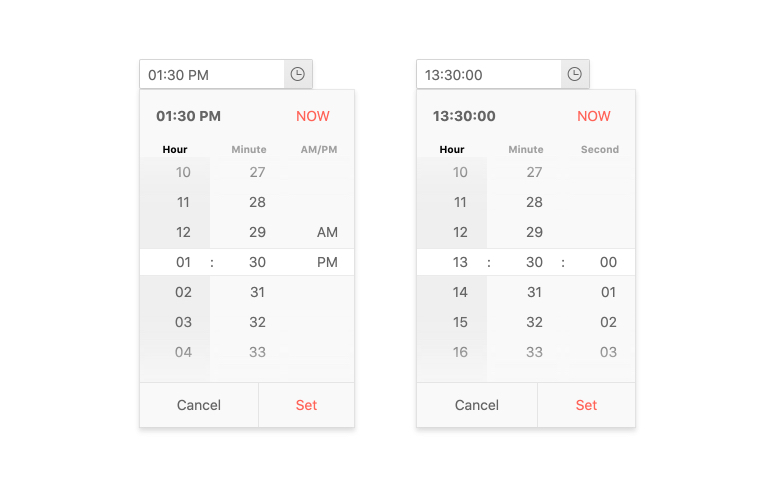
    See Angular TimePicker Overview demo

    Kendo UI for Angular TimePicker - Overview
  • Time Ranges

    By setting the minimum and maximum configuration options of the Kendo UI for Angular TimePicker, you can limit the time slots available to users. Setting this available ranges helps ensure the user finds the value they need and ensures you get valid data.

    See Angular TimePicker Time Ranges demo

    Kendo UI for Angular TimePicker - Time Ranges
  • Formats

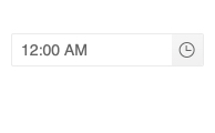
    The Kendo UI for Angular TimePicker has a format property to set the time format of the component. Standard time formats are built-in, but It can use any standard time format string for custom formats. Also, you can easily switch between 12-hour and 24-hour clocks.
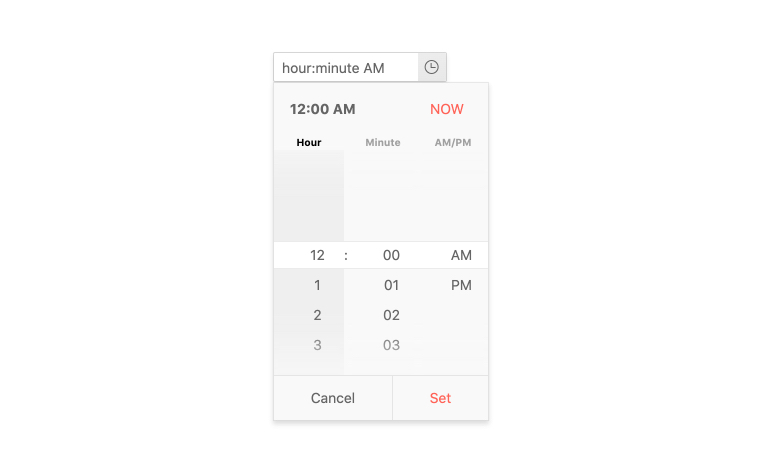
    See Angular TimePicker Formats demo

    Kendo UI for Angular TimePicker - Formats
  • Placeholders

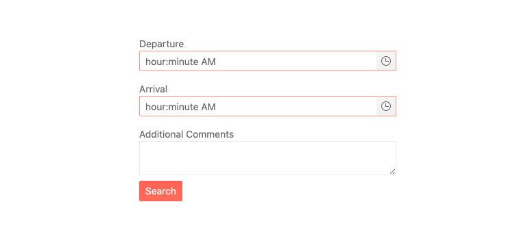
    With the placeholder feature of the Angular TimePicker component, you can provide a custom string to give users a contextual cue about what information they are expected to enter. For example, you can demonstrate the required format or you can show a hint that reads "select your desired time." 
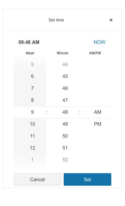
    See Angular TimePicker Placeholders demo

    Kendo UI for Angular TimePicker - Placeholders
  • Adaptive Mode

    The TimePicker adaptive mode enables a mobile-friendly rendering of its calendar popup. Simply set the AdaptiveMode parameter to AdaptiveMode.Auto and this will trigger the component to automatically adapt to the current screen size and adapt its rendering accordingly. The adaptive mode for the TimePicker component also enables you to define the title text rendered in the popup header.
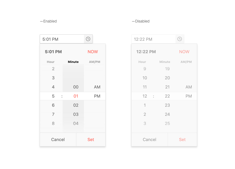
    See the Angular TimePicker Adaptive Mode demo

    TimePicker Adaptive Rendering
  • Disabled TimePicker

    You can disable the Kendo UI for Angular TimePicker in order to prevent user interactions until certain requirements have been met. With the enabled property set to either true or false, the Angular TimePicker can toggle between enabled and disabled states.

    See Angular TimePicker Disabled TimePicker demo

    Kendo UI for Angular TimePicker - Disabled
  • Read-Only TimePicker

    The read-only mode allows you to display the Kendo UI for Angular TimePicker, while preventing users from modifying its current value.

    See Angular TimePicker Read-Only TimePicker demo

    Kendo UI for Angular TimePicker - Read-Only TimePicker
  • Forms Support

    The Kendo UI for Angular TimePicker supports both template-driven forms and Reactive forms. Since this component is primarily used in forms, our goal is to make it as universal as possible.
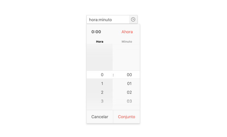
    See Angular TimePicker Forms Support demo

    Kendo UI for Angular TimePicker - Forms Support
  • Globalization

    With support for various time formats, as well as the ability to translate built-in strings, the Kendo UI for Angular TimePicker is perfectly equipped for any globalization and internationalization scenarios.
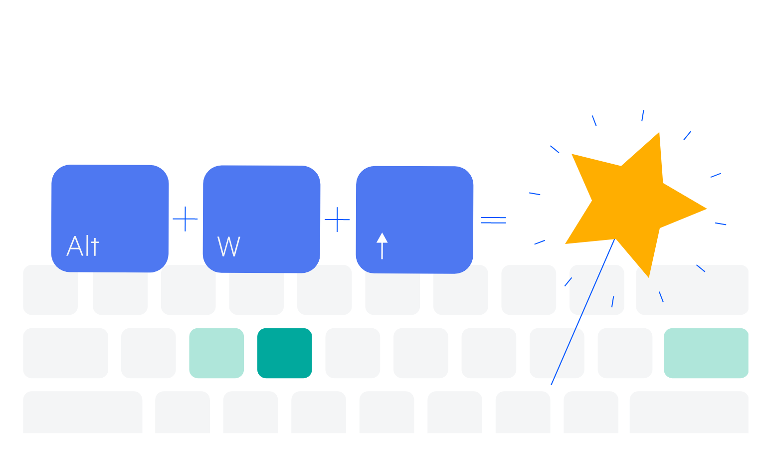
    Kendo UI for Angular TimePicker Globalization demo

    Kendo UI for Angular TimePicker - Globalization
  • Keyboard Navigation

    Thanks to keyboard navigation, users can navigate through and interact with the Kendo UI for Angular TimePicker using their keyboard. This includes manually typing in a time slot as well as accessing the popup that shows all available time slots.

    See Angular TimePicker Keyboard Navigation demo

    Keyboard Navigation
  • Accessibility

    The Kendo UI for Angular TimePicker supports Section 508 and WAI-ARIA standards, and has an AAA rating with WCAG 2.0.

    See Angular TimePicker Accessibility demo

    Accessibility

Frequently Asked Questions

  • What is an Angular TimePicker?
    An Angular TimePicker is a component designed to give users an interactive way to select time values. When the user clicks or taps on a time field in a form, they see spinner controls that allow them to select a slot. When the slot is selected, its value will populate the field.


  • Why should I choose the Kendo UI for Angular TimePicker?

    The Kendo UI for Angular TimePicker has many values that make it unique. It is very easy to customize its behavior with configuration properties, it is fully accessible and data-ready. It is also part of a complete library of over 100 other components that all share common themes and API. As a result, you can easily meet functional requirements and create a clean and consistent UI.


  • Can I try the Angular TimePicker?

    Absolutely. We offer free 30-day trials of the entire Kendo for Angular library. With the trial, you get full access to all the components, design tools, learning materials, and technical support. Once you sign up for the trial, you will get an email with instructions.


  • Can I purchase the Angular TimePicker only?

    To simplify the purchasing process and provide as much value as we can, we offer an all-in-one JavaScript development package called Kendo UI. This package is a bundle of four component libraries for Angular, React, Vue, and jQuery. The Angular TimePicker is part of this library and is not available separately at this time.


    See all purchasing options here.

  • How is the Angular TimePicker normally used?

    The Angular TimePicker is a form control and can be used anywhere you would like to ask users to select or input a time value. Common use cases are selecting an appointment time when scheduling online or making a reservation at a restaurant.


  • Where can I find the Angular TimePicker demo?

    Not only do we meticulously document each component and each feature, but we also strive to provide an Angular TimePicker example for each. You can find our Angular TimePicker documentation and demos here.


  • How do I get started with the Angular TimePicker?

    The Angular TimePicker is part of the Angular Date Inputs package which includes the Calendar, DateInput, DatePicker, DateTimePicker, DateRange, MultiViewCalendar, and the TimePicker. To get started with this package in just a few steps, see the Getting Started article.


All Kendo UI for Angular Components

Next Steps

Get Started with Kendo UI for Angular

Kendo UI for Angular - Kendoka