
Kendo UI for Angular
Angular ProgressBar
- Track the progress of a task in any Angular application with this customizable vertical or horizontal progress bar.
- Part of the Kendo UI for Angular library along with 110+ professionally-designed components.
- Includes support, documentation, demos, virtual classrooms, Visual Studio Code Extensions and more!
-
Configurable Progress Bar
The Kendo UI for Angular ProgressBar component displays and tracks the progress of a task or process in your Angular applications. The Angular ProgressBar has various configuration options to control the orientation and direction of the component and styling options to help make it your own.

-
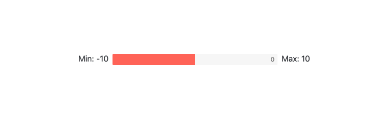
Value and Ranges
You can set the minimum and maximum properties of the Kendo UI for Angular ProgressBar to define what values and value ranges the component represents.
-
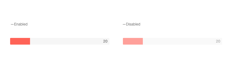
Disabled ProgressBar
When requirements call for the Kendo UI for Angular ProgressBar to prevent user interactions, it be disabled using a single setting.
-
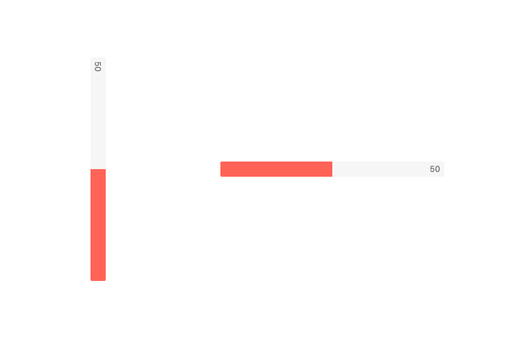
Orientation
The Kendo UI for Angular ProgressBar can be rendered either in a vertical or a horizontal fashion by defining the orientation setting.
-
Direction
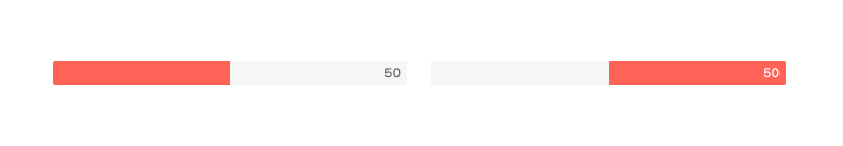
The direction of the Kendo UI for Angular ProgressBar can be controlled with a single configuration option. This allows the Angular Progress Bar to switch from flowing from left-to-right to right-to-left or from bottom-to-top to top-to-bottom.
-
Labels
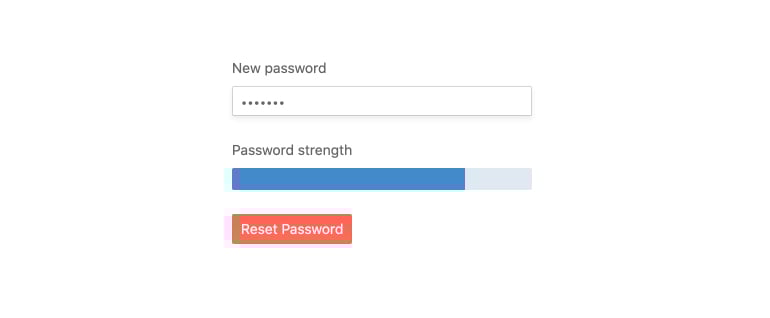
You can implement labels with the Kendo UI for Angular ProgressBar to indicate the progress value, such as a percentage. Both the position and the format of the label can be completely customized.

-
Animation
The Kendo UI for Angular ProgressBar can dynamically animate value changes in the component. You can customize animations or disable them altogether.

-
Appearance
You can customize the appearance of the Kendo UI for Angular ProgressBar via various settings. Easily define colors to dynamically represent changes in the value, or adjust the height and width of the component.
-
Globalization
The Kendo UI for Angular ProgressBar supports globalization scenarios by allowing the component to be rendered in an RTL (right-to-left) fashion.


Get Started with Kendo UI for Angular
