
Kendo UI for Angular
Angular FlatColorPicker
- While most color pickers appear in a pop-up this version appears directly on the page of your Angular app.
- Part of the Kendo UI for Angular library along with 110+ professionally-designed components.
- Includes support, documentation, demos, virtual classrooms, Visual Studio Code Extensions and more!
-
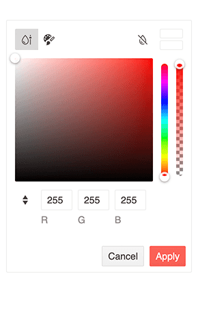
Gradient and Palette Views
The Angular FlatColorPicker component features two different views that let you control how the FlatColorPicker is rendered. Use the gradient view when you want to offer users complete freedom to easily browse for any color. Use the palette view when you want to display a limited set of colors. Or offer both and let the user decide.
-
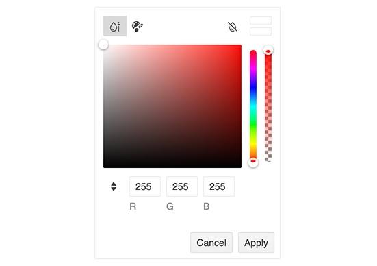
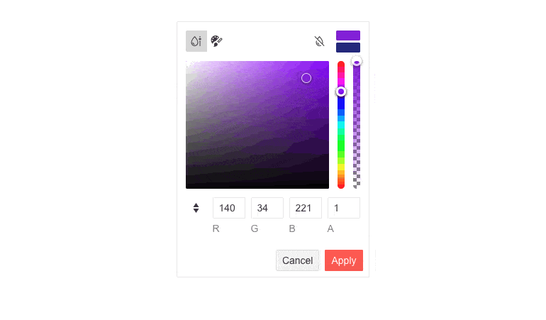
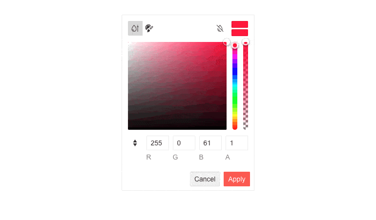
Color Preview
The Angular FlatColorPicker preview feature lets a user see color before applying it. When a color is clicked, it will appear in a swatch beside the previously selected color. The user can then apply or revert.
-
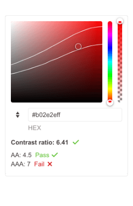
Color Contrast Tool
Good contrast is a critical factor in UI readability and legibility, ensuring access to your UI for all users. For example, the recommended minimum contrast ratio is 4.5:1 while the optimal is 7:1. In order to prevent users from selecting colors that are too similar, the Angular FlatColorPicker provides a calculator for computing contrast ratios through which users can make the right call.
-
Customization
The Angular FlatColorPicker has many building blocks. Each is enabled by default. The component exposes various properties to allow you to not only toggle these on and off but also customize their appearance and behavior. Customizable elements include the Views Toggle Buttons, Clear Button, Action Buttons Layout, Pallet View, and Gradient View.
-
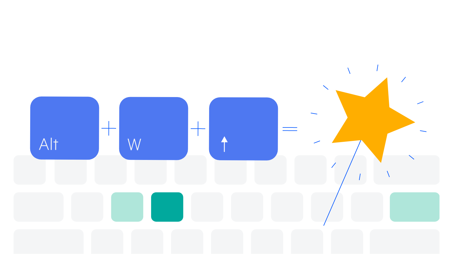
Keyboard Navigation
In order to provide the best UX and accessibility possible, keyboard navigation is built-in. Using keyboard shortcuts, users can navigate and interact with the FlatColorPicker.
-
Accessibility
Ensure your application meets the international accessibility requirements. Every Kendo UI for Angular component has built-in digital accessibility features to help you stay compliant with accessibility standards. The FlatColorPicker follows the official WCAG guidelines and supports Section 508, Keyboard Navigation, and WCAG 2.0 (with a AAA rating) compliance.

-
Embed a Color Picker On the Page
The Angular FlatColorPicker component adds another option for your users to select colors in React applications. It provides a flat view for the ColorGradient and the ColorPalette components and adds a header and footer. Unlike the Angular ColorPicker component, the FlatColorPicker is not rendered within a popup or dropdown but immediately to the page.

Get Started with Kendo UI for Angular
