
Kendo UI for Angular
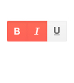
Angular ButtonGroup
- Configure multiple Angular buttons in the same component, each with consistent theming and independent configuration.
- Part of the Kendo UI for Angular library along with 110+ professionally-designed components.
- Includes support, documentation, demos, virtual classrooms, Visual Studio Code Extensions and more!
-
Selection Mode
The Kendo UI for Angular ButtonGroup component allows you to set the selection mode of individual buttons either to single or multiple selection.
-
Disabled ButtonGroup
The Kendo UI for Angular ButtonGroup can easily transition from enabled, its default state, to disabled. This allows you to prevent user interactions with the buttons until certain criteria have been met, while giving the disabled buttons a distinct visual representation to suggest that they’re inactive.

-
Accessibility
The Kendo UI for Angular ButtonGroup is compliant with Section 508 and WAI-ARIA standards and has a WCAG 2.0 AAA rating.

-
Easily Manage Button Groups
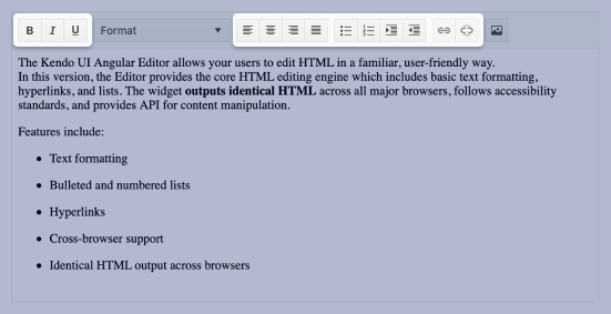
When two or more Kendo UI for Angular Buttons need to be rendered as part of the same component, this is where the Kendo UI for Angular ButtonGroup comes into play. This Button Groups component enables you to configure each button individually to display text content, icons, images or a combination of textual and image content.


Get Started with Kendo UI for Angular
