
Kendo UI for Angular
Angular ColorPicker
- Provide users with a predefined palette or a free-form gradient for a great UX when selecting colors.
- Part of the Kendo UI for Angular library along with 110+ professionally-designed components.
- Includes support, documentation, demos, virtual classrooms, Visual Studio Code Extensions and more!
-
Forms Support
The Kendo UI for Angular ColorPicker supports both template-driven forms and Reactive forms.
-
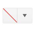
Disabled ColorPicker
By default, the Kendo UI for Angular ColorPicker is enabled, which means users can interact with it. For scenarios that call for the Angular ColorPicker to prevent user interactions, the disabled state can be set with a single configuration option.

-
Read-Only ColorPicker
The read-only property enables you to display the ColorPicker component and its value in the default enabled visual style, while it prevents users from changing the value.
-
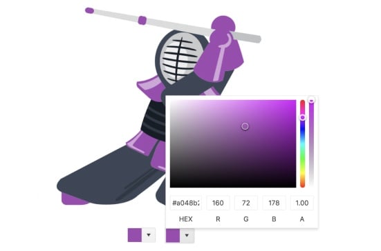
Custom ColorPicker
Every aspect of the Kendo UI for Angular ColorPicker can be customized to meet existing design requirements. You can customize the appearance and content of the input element, as well as what appears in the popup of the Angular ColorPicker.

-
Keyboard Navigation
Every aspect of the Kendo UI for Angular ColorPicker can be navigated through and interacted with using keyboard navigation. This lets anyone interacting with the Angular ColorPicker use only their keyboard when selecting a color.
-
Flat ColorPicker
This alternate version of the Angular ColorPicker presents the component directly on the page without hiding it behind a popup or other page element. It is fully featured, and integrates into template-driven and reactive forms.
See the Angular FlatColorPicker demo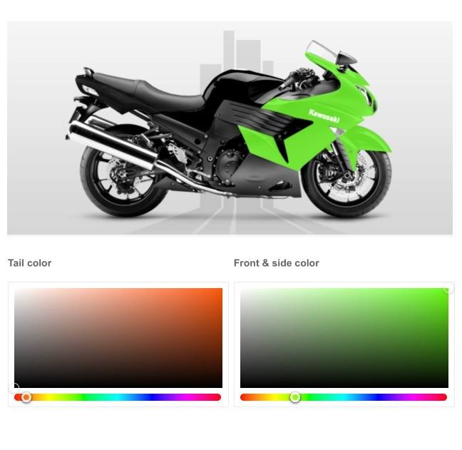
-
Ready-To-Use Color Picker
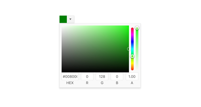
The Kendo UI for Angular Color Picker component provides users with a sleek and intuitive way to select and interact with colors in any Angular application. The component offers you to let users choose between a set of predetermined colors in a palette or select their own color from a gradient control.
-
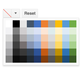
View Types
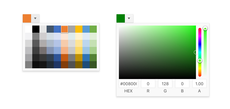
The Kendo UI for Angular ColorPicker allows you to choose between rendering either a color palette, a color gradient, or both, in the popup that appears when the user interacts with the component.

Get Started with Kendo UI for Angular
