
Kendo UI for Angular
Angular Dialog
- Display information and prompt the user to take action in an Angular modal window.
- Part of the Kendo UI for Angular library along with 110+ professionally-designed components.
- Includes support, documentation, demos, virtual classrooms, Visual Studio Code Extensions and more!
-
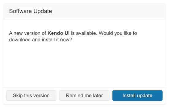
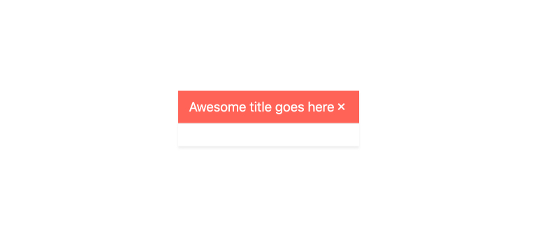
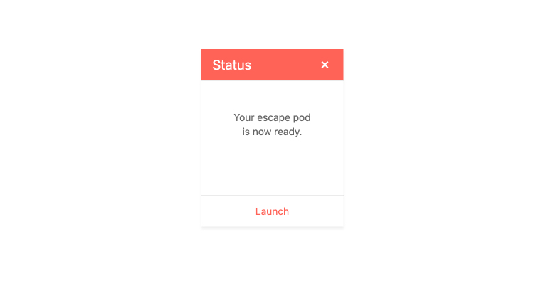
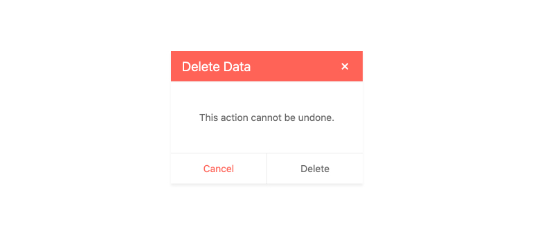
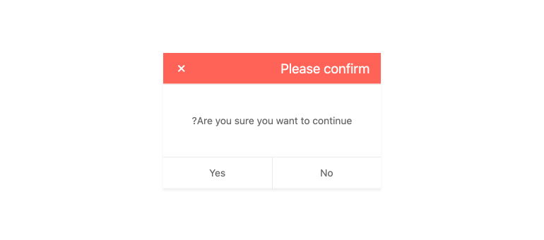
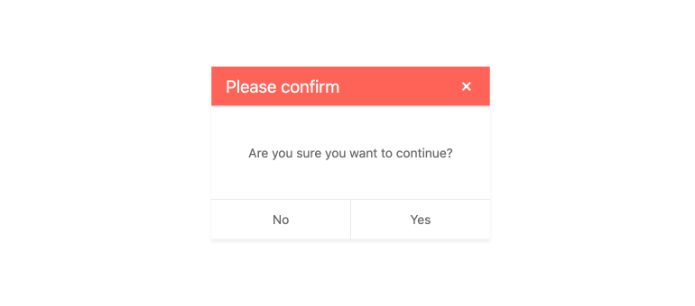
Title
Every Kendo UI for Angular Dialog component has a title area which can contain custom text, custom HTML, or be left blank. Use the title in order to help users quickly contextualize what the Angular Dialog is prompting them to do.
-
Dimensions
By default, the Kendo UI for Angular Dialog has built-in logic for determining the rendered height and width. For scenarios that need customization, the dimensions can easily be overridden by using the width and height options of the Angular Dialog component.
-
Action Buttons
You can flexibly define custom actions and buttons at the bottom of the Kendo UI for Angular Dialog, called Dialog Action Buttons. Each option in this area corresponds to a button that you can hook in to in order to perform an action based on the user’s selection. You can also customize the buttons layout by using the layout option.
-
Animations
The Angular Dialog opens with the default animation, but you can customize it to behave to way you like. Use a simple property to change the duration of the animation or choose from a list of built-in animations including slide up, down, left-to-right, and right to left, zoom, fade, and expand.

-
Visibility
The Kendo UI for Angular Dialog always displays its modal dialog in the center of the user’s screen, which can be challenging to create on your own. Moreover, you can hide or show the Angular Dialog when you need to through setting a single configuration option.
-
Globalization
The Kendo UI for Angular Dialog offers right-to-left support, allowing you to use the Angular Dialog in several different globalization scenarios.
-
Keyboard Navigation
The Kendo UI for Angular Dialog fully supports keyboard navigation and has several built-in keyboard shortcuts for interacting with the Angular Dialog component and its elements.
-
Accessibility
The Kendo UI for Angular Dialog is AA rated for WCAG 2.0 and compliant with both WAI-ARIA and Section 508 standards.
-
Other Supported Frameworks
The Dialog component is also available in these web development frameworks:
-
Display Information in an Angular Modal Window
The Kendo UI for Angular Dialog showcases specific information and prompts the user to take an action through a modal window. Often used to provide a modal dialog to confirm or cancel an action, the Angular Dialog component is perfect to draw the user’s attention when a decision has to be made before moving on.

Get Started with Kendo UI for Angular
