
Kendo UI for Angular
Angular CircularProgressBar
- Use this Angular progress bar component to show progress on a circular gauge,
- Part of the Kendo UI for Angular library along with 110+ professionally-designed components.
- Includes support, documentation, demos, virtual classrooms, Visual Studio Code Extensions and more!

-
An Alternative to the Linear Progress Bar
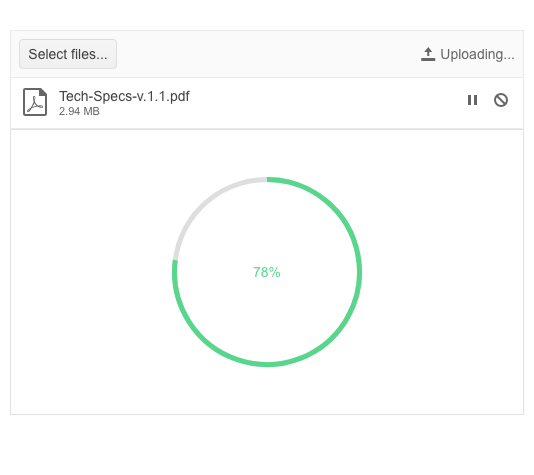
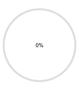
The Angular CircularProgress bar is an alternative to the typical linear progress bar and shows progress as a colored lined on a circle. When the circle is complete, progress is complete. You have total control to make it your own. Map colors to ranges (ex: up to 10% is red), format the middle label, set the size, and much more.
See the Angular CircularProgressBar demo
-
Center Template
Much like the circular gauge, the Angular CircluarProgressBar allows you to display custom text or HTML in the center. This is typically used to show percentage progress.
-
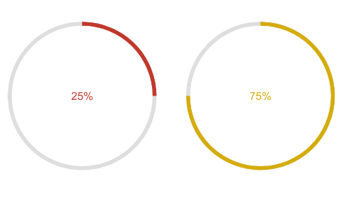
Color Ranges
The colors feature helps you make this version of the progress bar really stand out. By setting a few properties, you can render the indicator in a different color based on the value and it will change value as the process progresses.
-
Appearance and Animation
Customize the Angular CircularProgressBar to fit in with your application with properties such as width, height, color, and animation behavior.
-
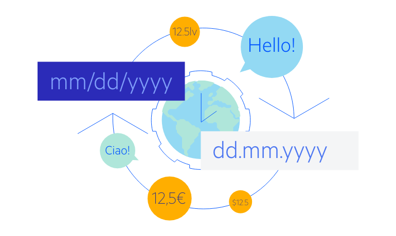
Globalization
The CircularProgressBar supports the globalization process through internationalization (i18n), message translation, and right-to-left layouts.

Get Started with Kendo UI for Angular
