
Kendo UI for Angular
Angular Toolbar
- Easily add a toolbar to your Angular applications by grouping multiple button types together.
- Part of the Kendo UI for Angular library along with 110+ professionally-designed components.
- Includes support, documentation, demos, virtual classrooms, Visual Studio Code Extensions and more!
-
Control Types
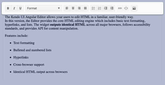
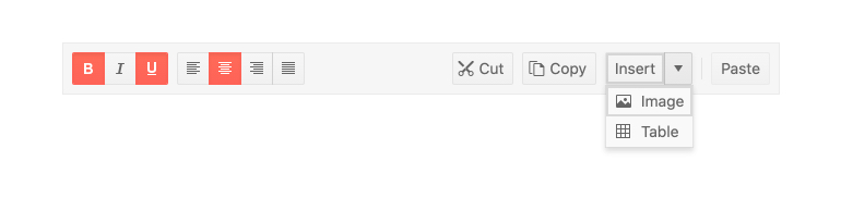
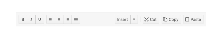
The Toolbar’s available control types range from Buttons, Toggle Buttons, SplitButtons, DropDownButtons, and ButtonGroups. You can also create custom control types by using Angular templates and passing in your own Angular components.
-
Keyboard Navigation
With built-in support for keyboard navigation, the Kendo UI for Angular Toolbar contains several keyboard shortcuts to help interact with and navigate through the various control types.
-
Globalization
To assist with globalization and internationalization scenarios, the Kendo UI for Angular Toolbar fully supports being rendered in a right-to-left (RTL) fashion.
-
Accessibility
The Kendo UI for Angular Toolbar is fully accessible, rated AA with WCAG 2.0 and compliant with both Section 508 and WAI-ARIA standards.

-
Manage Button Groups
The Kendo UI for Angular Toolbar component provides a collection of various button types, such as a drop-down and a split button, in a single UI element. Beyond sporting various button types, the Angular Toolbar includes ways to organize these buttons into various groups.

Get Started with Kendo UI for Angular
