
Kendo UI for Angular
Angular Pager
- Provide your users with a great data viewing experience by allowing them to navigate through data subsets.
- Part of the Kendo UI for Angular library along with 110+ professionally-designed components.
- Includes support, documentation, demos, virtual classrooms, Visual Studio Code Extensions and more!
-
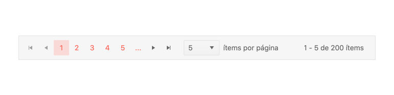
Globalization
All built-in strings of the Kendo UI for Angular Pager can be customized and translated into various languages. Additionally, the Angular Pager supports being rendered in an RTL (right-to-left) mode. This makes the component a great fit for any application that has globalization and internationalization needs.
-
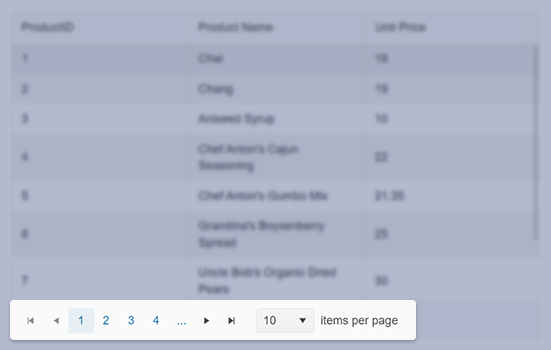
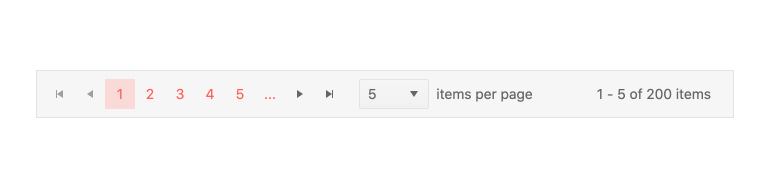
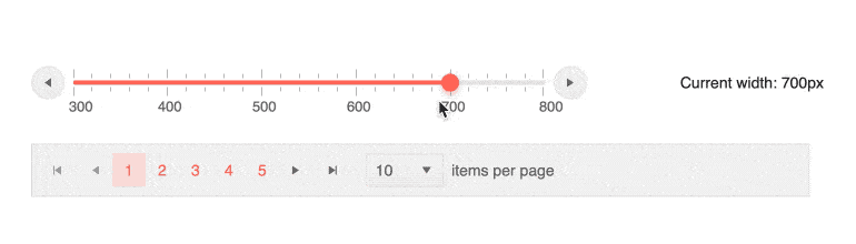
Navigate Through Pages of Data Sets
The Kendo UI for Angular Pager is the perfect component to assist with breaking down large datasets into smaller and more manageable pages. It comes with its own built-in navigation elements to help users move between the pages.
-
Templates
The Kendo UI for Angular Pager can be completely customized by utilizing a standard Angular template, giving you full control over the look and feel of the component.
-
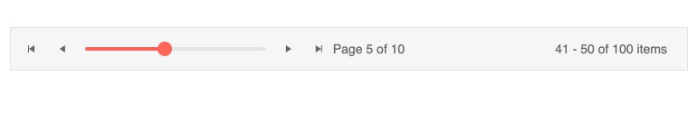
Responsive Design
The Kendo UI for Angular Pager component comes with built-in responsive behaviors. These include automatic calculations for when to show or hide certain elements, replacing elements of the pager and repackaging them in a more compact form, such as replacing the list of available pages with an Angular DropDownList.

Get Started with Kendo UI for Angular
